
Power Pivot Principles: Highlighting Absent Students
27 August 2019
Welcome back to our Power Pivot blog. Today, we look at how to create a PivotChart that highlights the number of absent students in university classes.
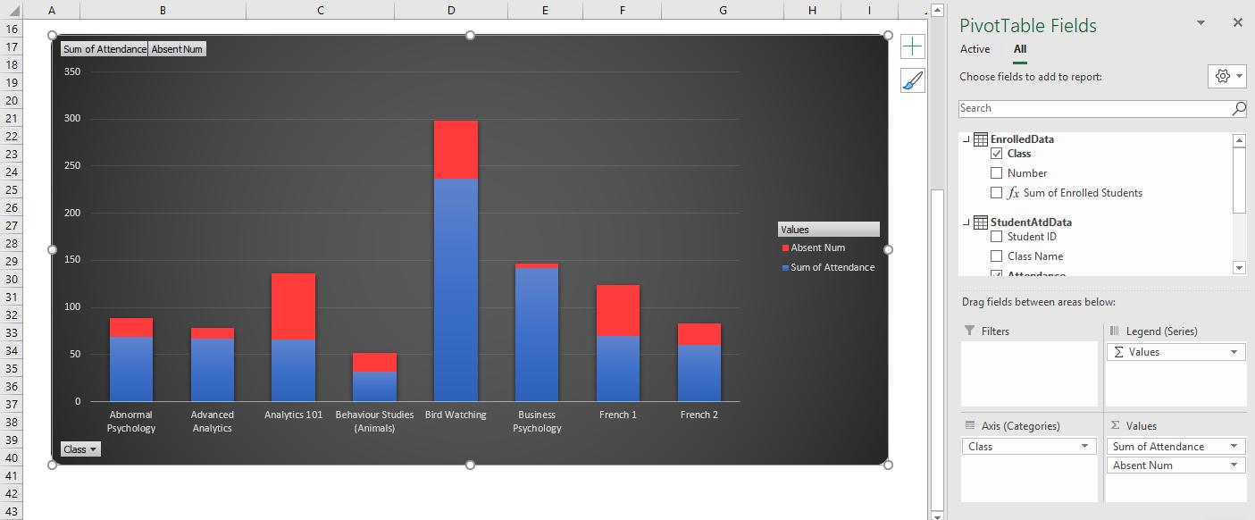
Here is the scenario: we are a teaching assistant to a professor and the professor has tasked us with creating a stacked bar chart that will highlight the number of students that are absent from several classes:
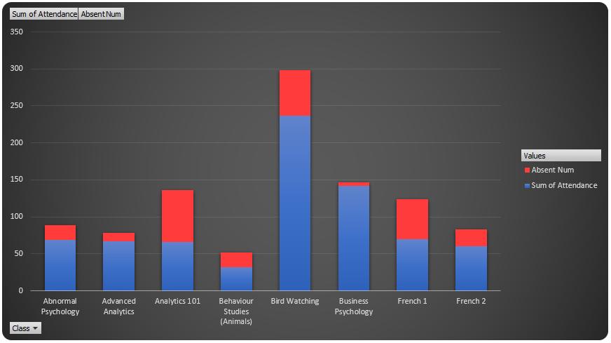
In this stacked bar chart, the red segments of the chart illustrate the total number of absent students in each class and the blue segments illustrate the number of students present. The red and blue segments combined add up to the total number of students enrolled in each class.
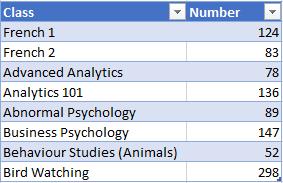
The professor has given us two data tables, one has the total number of students enrolled in each class:
The other data table contains 700+ rows of attendance data, it is organised in such a way that for each student only appears on this list if they had attended the class (i.e. the screenshot is not exhaustive):

You must be thinking, “surely we can use SUMIF function in Excel to compile the numbers then compare them in a chart” – well, yes… but let’s do it in DAX.
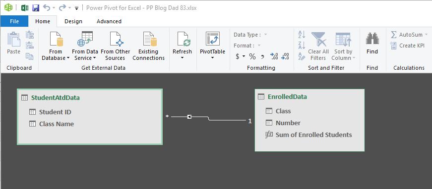
The first step is to add both data tables into our data model. We have to create a relationship between the two Tables using the “Class” and “Class Name” columns as the common keys between both tables:
The issue now is how do we illustrate the number of students that are skipping class? There are two methods:
- We can add a custom column into the table called Attendance and populate the entire column with ‘1’ values
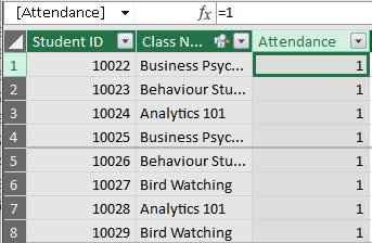
From there we can sum the attendances.
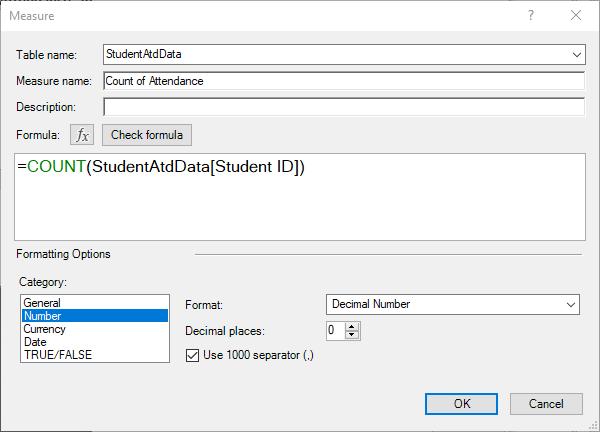
- If, for whatever reason, you are unable to do that (e.g. not enough memory), we can create a measure to count the number of students going to each class with the COUNT function:
=COUNT(StudentAtdData[Student ID])
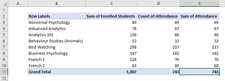
Both methods yield the same result:
Adding the attendance field to our PivotChart yields:
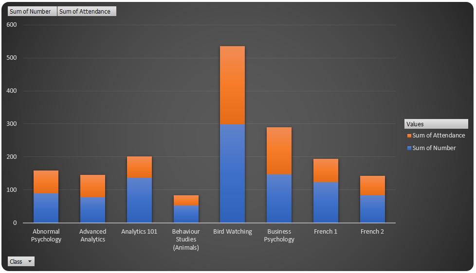
As it stands, the stacked bar chart is displaying the attendance of students in orange, and the number of enrolled students in blue. We want the orange segment of the bars to illustrate the number of students missing from each class. To do that, we’re going to have to create some measures:
=SUM(EnrolledData[Number])
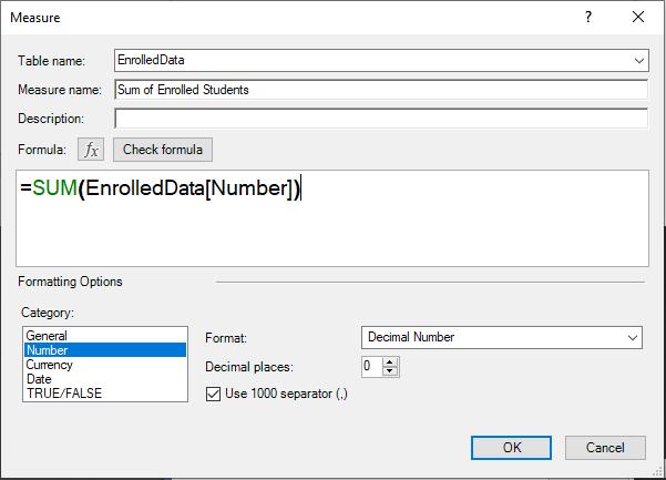
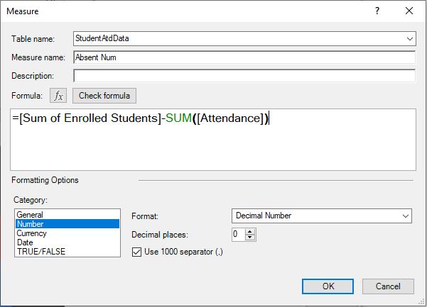
Once we have the sum of enrolled students, we can create the number of absent students in each class:
=[Sum of Enrolled Students]-SUM([Attendance])
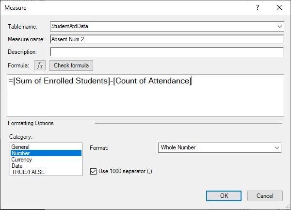
or (if you used the Count of Attendance measure):
=[Sum of Enrolled Students]-[Count of Attendance]
With the Absent Num 2 measure calculating the number of students that were absent in each class, we can create the following Stacked Bar Chart (we have also decided to use red instead of orange, because it is more incriminating):
That’s it for this week, come back next week for more Power Pivot. Until then happy pivoting!
Stay tuned for our next post on Power Pivot in the Blog section. In the meantime, please remember we have training in Power Pivot which you can find out more about >here. If you wish to catch up on past articles in the meantime, you can find all of our past Power Pivot blogs here.