
Power Pivot Principles: Annual / Monthly Comparisons
20 April 2021
Welcome back to the Power Pivot Principles blog. This week, I will be comparing my Actuals data for different years.
Let us say I received a request from my manager asking for a financial performance report of the company. As an ‘excellent’ analyst, I decided to compare Charts of Accounts for two years to show the relative change in performance monthly.
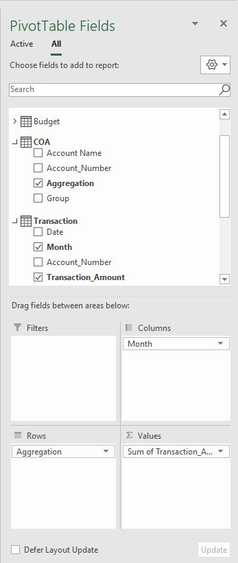
From previous blogs, you will note I have been running my financial ‘analyses’ for the past few weeks already. Let me quickly pull in my Actuals data by selecting the following fields:
My summary table looks like this:
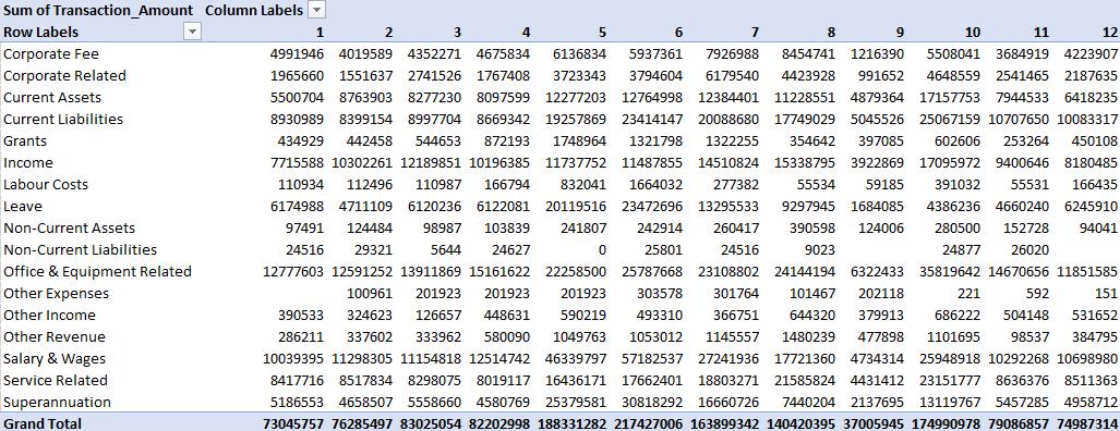
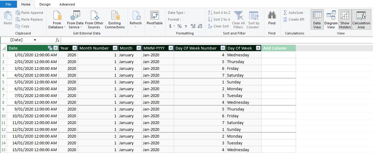
Wait, this is not right! I cannot use this summary table to compare between two different years. I am running late, so I will simply create a Calendar table, viz.
In the diagram view, I will create a relationship between Actuals and Calendar query:

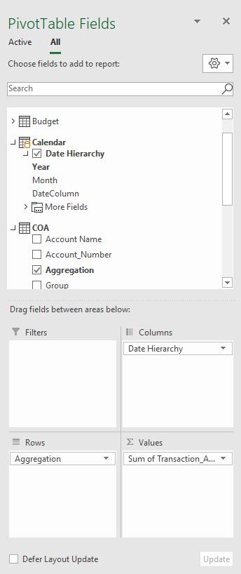
Now that I am prepared, I will replace the ‘Month’ field with the ‘Date Hierarchy’ in my summary table:
My summary table looks like the following:

All I must do now is expand both the years, viz.
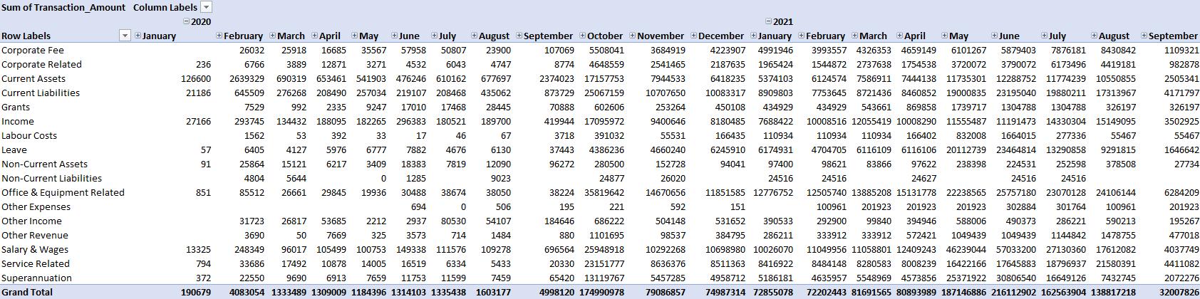
There it is! I can finally begin writing my report. I have my numbers right here to begin with.
That’s it for this week!
Come back next week to see how we use the disconnected table for performing a sensitivity analysis by staying tuned for our next post on Power Pivot in the Blog section. In the meantime, please remember we have training in Power Pivot which you can find out more about here. If you wish to catch up on past articles in the meantime, you can find all of our Past Power Pivot blogs here.