
Power BI Blog: Waterfall Charts
9 May 2019
Welcome back to this week’s Power BI blog series! This week, we’re going to look at how to create Waterfall charts.
Imagine we had a basket of 10 fruits consisting of a combination of Apples, Pears, Oranges, and Durians. We are also supposed to use this basket of 10 fruits to feed 2 animals at the zoo. animal 1 only eats Apples and Oranges, and animal 2 only eats Pears.
On top of fussy animals our senior zookeeper wants us to create a Waterfall Chart in Power BI to display the number of fruits eaten by each animal and the breakdown of fruit types… what?
Let’s jump into it.
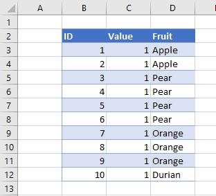
For this blog we will be using the following data set:
Importing this table into Power BI and attempting to create a Waterfall chart yields:
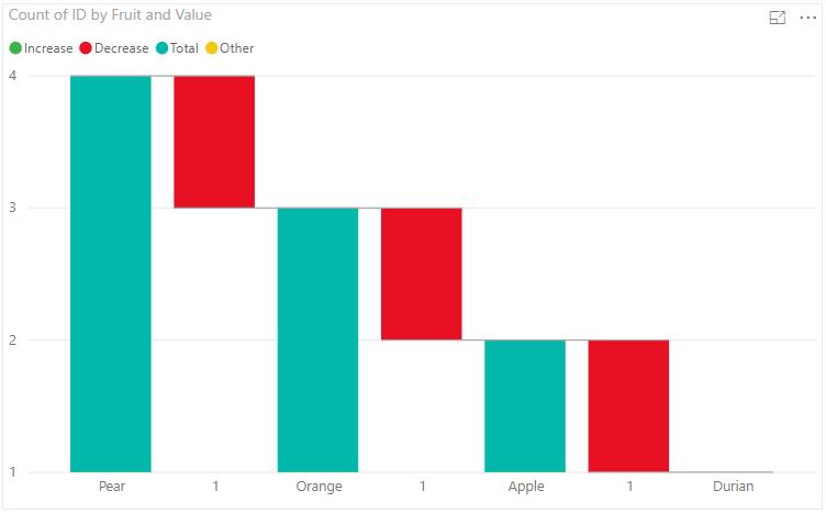
Not exactly what we are looking for.
The Waterfall chart in Power BI requires 4 inputs, Category, Breakdown, Y Axis, and Tooltips.
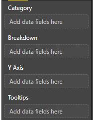
In this example we will only be concerned with the Category, Breakdown, and Y Axis.
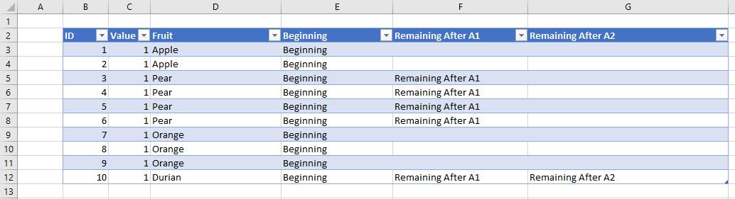
In order for us to create the waterfall chart correctly in Power BI we have to present the following data in Power BI:
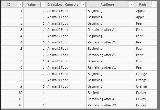
This is a several step process. First we have to add 3 columns to our Excel data one column to represent the amounts at the Beginning, Remaining After A1 (animal 1), and Remaining After A2 (animal 2). These text values will appear on the X-Axis of the Waterfall chart. We will have to populate each column conditionally after each animal eats their share of fruit:
We can either do this in the raw data source or we can use Power Query to transform the data – either way works.
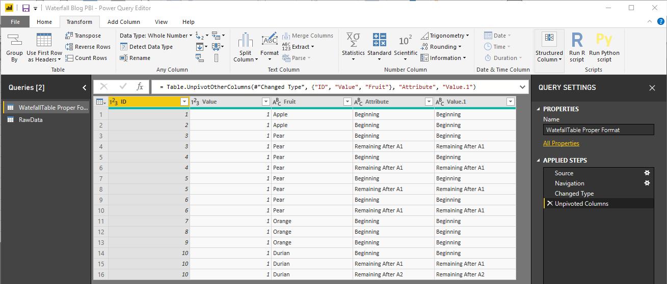
After importing this new table into Power BI, we have to unpivot the Beginning, Remaining After A1, and Remaining After A2 columns:
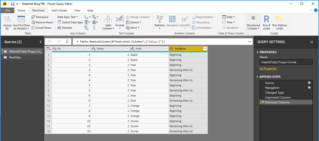
The next step is to remove the ‘Value.1’ column as it is identical to the ‘Attribute’ column:
The process of unpivoting creates multiple rows for each of our fruits. Note that we started off with 10 lines of fruits and now have 16 lines in our dataset? Essentially, each line appears once for each part of the waterfall that it is being counted in.
Close and Apply, and we can now create our Waterfall Chart. In the Visualizations area find the ‘Waterfall Chart’ icon, click it, drag the ‘Attribute Field’ into the Category area, drag the ‘Fruit’ field into the Breakdown area, an the ‘Value’ field into the Y Axis area:
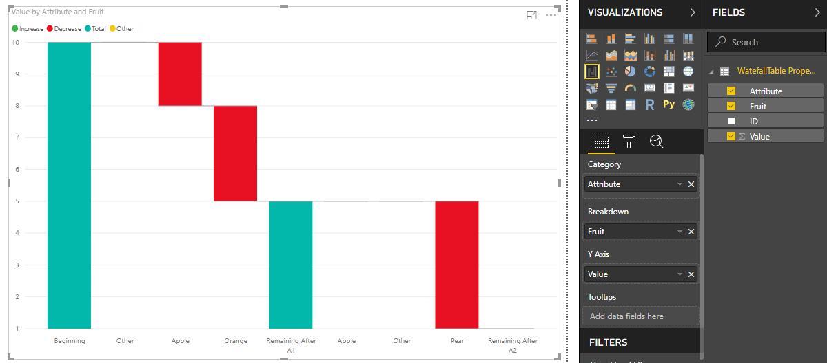
There we have it! Our waterfall chart now displays which fruits are being consumed by the animals!
Tune in next time for more Power BI. See you then!