
Power BI Blog: Restaurant Selector
23 May 2019
Welcome back to this week’s Power BI blog series! This week, we’re going to look at cleaning up the data we brought in last week from ‘New web table from inference’.
Last week we brought in 4 different tables of data from the TripAdvisor webpage, you can read more about that blog here.
The four different tables don’t help much on their own other than making relieving us of having to scroll through the webpage to look at restaurants.
Let’s see if we can combine them together to make something more of it.
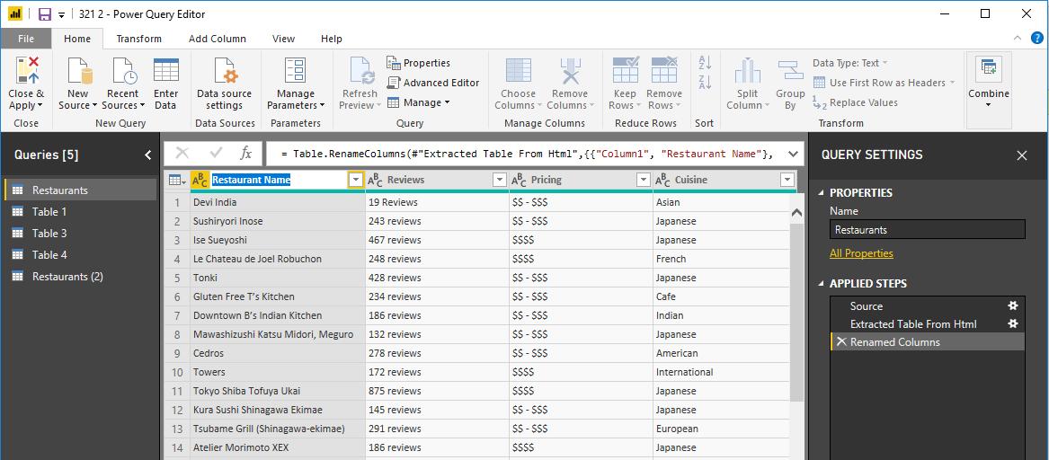
The first step we are going to take here is to rename Table 2 to ‘Restaurants’ and the column headers:
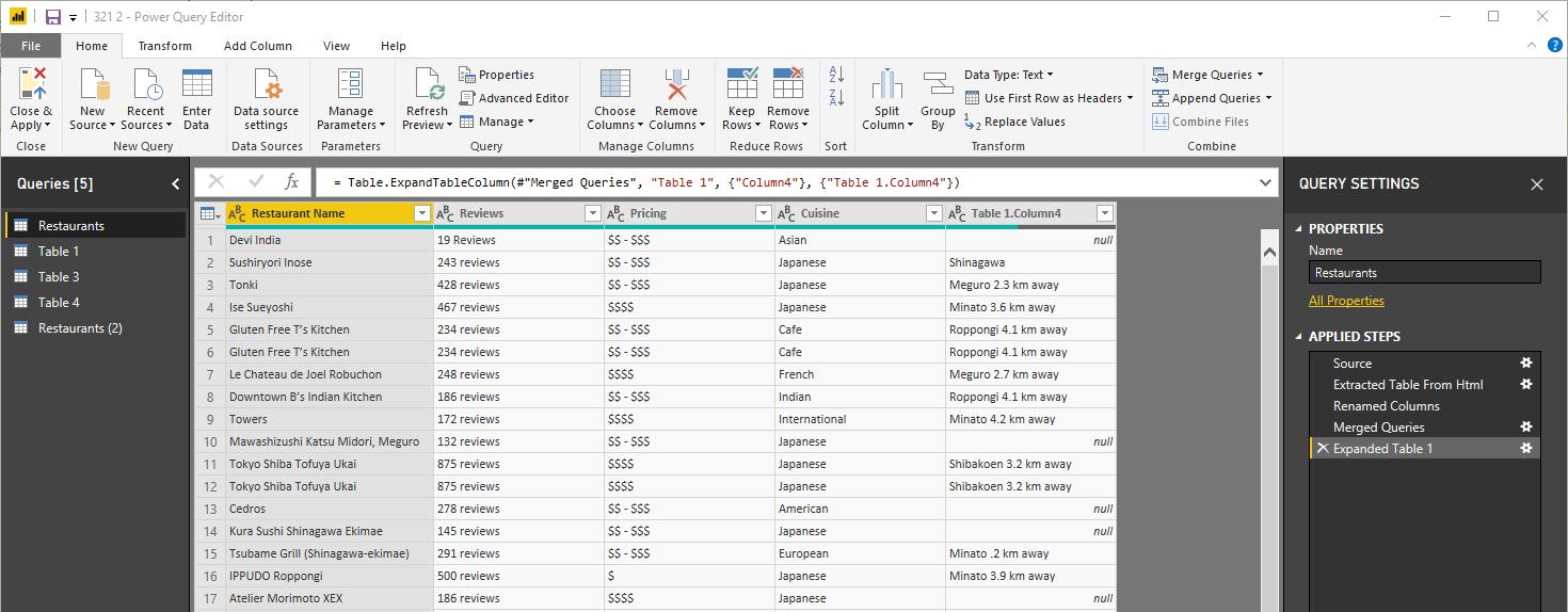
The next step is to merge two tables based on the restaurant name so that we can see how far each restaurant is from us:
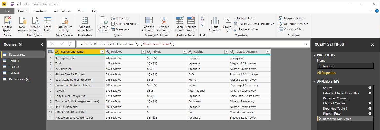
Next, we have to filter out rows with null values and remove duplicate entries in our table:
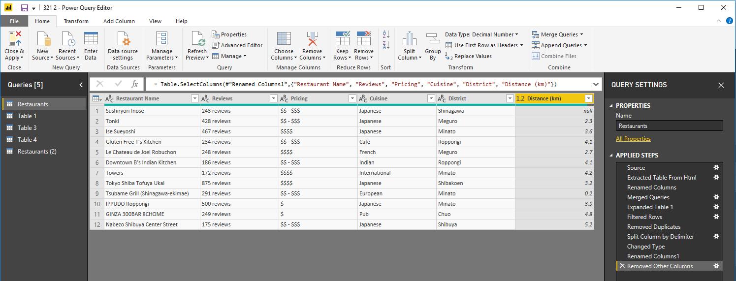
We now have to split the ‘Table 1.Column4’ column by delimiter so that we can have a number value for the distance. Don’t forget to give the new columns appropriate names!
Close & Apply, and the next step is to create several simple visualisations. A table with the Restaurant Name, Pricing, District. A clustered bar chart displaying the Distance (km) by Restaurant Name. A slicer to help filter the distances and another slicer for the Prices.
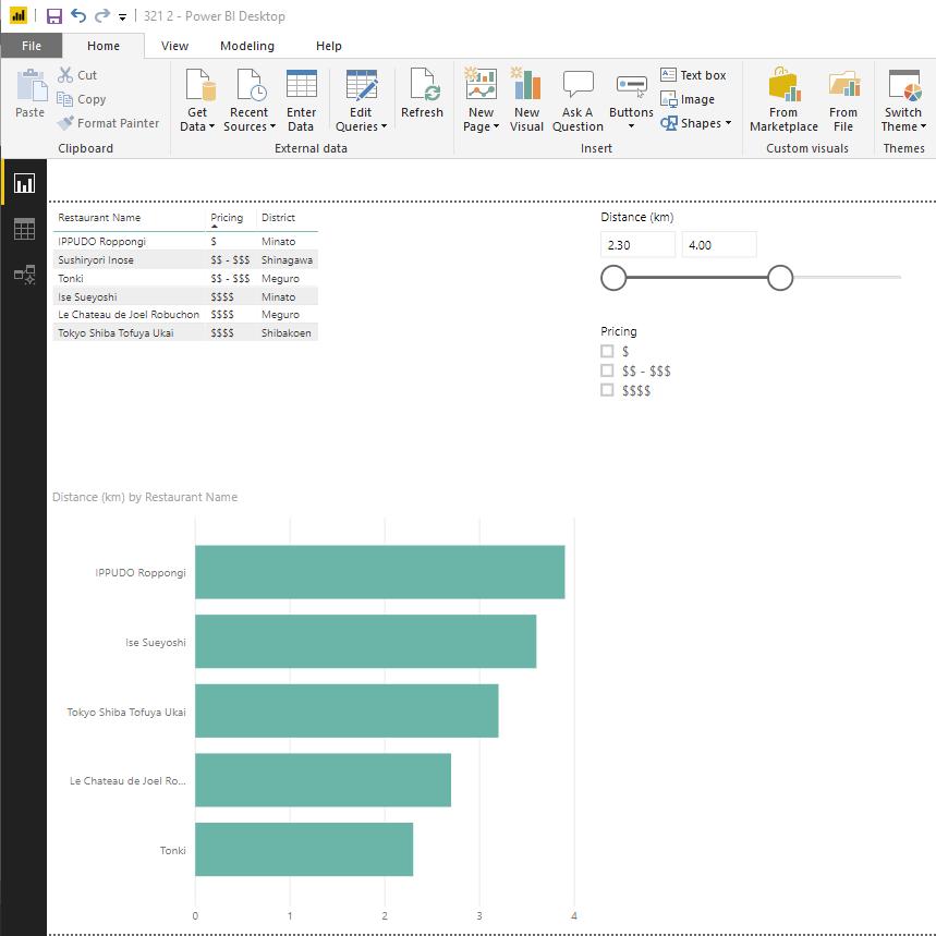
We can now sort the restaurants by ascending prices, and Power BI will filter the results based on our price tolerance level and how far we are willing to travel!
Hopefully building something like this will help you decide where to go to eat next time you’re having trouble!
Tune in next time for more Power BI. See you then!