
Power BI Blog: Practical Influences
28 February 2019
Welcome back to the Power BI blog! This week, we’re going to look at the Key Influencers visual and provide some guidance on how you can use it from a practical perspective.
You need to have a lot of observations
Within the categories that you’re searching for, you need to have enough data points that meet that criteria for Key Influencers to work properly. Essentially, it’s hard to find patterns if you don’t have sufficient data, and the visualisation works best if you have over 100 observations for the category you’re looking at, and at least 10 observations for the comparison (i.e. things not in your category).
It’s also worth noting that you need to have explanatory fields that have lots of observations in each category. If you use a field with many different values and very few data points in each, Power BI will find it difficult to establish a pattern.
You need to ensure a unique relationship between your metric and your fields
There needs to be a relationship between the category you’re looking for and the values you’re using to explain it. However, this relationship must be unique, or you will get an error:
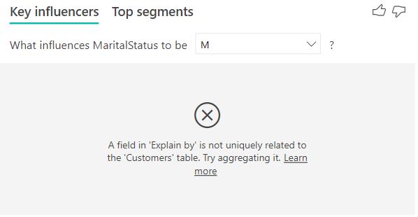
In this instance, we’re trying to look at the Sales Category to explain the Marital Status. In a normal influencer analysis, we would expect to see relationship where the Marital Status could be used to explain the Sales Category (e.g. married people have a 30% chance to buy a bike, whereas single people have a 50% chance to buy one). However, when entering it the other way around, there isn’t a single unique sales category that can be applied to every customer – a customer may purchase a bike, or a tyre, or a piece of clothing, and fall into different sales categories.
As a result, the easiest way to think about what you can and can’t do is to consider if there is a many-to-one relationship between your variables, and which way it goes. You can only use fields to explain influences if they are further up the hierarchy. Essentially, the most granular transaction should be in the category to be checked.
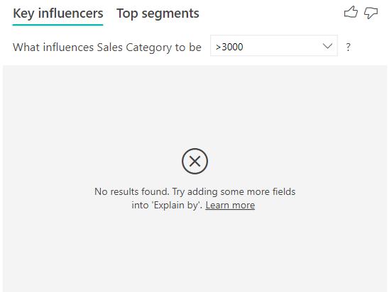
Measures can’t be included in your analysis
I’d like to see which category gives me the highest average sales. However, measures can’t be used as the result. This is because the category you’re searching for has to be just that – a categorical variable. You need to be able to establish a subset of data to segment and be associated with.
In practice, rather than using the base fields in your dataset, it’s often a good idea to set up flags as variables – either [1,0] or Yes / No or even Include / Exclude. This provides a clear indicator to Power BI to check for things that you want to see. Some examples of these in real-life datasets might include:
- Customer churn
- Credit card default
- Debt covenants being met
- Sales value over $X
- Invoice overdue
The process of establishing these flags will actually help provide you with the mental framework to approach the question and consider what in your dataset might be relevant to establish the category and therefore what might be useful to consider as an influencer.
We hope that you’ve found this month’s series on Key Influencers useful – see you next week for more Power BI tips!