
Power BI Blog: Personalize Visuals (Preview)
14 May 2020
Welcome back to this week’s Power BI blog series. This week, we look at how you may now personalise (customise) your visuals in Power BI.
Previously, the way you could explore and modify the properties of a visual was by being in the full-editing experience (which can be quite foreign or not an option to many end users without edit access), else have the report author duplicate the visual, make the requested modifications, and save it as a report bookmark.
That has now changed. With the latest Power BI (April 2020) update, you can empower your end users to explore and personalise visuals all within the consumption view of a report.
Using this feature, your end users may explore a visual in many ways, e.g.
- change the visualisation type
- swap out a measure or dimension
- add or remove a legend
- compare two or more different measures
- change aggregations.
Not only does this feature allow for new exploration capabilities, but it also includes ways for end users to:
- capture their changes
- share their changes
- reset all their changes to a report
- reset all their changes to a visual
- clear out their recent changes.
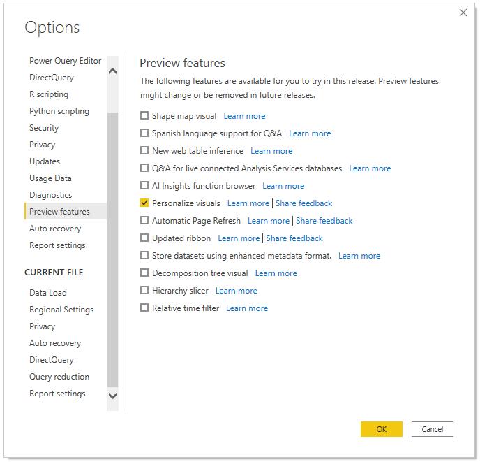
Since this feature is in Preview, you will need to first turn on the feature switch by going to File -> Options and Settings -> Options -> Preview feature and make sure ‘Personalize visuals’ is turned on:
After you turn on the Preview switch, you will need to specifically enable it for the reports that you want end users to be able to personalise visuals for.
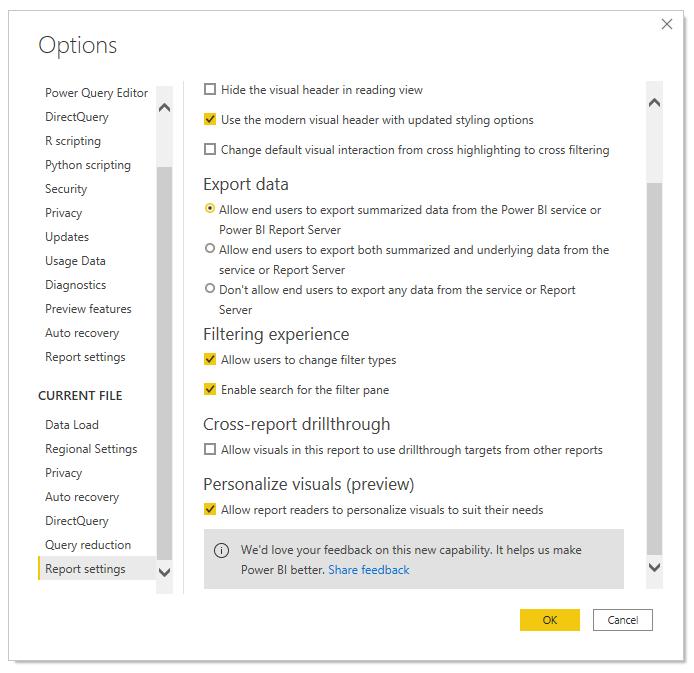
To enable the feature on in Power BI Desktop, you will need to go to File -> Options and Settings -> Options -> Report settings for the CURRENT FILE and make sure ‘Personalize visuals (preview)’ is turned on.
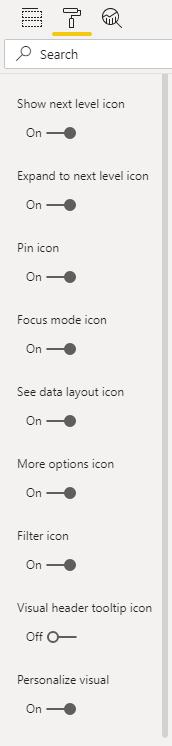
When you enable this setting for a given report, all visuals in that report will have this on by default. If you want to customise which visuals have this experience, you can toggle on / off this setting per visual in the visual header section of the Formatting pane:
After deciding which visuals you want to allow the end user to personalise, you publish the report to the Power BI online service.
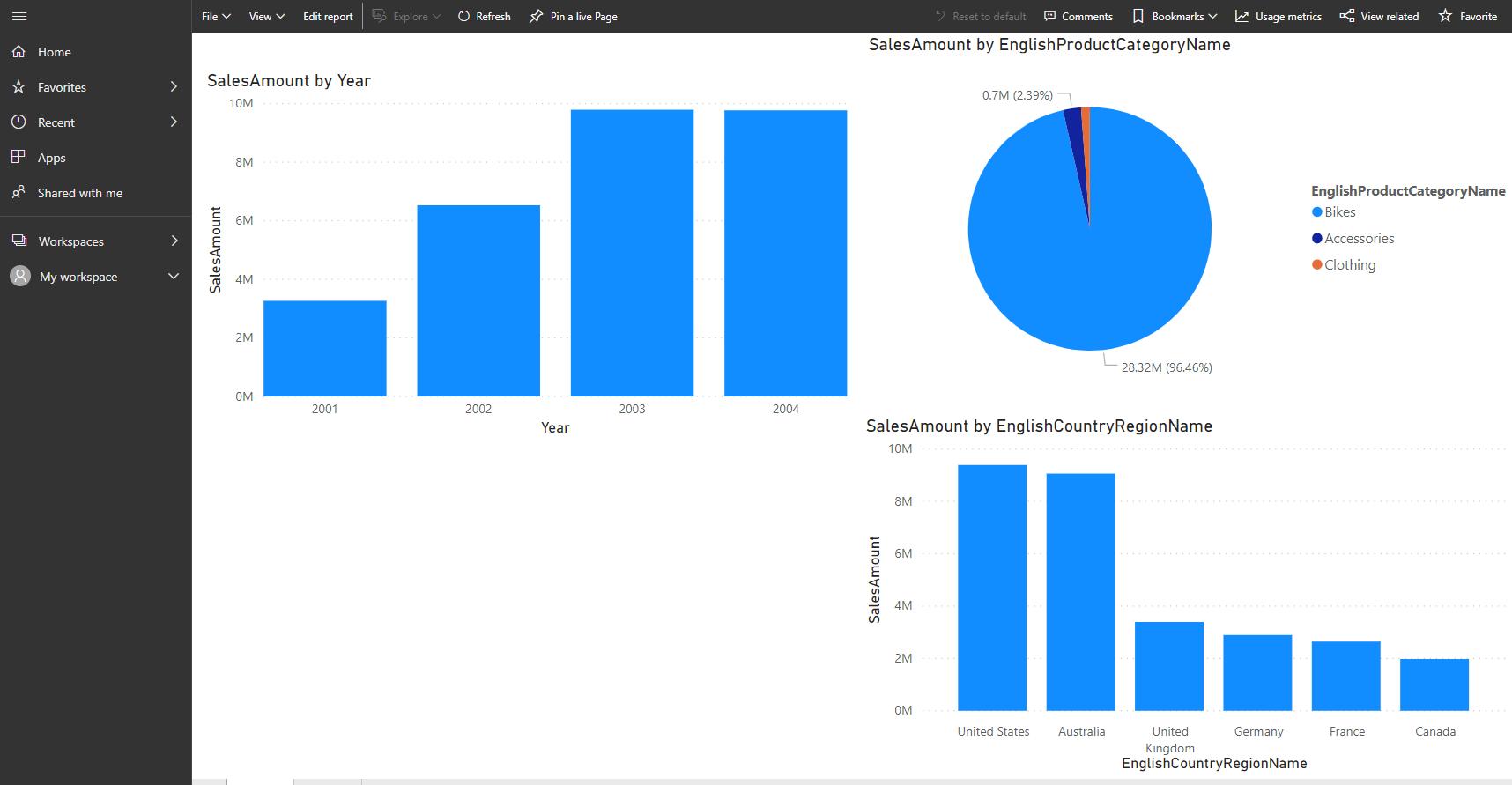
To demonstrate how it will appear to end users, you can go to the workspace where you published it (e.g. ‘My Workspace’):
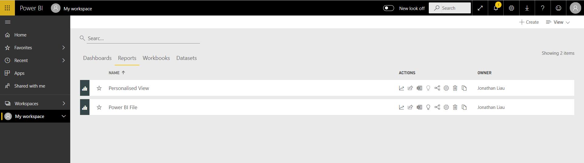
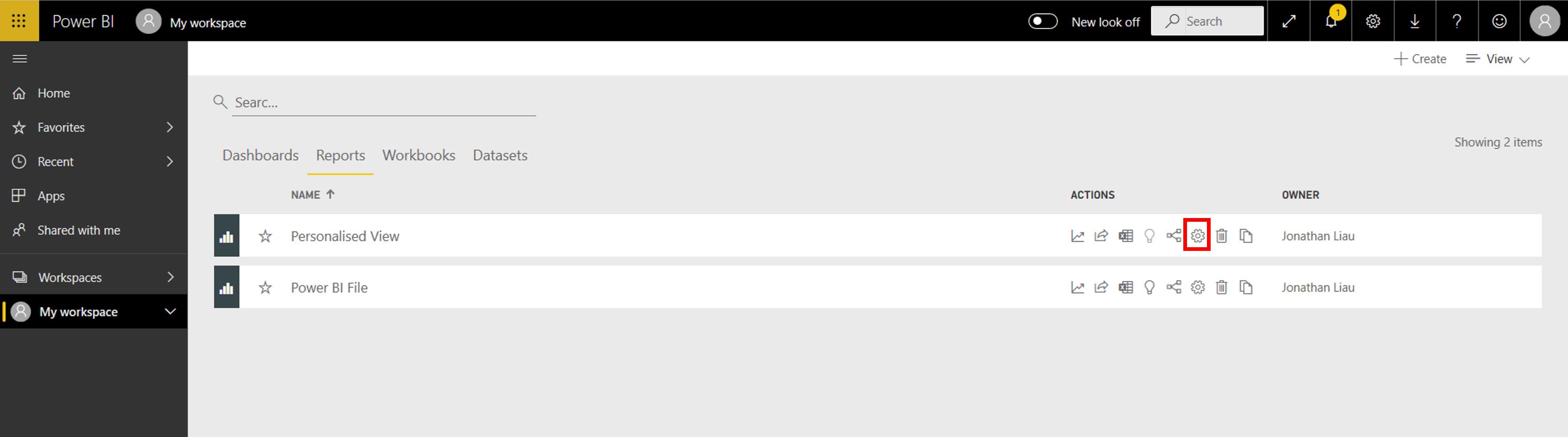
You will find your report in the Reports section. If you click on the settings icon,
this will bring up a ‘Settings for Personalised View’ side panel where you can enable or disable several different options, one of those options being ‘Personalize visuals (preview)’:
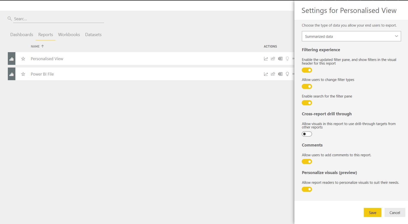
Enable this option and click on Save. If you view the report now, you will notice a new icon that appears when you mouse over the visualisation:
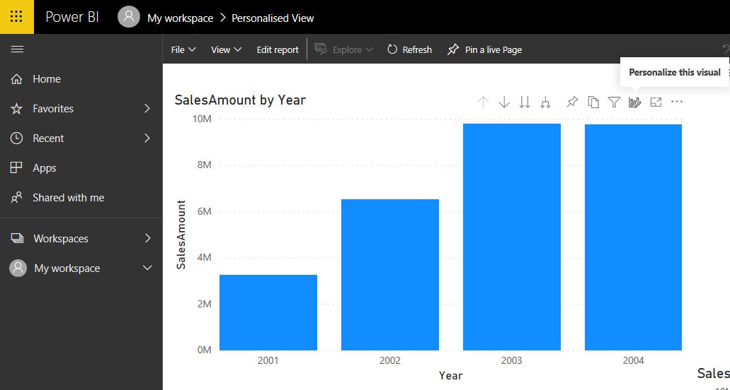
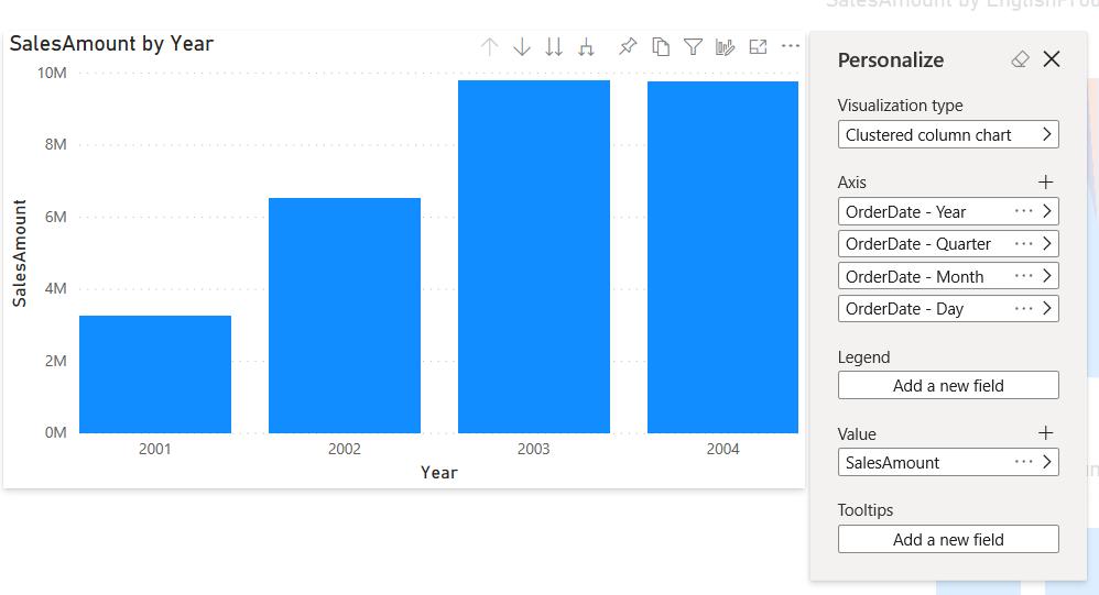
Clicking on this option will bring up the Personalize pop-up menu, allowing the user to change various aspects of the visualisation.
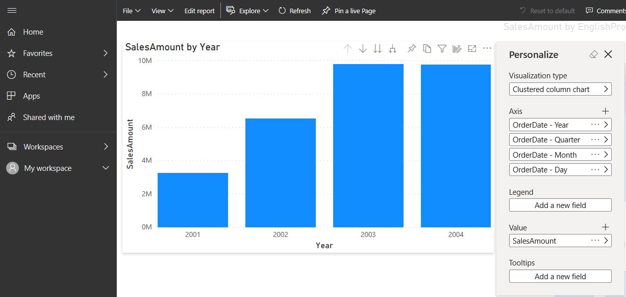
There is a lot to cover, but we will go over some simple examples to show you what can now be done in Personalized View.
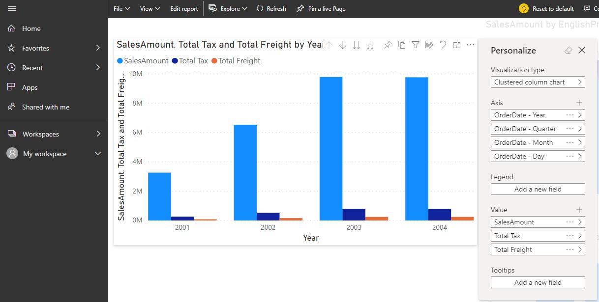
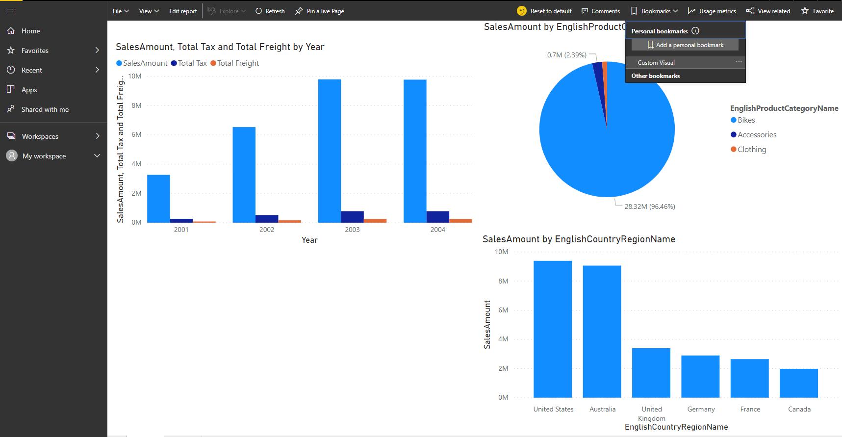
For example, the user may change the visualisation, and even change the measures or fields, displayed in the visualisation:
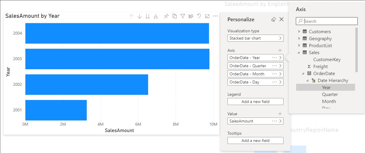
You will have access to all of the different fields and measures in the report. You can also new fields into the Values area that weren’t originally included:
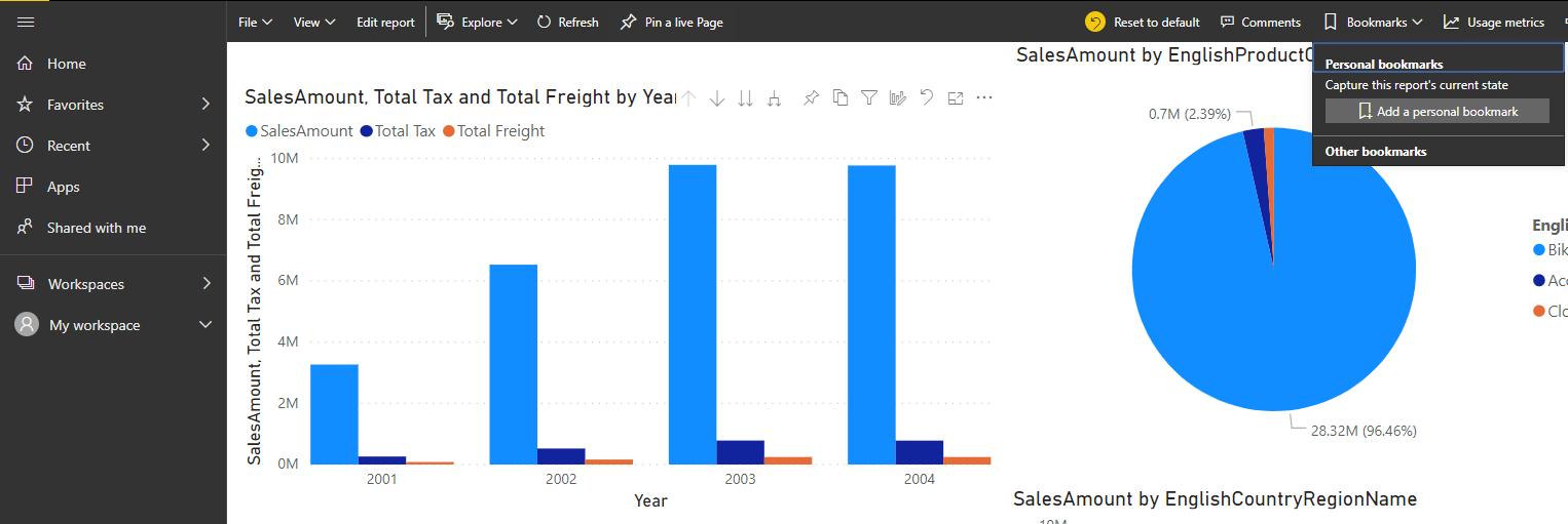
To save this view, you can go to Bookmarks at the top of the window to add a ‘personal bookmark’:
You can then toggle between the default view (by clicking on the ‘Reset to default’ button) and the bookmarked view (by selecting the bookmark):
That’s it for this week!
Come back next week for more on Power BI.