
Power BI Blog: Custom Visuals – Summary Table
21 March 2019
Welcome back to the Power BI blog series. This week, we’re going to look at tables that you can customised to your needs, where you can arrange rows, add custom formulas, for example Profit and Loss statement (P&L) that we’ll particularly create in this post.
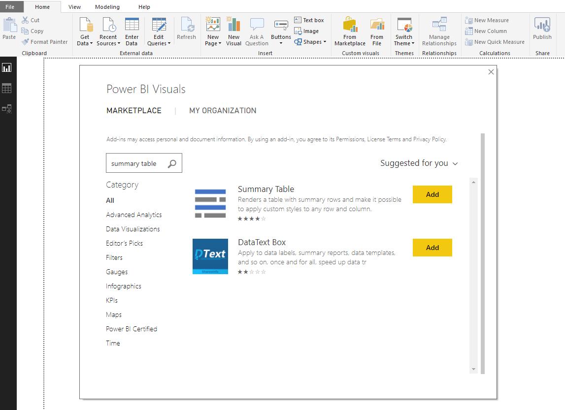
First, we need to add the Summary Table visual to Power BI canvas. Again, we can do this by going to “From Market Place” on Home tab, search “Summary Table”:
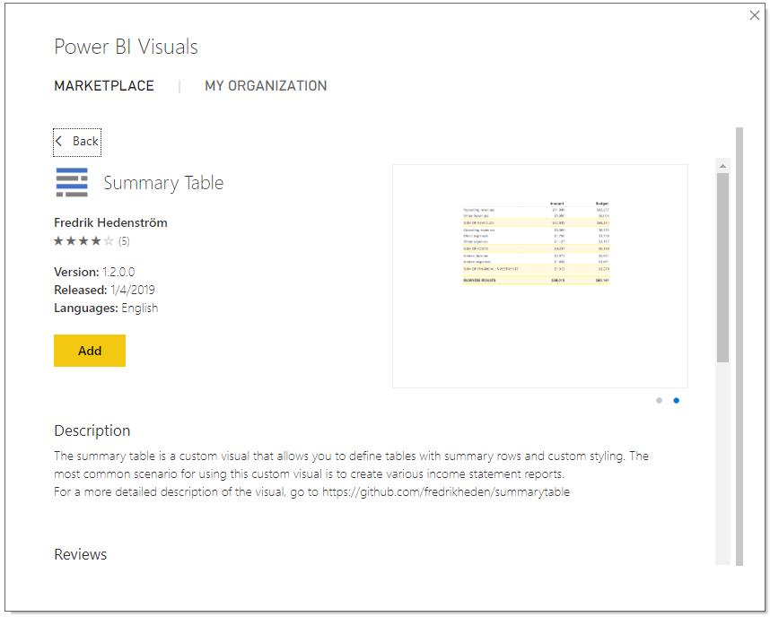
We can review our option; this Summary Table custom visual is created by Fredrik Hedenstrom. Then we click “Add”.
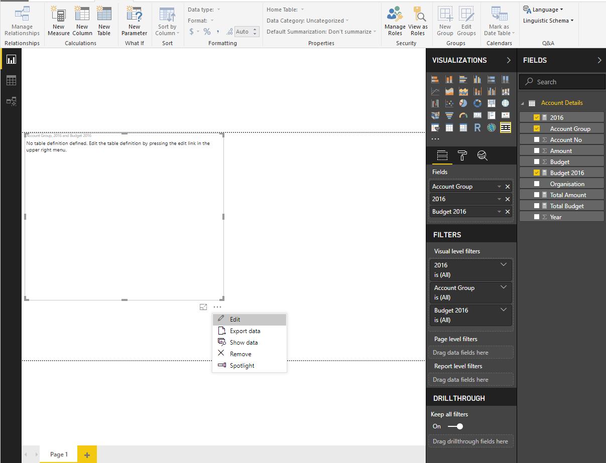
Next, in PowerBI window, we choose “Summary Table” and add our measures to the field list. The visual will not be displayed immediately, however, we have to click Edit in the visual’s menu (the three dots) to enter the JSON editor (aka JavaScript Object Notation) where we can modify our columns, rows and formats to suit our needs.
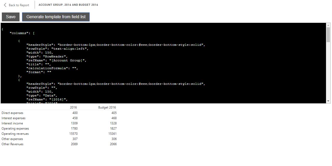
Click “Generate template from field list” button to get started, this will give us a template based on all fields and rows in our dataset.
One tip to note here is that, after editing the JSON, we should click SAVE. Afterwards, we should not click “Generate template from field list” as this will alter all of our adjusted code and refresh to its original one.
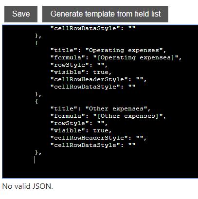
The visual sometimes may not display all the rows or columns from our data, but this can be simply fixed following the JSON. We can also arrange our rows or columns just by copying the JSON paragraphs to our desired order.
The JSON paragraph starts with { and end with “},” unless it is not the final paragraph of the rows or columns sections. Each paragraph contains “key:” and “value”, where we can put our values, formulae or formats accordingly.
If “No valid JSON” is shown, we should check our JSON syntax, mind the comma(,), or whether we have all the “keys:”. (It is not necessarily that rowStyle, cellRowHeaderStyle, cellRowDataStyle must be followed by a value, in other words, they can be put blank.)
After all the initial set up, we now can enter the interesting format phase.
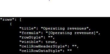
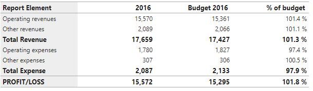
Let’s get started with rows. We can add rows that we need, for example, we’ve added Total Revenue, Total Expense and Profit/Loss rows to our table. We also formatted the rows style to bold.
{
"title": "Total Revenue",
"formula": "[Operating revenues]+[Other Revenues]",
"rowStyle": "font-weight:bold;font-size:small;",
"visible": true,
"cellRowHeaderStyle": "",
"cellRowDataStyle": ""
}
In case of Profit/Loss:
{
"title": "PROFIT/LOSS",
"formula": "[Operating revenues]+[Other Revenues]-[Operating expenses]-[Other expenses]",
"rowStyle": "font-weight:bold;font-size:small;",
"visible": true,
"cellRowHeaderStyle": "border-top:1px;border-top-color:#aaa;border-top-style:solid;border-bottom:1px;border-bottom-color:#aaa;border-bottom-style:solid;",
"cellRowDataStyle": "border-top:1px;border-top-color:#aaa;border-top-style:solid;border-bottom:1px;border-bottom-color:#aaa;border-bottom-style:solid;"
}
We’ve added some further formatting to this final row, particularly add details to the cellRowHeaderStyle and cellRowDataStyle.
It’s also worth noting that, in the formula key, we have to list all the field: "[Operating revenues]+[Other Revenues]-[Operating expenses]-[Other expenses]”, rather than just “[Total Revenue] – [Total Expense]”. This is because Summary Table has restriction on other rows reference, and it only allows plus(+) and minus(-). So if your formulae consist of a lot of values, make sure to check it carefully.
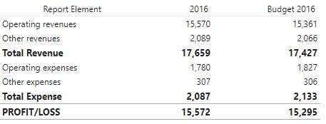
This is the table after rows editing:
Now let’s continue with columns.
I’ve adjusted the header column by adding styles to headerStyle. It is similar to rows editing, moreover, here we can change the column width (in pixel units). We can also highlight the column by adding background-color:
{
"headerStyle": "border-top:1px;border-top-color:#aaa;border-top-style:solid;border-bottom:1px;border-bottom-color:#aaa;border-bottom-style:solid;text-align:left;background-color:#eee",
"rowStyle": "text-align:left;background-color:#eee",
"width": 150,
"type": "RowHeader",
"refName": "[Account Group]",
"title": "Report Element",
"calculationFormula": "",
"format": ""
}
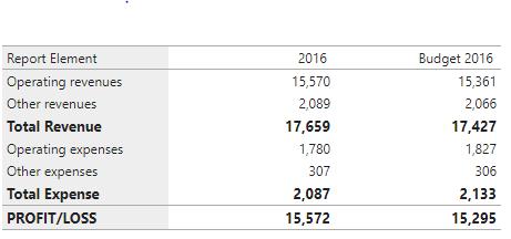
This is how it looks like:
Especially, if we want to add simple calculation column, for instance, percentage column to compare the actual vs the budget, we can add another JSON paragraph to the column section (Actually, you can also create separated measure and add it to the fields.)
{
"headerStyle": "border-top:1px;border-top-color:#aaa;border-top-style:solid;border-bottom:1px;border-bottom-color:#aaa;border-bottom-style:solid;",
"rowStyle": "",
"width": 150,
"type": "Calculation",
"refName": "",
"title": "% of budget",
"calculationFormula": "[2016]/[Budget 2016]",
"format": "0.0 %;-0.0 %"
}
We can format the number just like we normally do in MS Excel. Don’t forget to format headerStyle every time we add new column so that it matches beautifully in the table.
The top row (header row) still needs formatting. This can be done in the last part of the code when you scroll down to the end – headerRow:
"headerRow": {
"rowStyle": "font-weight:bold;font-size:small"
We’ve put the font-weight and size, so now the table becomes:
Hopefully this gives you some idea when you are searching for freedom to add, arrange and edit rows and columns to suit specific report formats.