
Power BI Blog: Custom Visuals – Infographic Designer
28 March 2019
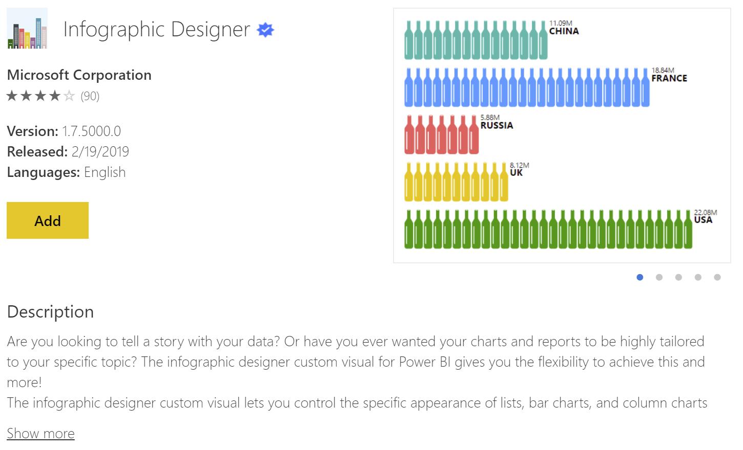
Welcome back to the Power BI blog series! This week we are going to take a look at the Infographic Designer, typically one of the featured custom visuals on the marketplace.
The Infographic Designer is a tool that basically allows you to change your columns and bars in your typical charts to be represented by graphics that can be stretched or repeated to fill the height or length of your values.
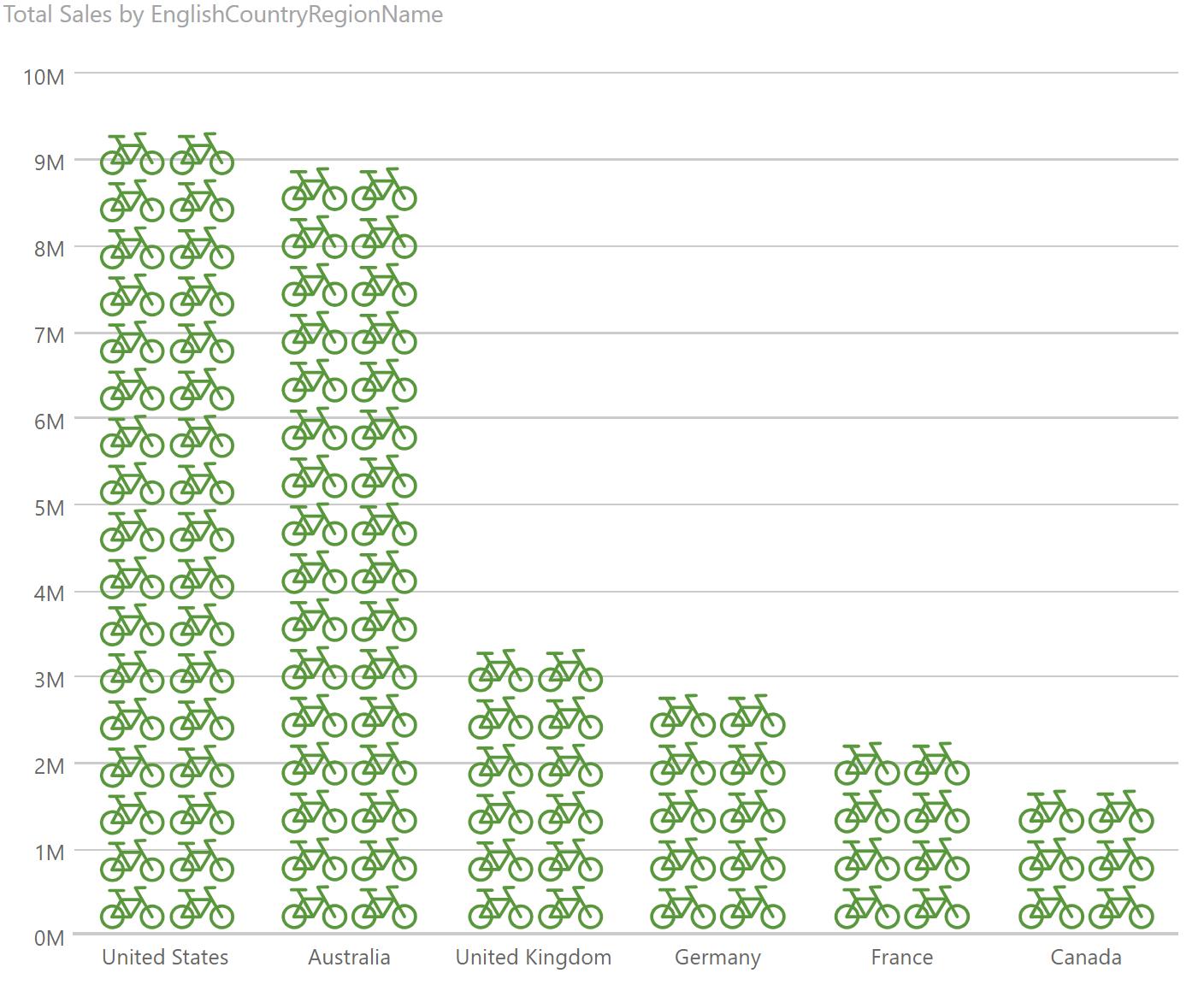
With our dataset being a bike store, it makes sense that we might want to try replacing the standard columns with bikes instead. That will take us from this:
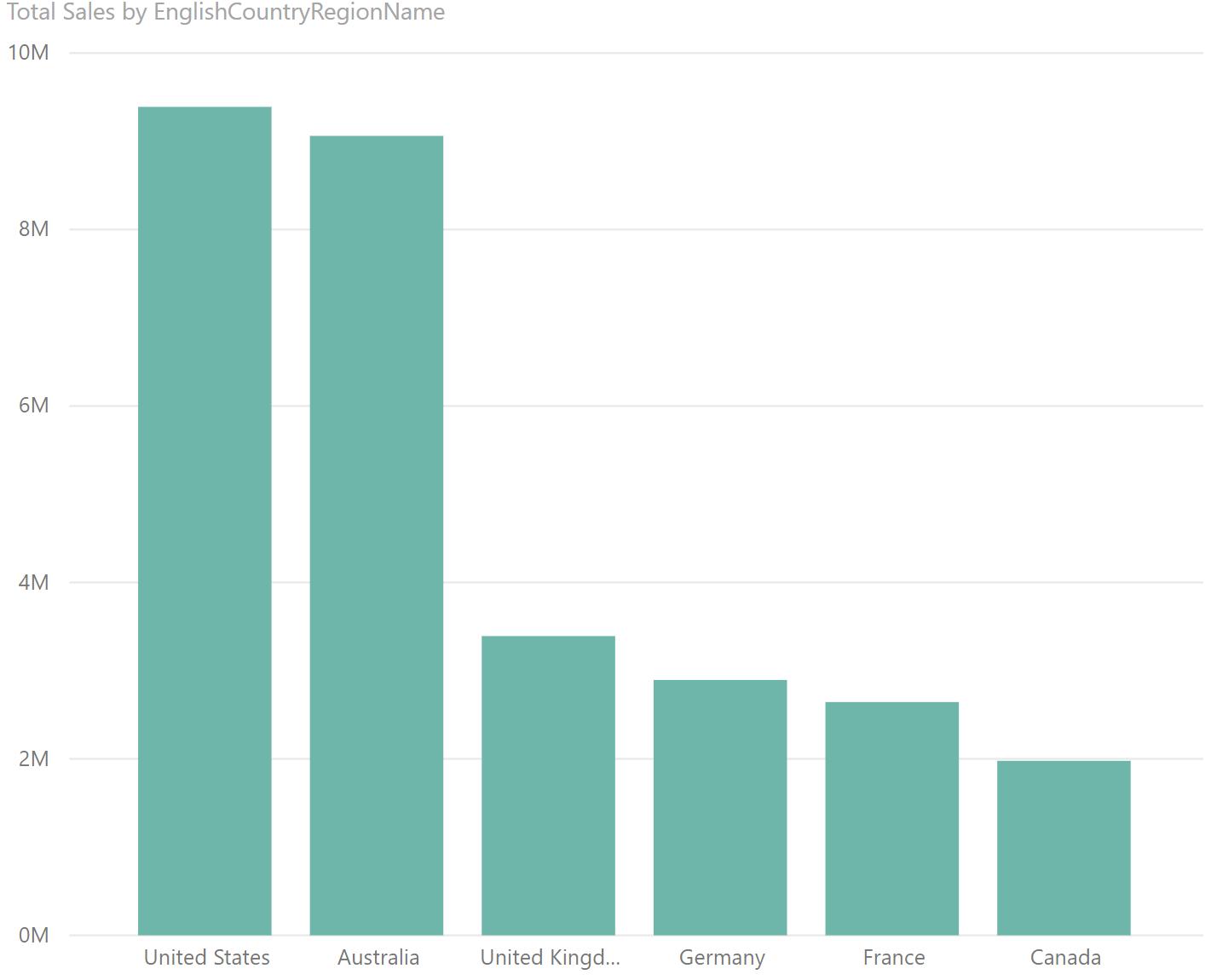
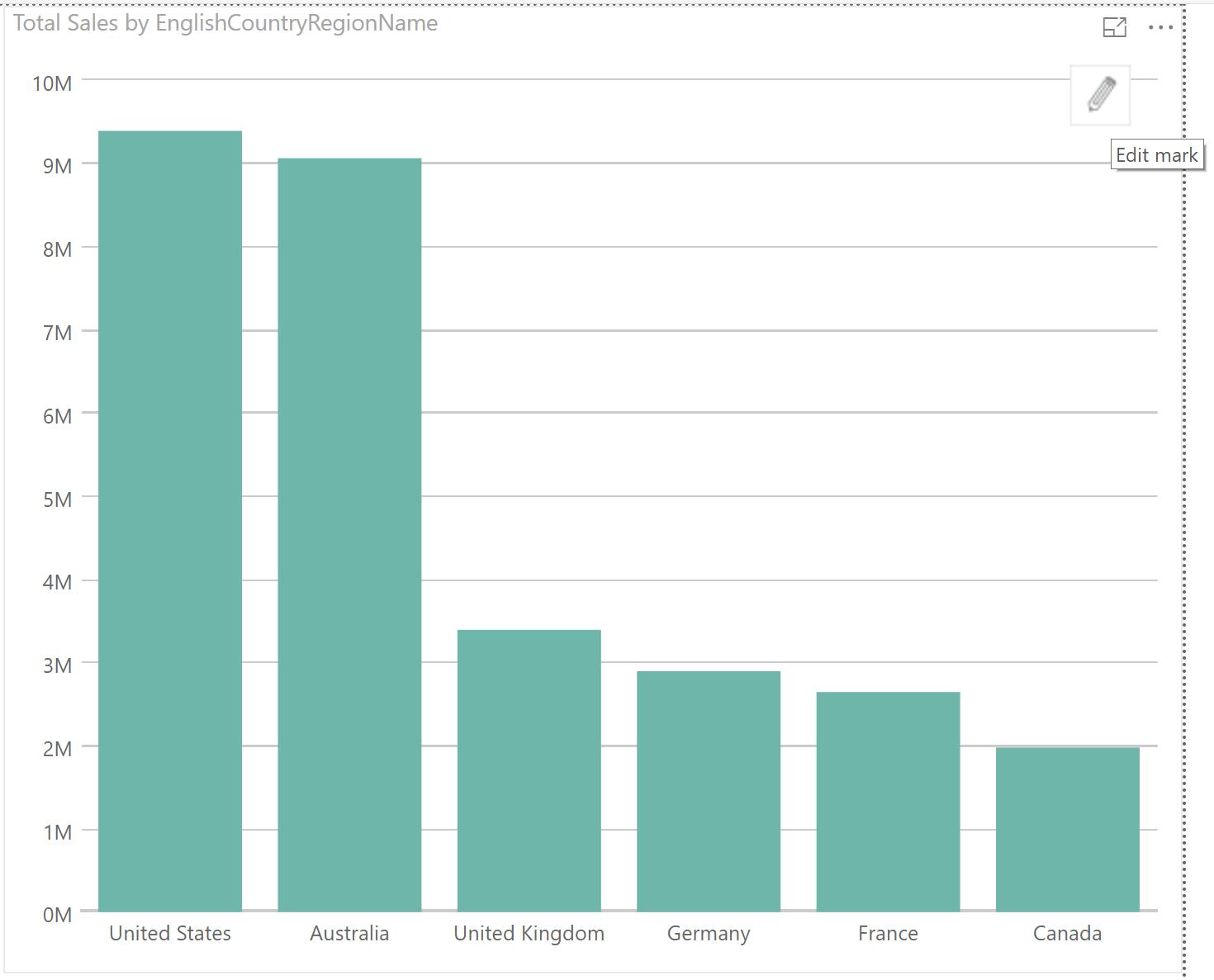
… to something more interesting. Once you add the Infographic Designer to the PBIX file, you can create the visualisation, and once you add in the basic values, it will look like any other column chart, by default:
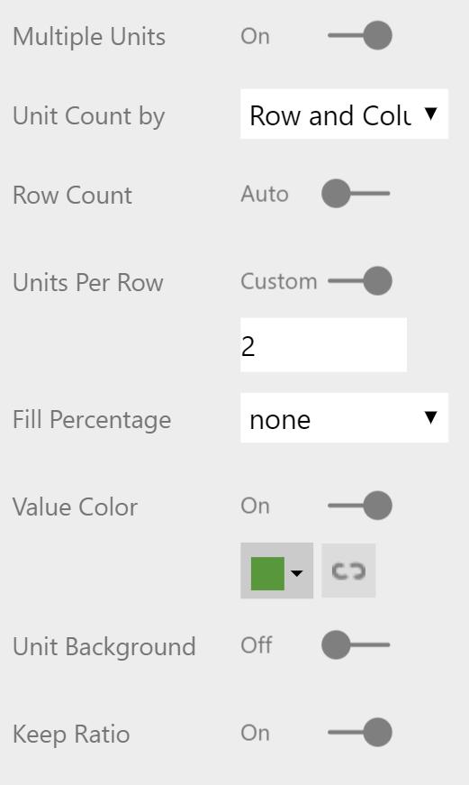
However, there is an Edit button in the top right-hand side. Click on that, and this will bring up a menu that allows you to stack and change the shapes.
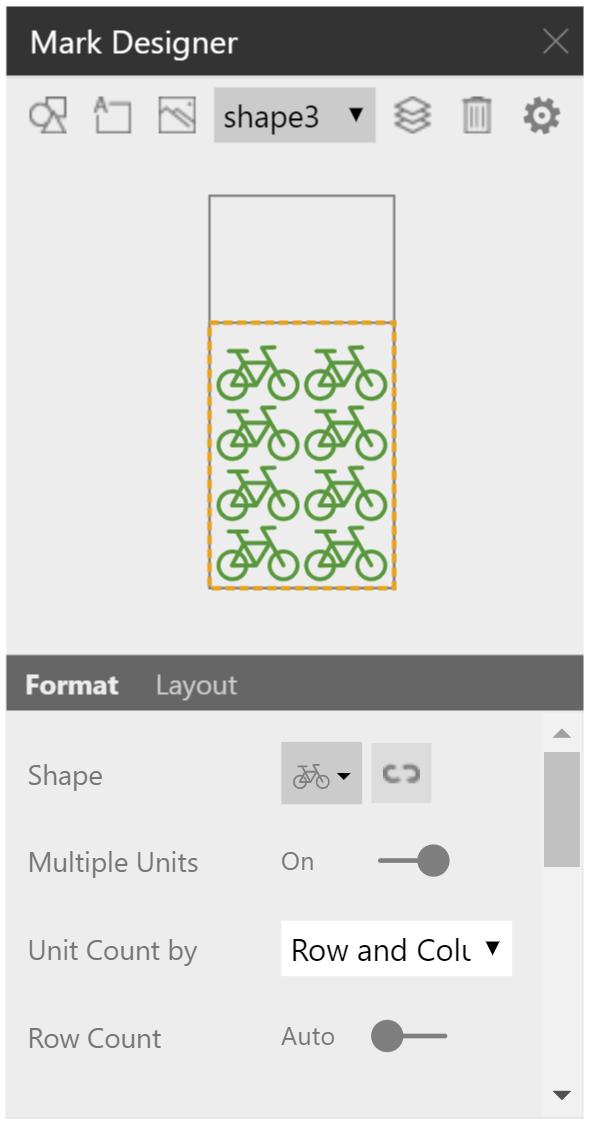
You can add, change and remove shapes by using the buttons on the top row, and you can see a sample in the middle of the pop-out box. The bottom section allows you to change the settings for each shape layer that you play with. To get our visualisation, we’re using the following settings:
… and this gives us the resulting chart:
You can also import your own photos and images to your own spin to the chart. (Haha, spin, bikes? Never mind…)
Check back next week for the next blog in our Power BI series!