
Power BI Blog: Custom Visuals – Box and Whisker Chart
7 March 2019
Welcome back to the Power BI blog series! This month, we’re going to take a look at a number of different custom visuals that are available from the Power BI marketplace.
In addition to the standard built-in visualisations in the top right-hand side of the user interface, you can also download custom visualisations for specific charts that aren’t otherwise easily created. To access these, you can find the Custom visuals group in the Home Tab, and click on “From Marketplace”. If you are not signed into Power BI yet, this will prompt you to do so. You need to have an active Power BI account (can be a free account).
Logging in should get you the following page:
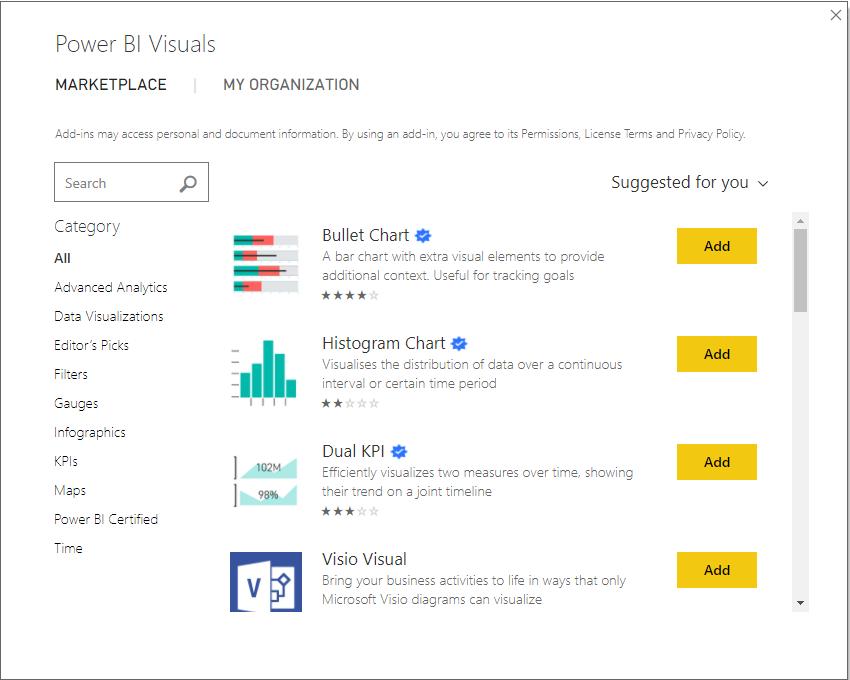
Here, you can search for specific visuals that you are trying to find, or browse through the popular choices to get inspiration for your reports. For example, a common request we get when building dashboards is to develop a box and whisker chart – something not native to Excel, and relatively difficult to build as it requires the calculation of each of the underlying median / mean / quartile metrics before it can be incorporated into a chart.
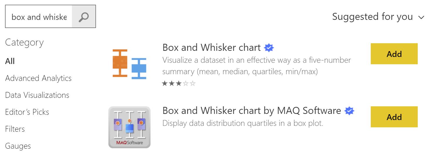
However, the reporting system in Power BI is actually very well suited to summarise large datasets, and the box and whisker chart is in high enough demand that there are a couple of different custom visuals that are ready to go in the marketplace.
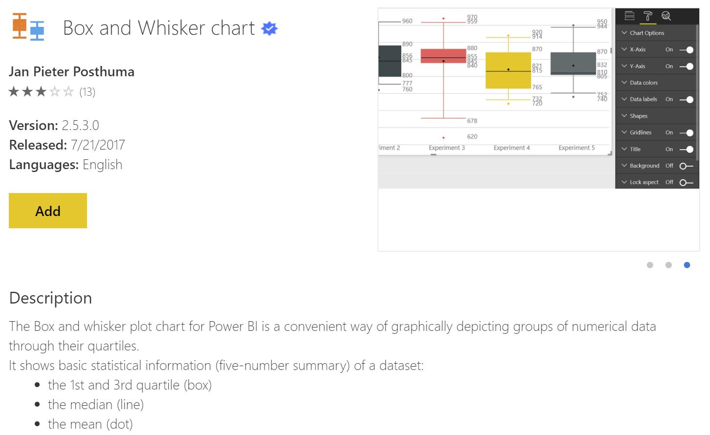
Let’s take the first of those two options. Click on it to see a description and screenshots of what the chart will look like. Once you are ready, click Add to add it to the Power BI workbook.
When you download custom visuals, it’s important to note that they are created and saved in the PBIX file, not in your application. Firstly, it means that if you send the PBIX file to someone else, they will still be able to view the reports that you have created, even though they may not have seen or downloaded the custom visualisation before. The consequence of this is that if you want to use a chart repeatedly in multiple different PBIX files, you will need to add them manually to each one.
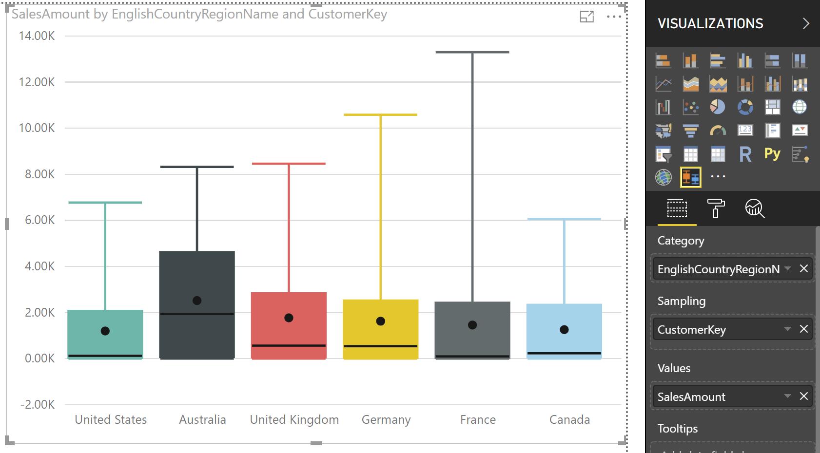
When they are downloaded, you can see that they appear in the Visualizations pane on the top right hand side of your report window. In this instance, we can use the box and whisker chart to analyse the distributions of historical purchases by customer. This shows us that Australian customers make, on average, larger purchases than customers in other countries, with the mean (the dot), median (black bar part way through the box) and upper quartile (top side of the box) sitting significantly higher. However, the customer with the greatest value of purchases comes from France, as evidenced by the tallest “whisker” in the chart.
We’re going to spend the rest of this month exploring other useful custom visuals and showing how they can make your reports more interesting than simply using the default visuals built into Power BI. See you next week for the next blog in our series!