
Power BI Blog: Pie and Donut Chart Rotation
16 December 2021
Welcome back to this week’s edition of the Power BI blog series. This week, we look at rotating Pie and Donut charts.
Currently, Pie and Donut chart slices are drawn in clockwise order, beginning at the 12 o’clock position, which often results in the final slices being drawn near that first large value, approaching it clockwise from the opposite side. Those final slices are often smaller values, and thus smaller slices.
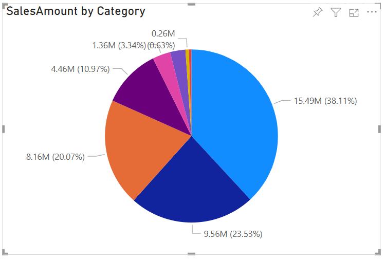
While this creates an intuitive Pie chart, it leaves less room for data labels describing the smaller slices, as text runs horizontally but the slices are vertical. To assist, Power BI has introduced a new rotation option in the Formatting pane to provide greater control over where you start drawing the Pie. You may find that in the Shapes card in the old Formatting pane as ‘start angle’ and in its own Rotation card in the new Formatting pane.

Check back next week for more Power BI tips and tricks!