
Power BI Blog: Draw a Line
15 July 2021
Welcome back to this week’s edition of the Power BI blog series. This week, we will look at how to create a line in a matrix visualisation.
This has been one of our more popular queries regarding Power BI – unbelievably!
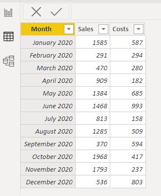
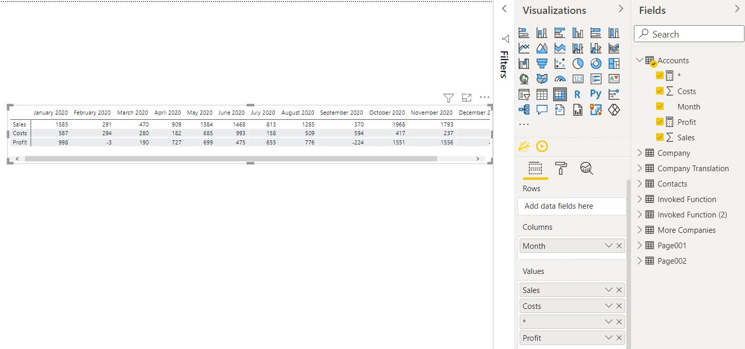
I have a simple table of accounting data, and I want to create a Matrix visualisation:
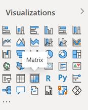
I can choose to create a Matrix in the Visualisations pane:
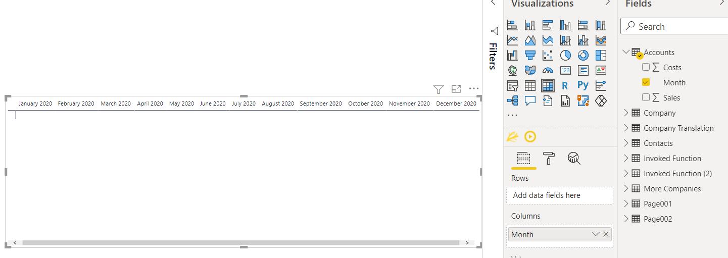
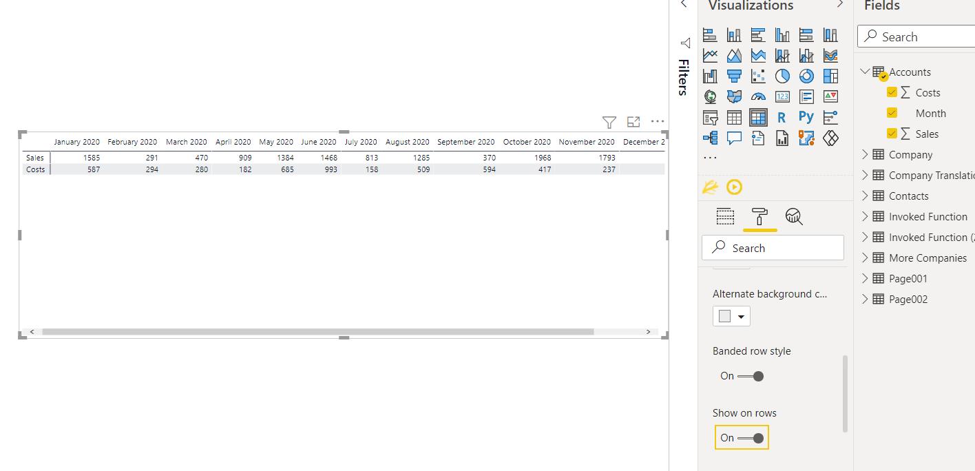
I drag the Months field into the Columns area.
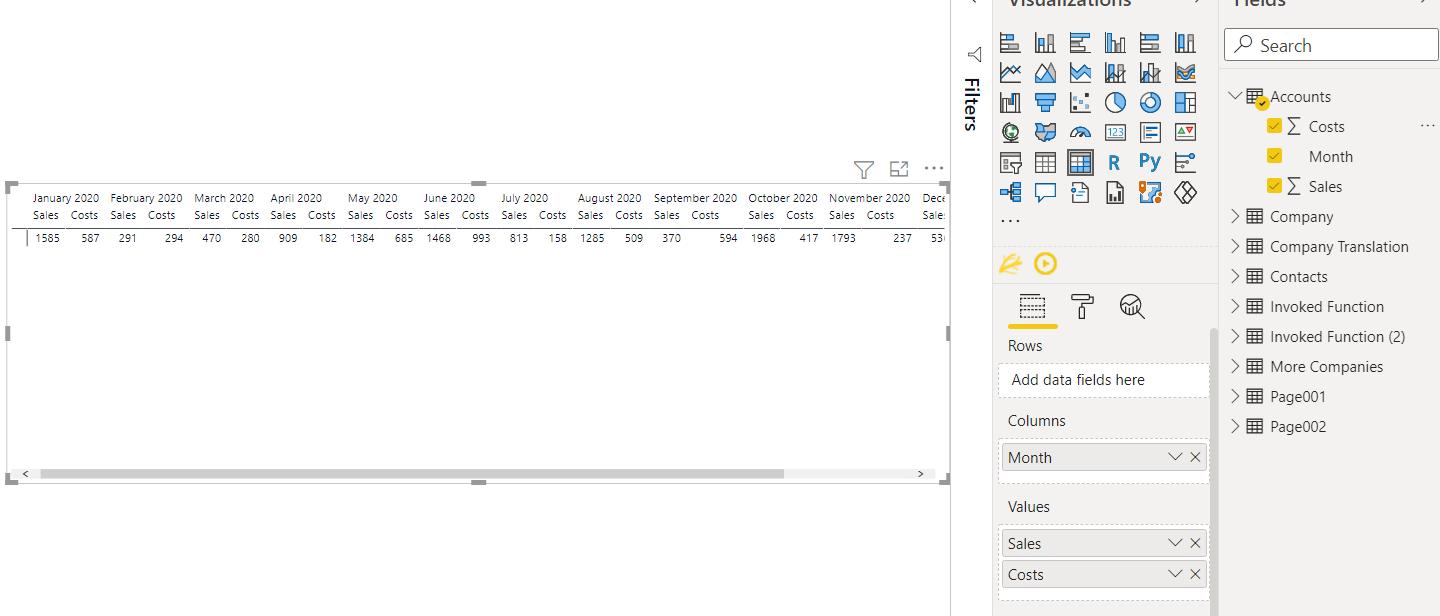
I then drag the Sales and Costs into the Values area.
I toggle on the ‘Show on rows’ option in the Formatting tab in the Visualizations (values) section.
I am going to create a simple measure to calculate profit:
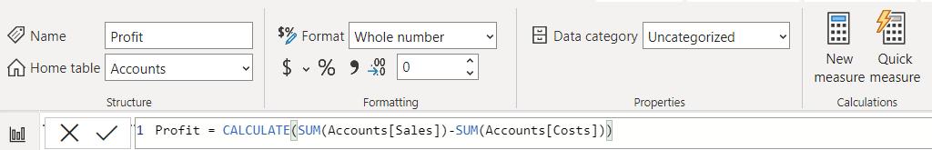
Profit = CALCULATE(SUM(Accounts[Sales]) – SUM(Accounts[Costs])
This is a simple calculation to get Profit, which I can add to the Values area.
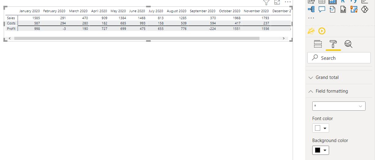
I’d like to make it clear that Profit has been calculated from Sales and Costs. Therefore, I’d like to put a line before Profit. To do this, I can create a new measure:
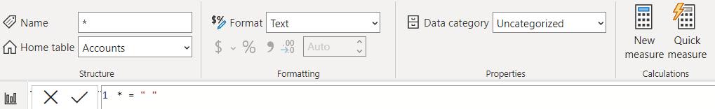
* = “ “
The name of the measure (which I will refer to as the asterisk measure) is an asterisk, and the value is a space. The reasons for this will become clearer when I plot this measure on the Matrix.
The name of the asterisk measure doesn’t appear as it’s a special character. Next, I need to format the measure so that it appears as a line. On the Formatting tab, there is a section for ‘Field formatting’, and I can choose my asterisk measure.
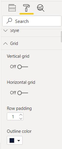
Changing the background colour to black has made my asterisk measure appear as a black line. The thickness of this line is linked to the padding on the Grid section of the Formatting tab. I have this set to 1:
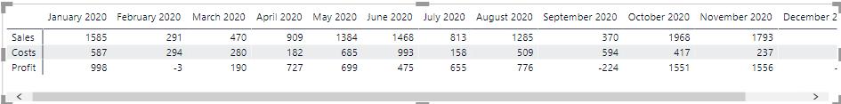
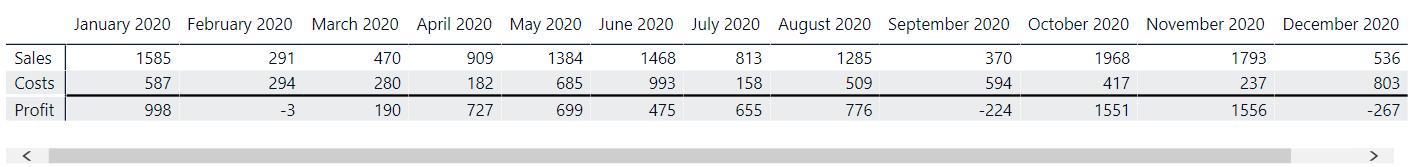
It’s now clear that Profit has been calculated from Sales and Costs.
Next time, I’ll look at how to leave a blank line in a Matrix when I have multiple calculations.
Check back next week for more Power BI tips and tricks!