
Power BI Blog: Hierarchical Axis (by default)
20 October 2022
Welcome back to this week’s edition of the Power BI blog series. This week, we look at the so-called Hierarchical Axis.
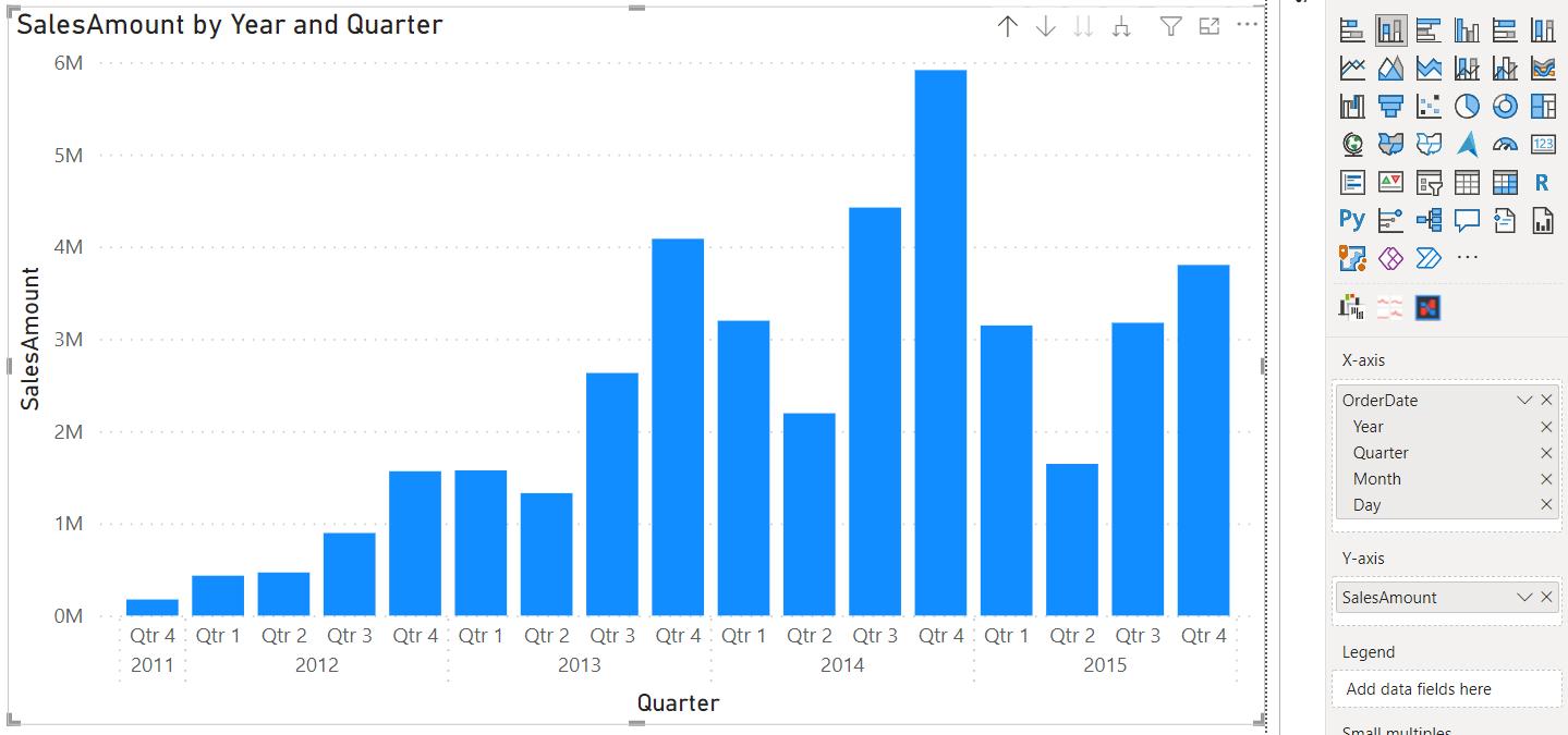
One of Power BI’s Cartesian charts’ more useful capabilities is the option to visualise multiple categorical fields in an hierarchical x-axis.
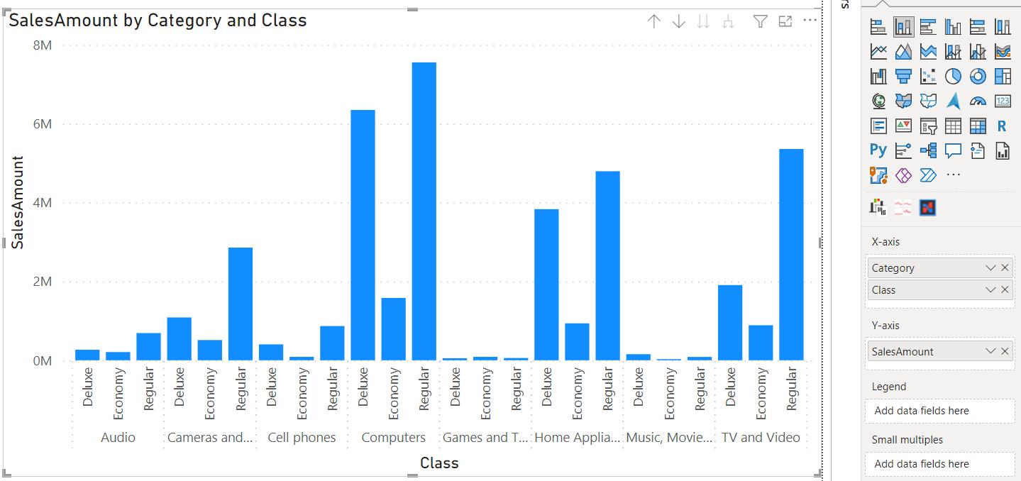
The grouped x-axis is an organised way to add an additional dimension to the data in your charts, especially when dealing with subcategories that are specific to individual category fields or sequential subcategories such as more granular dates.
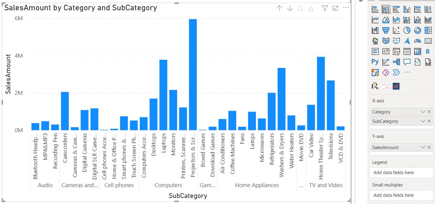
A different form of visualising these additional dimensions, like using a legend or small multiples, would not be nearly as clear as the hierarchical x-axis. However, before this release, formatting a chart to use the hierarchical x-axis was a multi-step process involving:
- adding a new field to the X-axis field well and knowing to expand the visual down to the next level, or else nothing would change
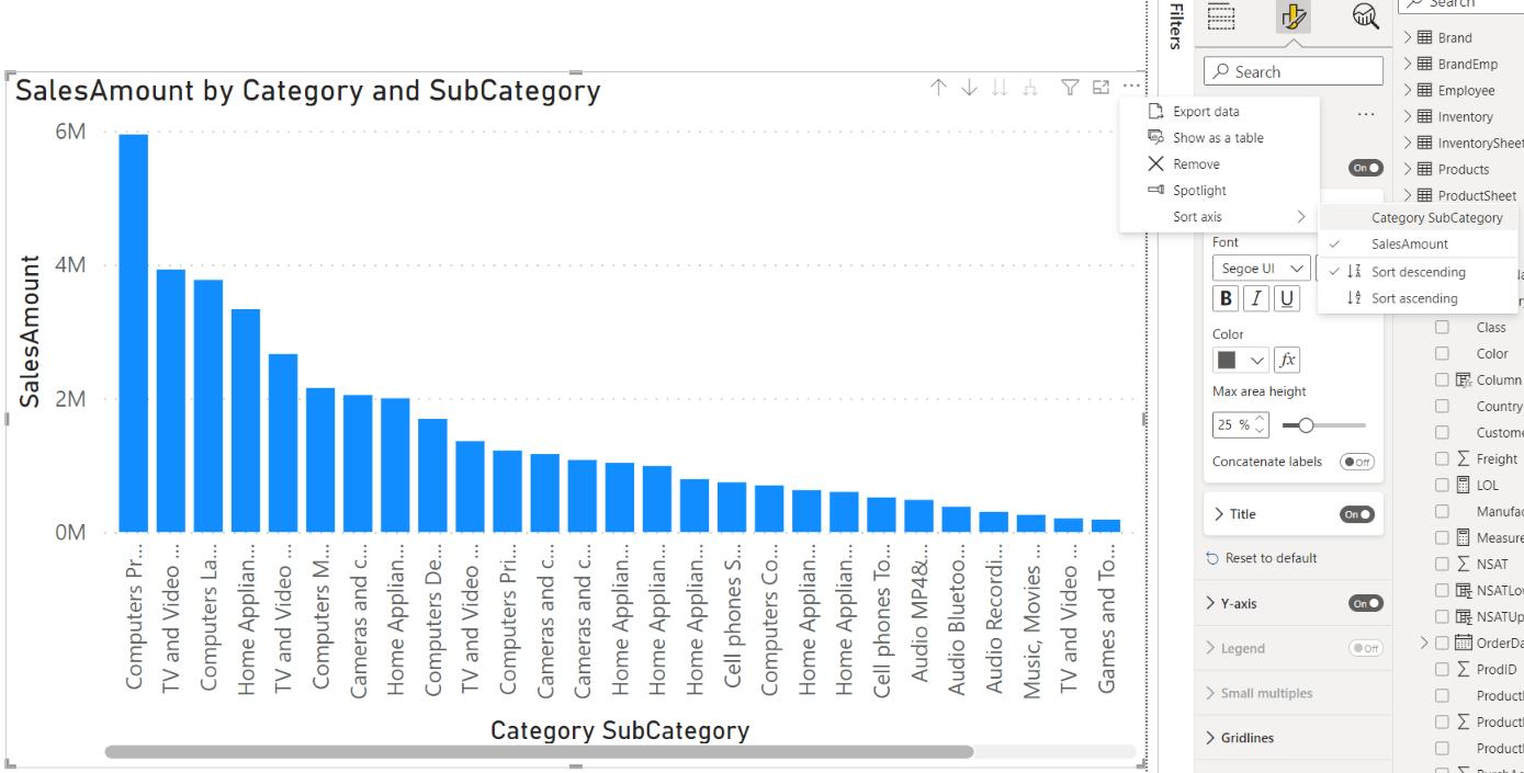
- turning off the concatenate labels option in the Formatting pane, which would often still result in nothing happening because the user also had to sort the visual by the axis fields rather than by value fields, otherwise categories and subcategories would not be grouped properly.
This latest update (September 2022) adjusts the behaviour to ensure that the hierarchy axis is automatically turned on when a user drags multiple fields into the x-axis field well of charts which support the feature. Also, Microsoft has turned the concatenate labels option off by default in the Formatting pane. Power BI will now auto-expand charts down to the bottom of the hierarchy when you add fields to the x-axis field well and will also sort on category by default once you drill down.
The exact changes in logic are as follows:
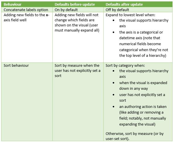
This only changes how Power BI responds to authoring actions, so existing reports should not be affected, and you should be able to recreate any previous sort or expand state after this release as well.
It is understood that adding new conditions to default behaviour will create some inconsistencies in what happens when you perform an action. That said, Microsoft hopes that they will feel intuitive as you create new charts and that they will save you clicks, Formatting pane navigation and internet troubleshooting.
Check back next week for more Power BI tips and tricks!