
Power BI - Here to stay
14 June 2016
Tim Heng
Business intelligence at your fingertips
There’s a certain irony about having something “at your fingertips”. While the corporate jargon implies that it’s always accessible and easy to use, let’s be honest, how much control do you really have on something with just your fingertips?
So with that said, let’s get it out of the way – Power BI is business intelligence at your fingertips; at least, those fingertips that are gently balanced on your computer mouse. Those fingertips that click and drag and point at things on a screen. Or the ones that tap on your phone or tablet touch screen. If a seven-year old can use it to build a reporting dashboard, I’m pretty sure that we can justifiably say that it’s easy to access and easy to use.
What is Power BI?
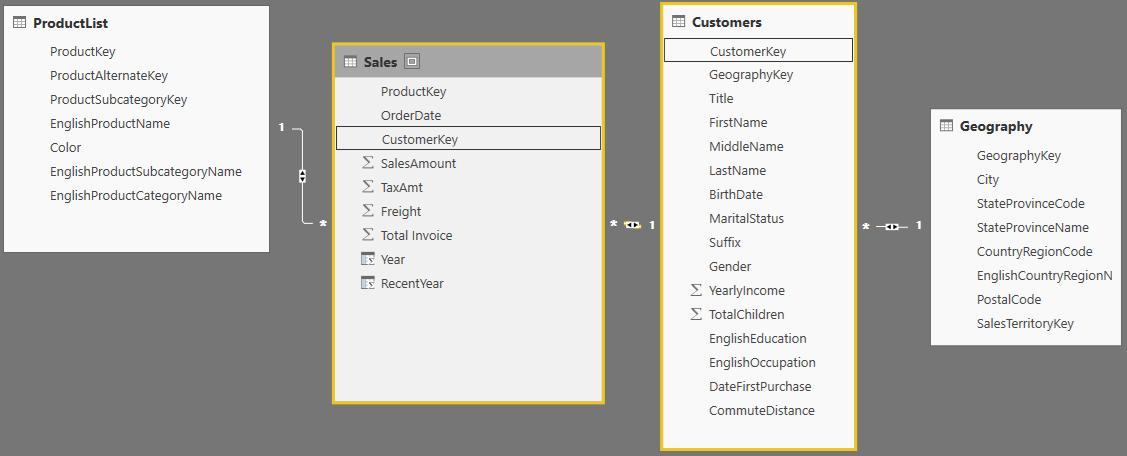
BI stands for Business Intelligence and Power BI is a business intelligence tool designed to do quickly take data from a range of sources, rearrange and transform the data if necessary, generate reports and distribute them to stakeholders. Historically, the challenge to do this effectively has been in overcoming the wide range of sources, data transformation tools and reporting capabilities that businesses have had at their disposal.
Month-end reporting
Consider a traditional business reporting framework: business data is stored across several SQL databases. These are either worked on by IT teams to create a single output to be exported into Excel or several files are exported and combined in Excel instead. There may even be an interim Access database to perform transformation and linking in between.
Once in Excel, an analyst will run calculations over the data, arrange it into tables and export these back into Hyperion or some other cube software, which may have a bespoke or other third-party add-on interface that allows management to look at the underlying report numbers.
Alternatively, charts are created in Excel that are then saved as PDFs, which are either emailed to management, or printed and put into a reporting pack, completing the gruelling two-week reporting process. Finally, this reporting process is repeated two weeks later, at the start of the next month.
KISS 2: keeping it streamlined, smart
The challenge to streamline reporting processes is generally focused around removing the human interaction around reporting. By minimising what people have to do, you’re improving not only the speed and timeliness of producing the reports, but you’re also reducing the risk of errors. Generally speaking, the human parts of the reporting process have always been around getting data from A to B (moving data between systems) and processing dynamic and changing datasets using static spreadsheets that need to be updated and adjusted each month as new data comes in.
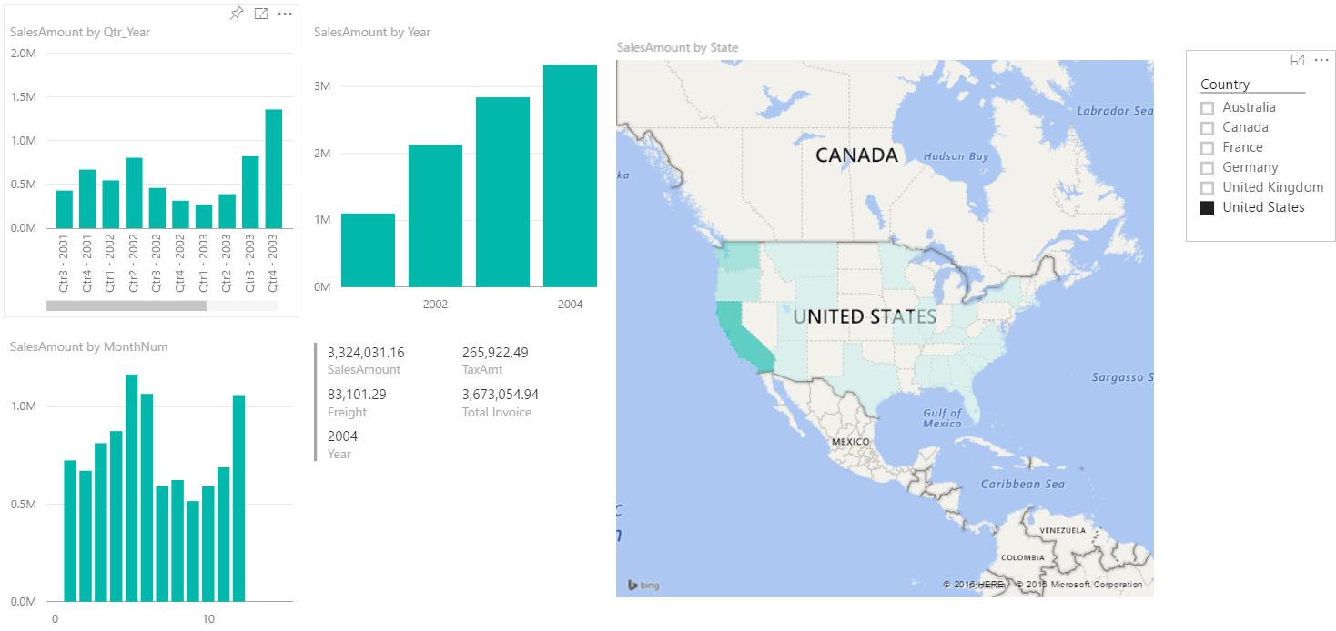
Now, how does Power BI help this process? Well, firstly, it doesn’t need the specialised IT skills that database work usually requires to extract and / or combine the data you need. Secondly, by establishing a direct connection that can be scheduled to refresh, we limit the need to ‘export to Excel’ that slows down the process. Finally, by having calculations and reports that automatically scale to size and don’t require people-interaction to create or distribute, this drastically reduces the time from data being available to information being consumed by stakeholders. In fact, due to the real-time information flow, there is nothing stopping businesses from developing on-demand dashboards, rather than historical monthly dashboards.
Cloud analytics
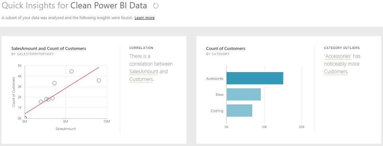
The bonus to all of this is the ability to load your data up to PowerBI.com and let Microsoft’s servers at it. There are two game-changing tools Power BI has at its disposal: the first is Quick Insights and the second is Q&A.
Quick Insights is an easy way to scan your data for insights and automatically displays charts and dashboard outputs. It can search for major factors, category outliers, time series outliers, determine trends and seasonality, and generally detect correlations between fields in your dataset. Once these have been generated, it is a point-and-click matter to upload these to a dashboard for ongoing monitoring and reference
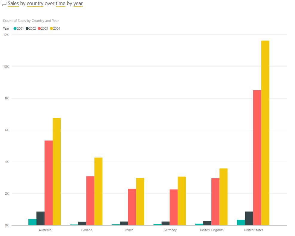
The other tool that people are raving about is Q&A, Power BI’s feature to take in plain-language questions and respond with charts and datasets that answer the questions for you. Here, the power goes as far as your data and your imagination can take you. Let’s start simple with our sample dataset – let’s see what sales are, by country, over time (sorted by year):
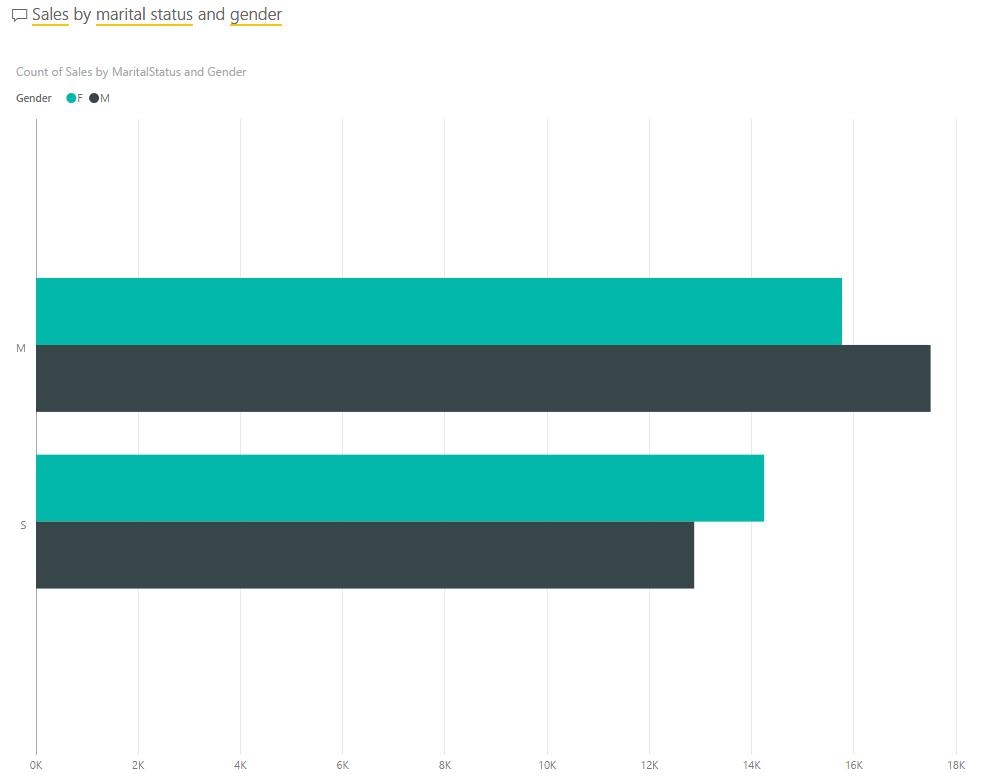
Do you have some customer data on your hands? Let’s take a look at total sales by gender and marital status:
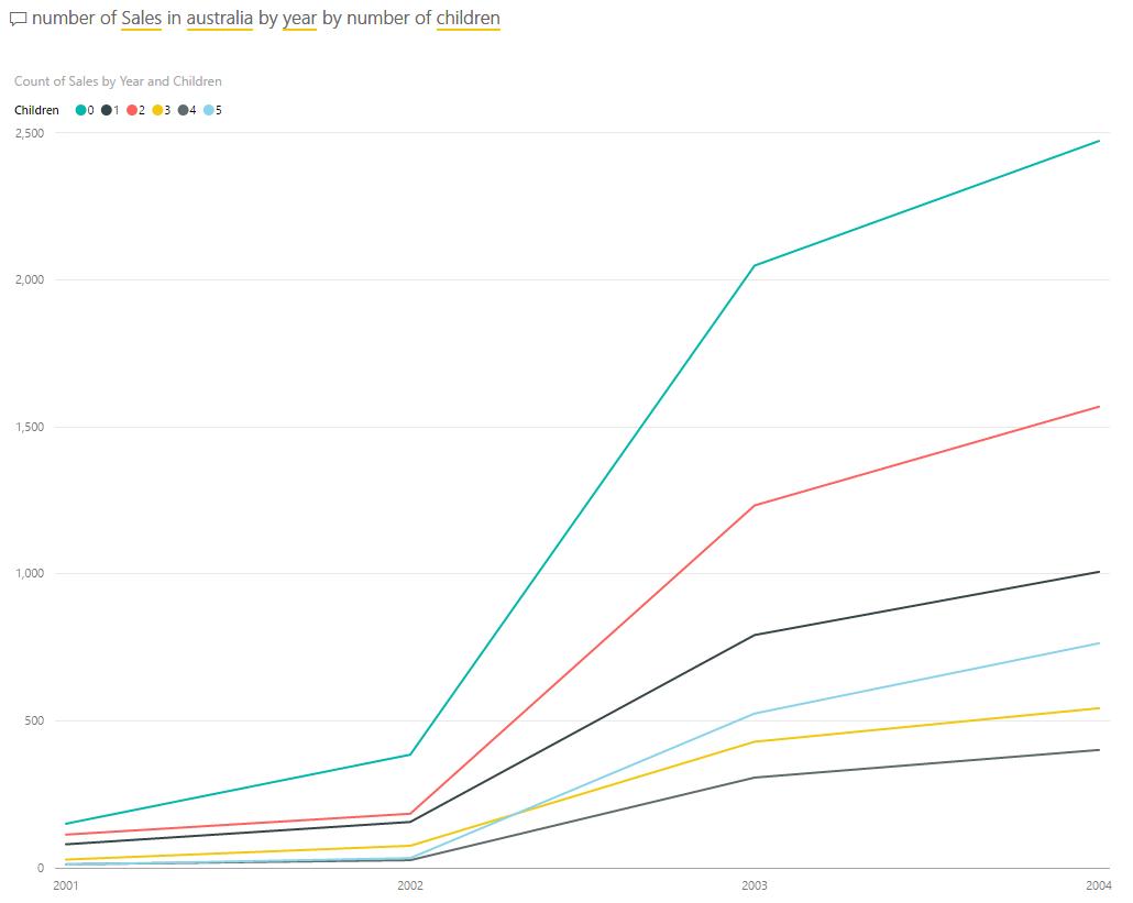
How about the number of sales in Australia, broken down by the number of children in the household?
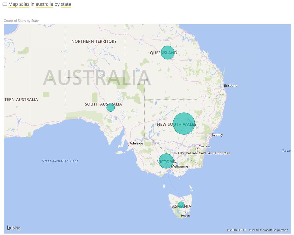
Staying on the Australian front, what if we want to map sales in Australia by state?
There are businesses out there that are now using Power BI to generate all of their reporting and dashboard solutions. Rather than exporting the data to Excel and needing to present the data nicely in tables and rows, simply asking nicely will get the answers that you want. Seems our parents were right all along!
I’ll be heading down to Melbourne next week to showcase how to use and benefit from Power BI with a few of our contacts and clients. If you’re interested in seeing how this might work for your business, drop us a line and let’s catch up!