
Monday Morning Mulling: January 2018
29 January 2018
On the final Friday of each month, set an Excel for you to puzzle over for the weekend. On the Monday, we publish a solution. If you think there is an alternative answer, feel free to email us. We’ll feel free to ignore you.
Welcome back! Hope the Aussies enjoyed the long weekend, but it’s time to get that brain back into gear.
Final Friday Fix: January 2018 Challenge Recap
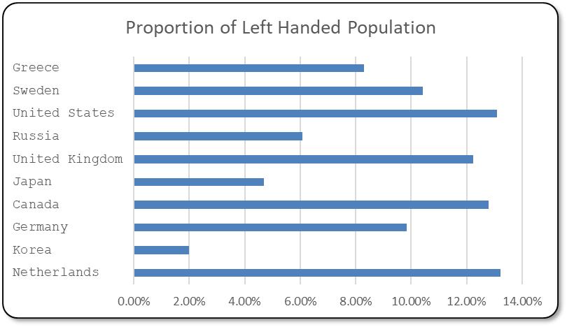
January's challenge was about thinking shifting text alignment to the left for the vertical text labels of a bar chart - which defaults to th right.
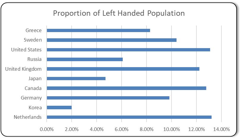
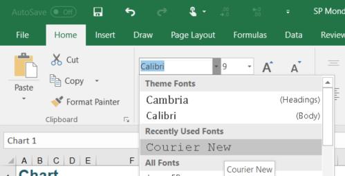
The hack used to align the text to the left is using monospace type fonts. Monospace type fonts are fonts where letters and characters each occupy the same amount of horizontal space. Think of the good old typewriter which uses monospace fonts and old fashioned typeset print media. There are two monospaced fonts that come default with Windows/Office: Courier New and Lucida Sans Typewriter.


What this means is that spaces can be appended to the text to generate spaces as filler within the label to give the illusion of being left aligned.
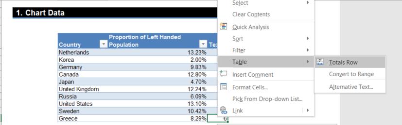
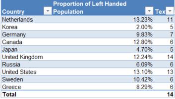
How many spaces would be needed to be added to the end? Well, let’s look at the longest text label and use that as our base. The number of characters of a table can be found with the LEN function. Notice how the data is stored in a table. Let’s add a column to the right with the following formula:
=LEN([@Country])
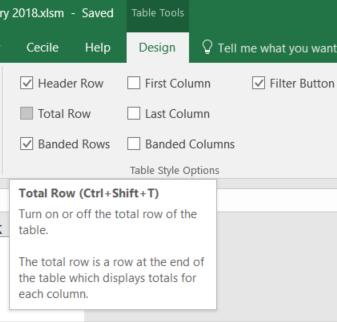
In order to find the maximum, let’s put a totals row. The total row can be added by using the Table Style Options subgroup of Design tab under Table Tools in the ribbon:
Or alternatively in the contextual menu upon right clicking a cell in the table:
That will make the Totals Row – but this calculates the SUM of the Table:
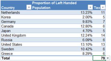
Notice that there is a drop down menu on right of the Total cell.
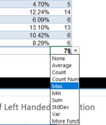
From there MAX can be selected and it will change the formula in the bar to be:
=SUBTOTAL(104,[Text Length])
Don’t forget to change the row label to “Max” instead of “Total”! Now the table looks like this:
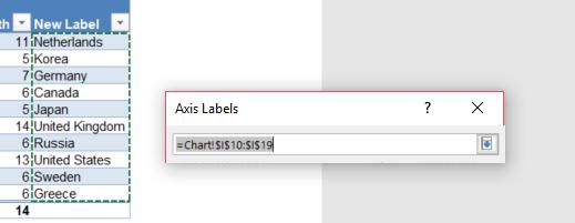
So the number of spaces required to fill in the rest of the label would be the maximum of the length LESS the actual length of the current label. The spaces can then be generated using the REPT function with the following formula:
=[@Country]&REPT(" ",Tbl_LeftHandedness[[#Totals],[Text Length]]-[@[Text Length]])
The next step is to point the labels of the chart to the new column. Go to “Select Data Source” (found on the right click menu of the chart or the Data subgroup of the Design tab under the Chart Tools ribbon).
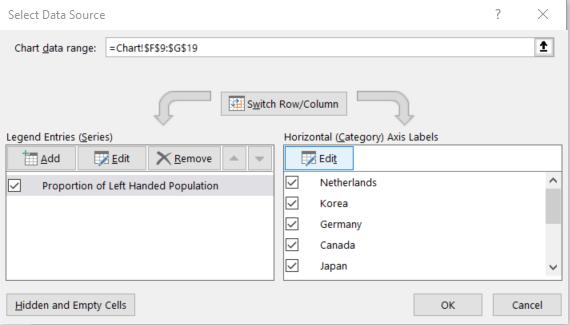
Click the Edit button under "Horizontal (Category) Axis Labels" and select the [New Label] column.
And the chart will be updated. Now let’s see how it looks.
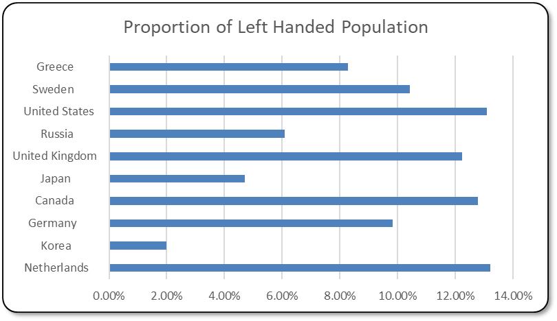
Notice how the labels appear strangely offset? That’s because the font is not spaced equally between each letter! Change the font to one of the monospaced fonts above by clicking on the axis labels and selecting it in the Font subgroup of the Home tab in the ribbon.
And the chart will be updated. Let’s see how it looks.
Hope that tickled the left side of the brain! Peruse the solution file here for further understanding.
The Final Friday Fix will return on Friday 23 February with a new Excel Challenge. In the meantime, please look out for the Daily Excel Tip on our home page and watch out for a new blog every business workday.