
Final Friday Fix: September 2017 Challenge
29 September 2017
Creating Charts with Standardised Axes
Near the end of the quarter we usually find ourselves creating quarterly reports and sending them off to head office. And that may cause issues.
Have you ever been told by head office that they want all of the charts on a worksheet to have the same axis ranges, but you can’t use a macro as it is against company policy? Hoping to find a solution, you navigate to trusty Google and only find answers that involves said prohibited automation?
The Challenge
Download the sample file here.
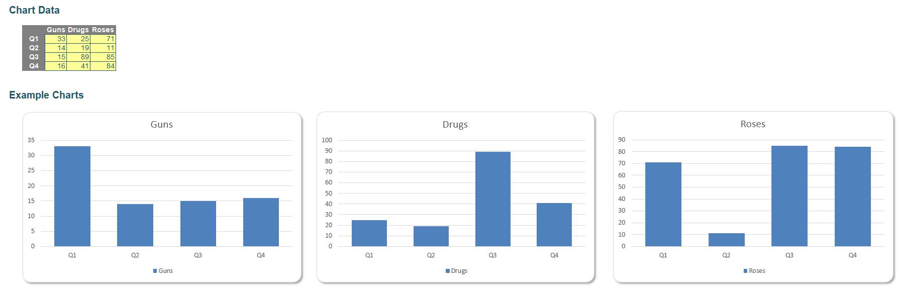
Open the file, see that there are three charts pulling data from the table. We want to have all three charts to have the same y-axis values. However, there are two conditions:
- the y-axis values have to be dynamic, i.e. they have to change based on the range of data
- this has to be done without the use of a macro.
Too perplexing? Well we’ll have one suggested solution for you on Monday…