
Excel for Mac: Combo Charts
17 May 2024
This week in our series about Microsoft Excel for
Mac, we show how you can set up Combo charts.
It’s a little different to how we do it on Windows, but once you know how, we think
it’s very fast and easy.
Combo Charts are charts where you combine two [2] or more chart types into a single visualisation. For example, you might want to show the volume of sales and the number of customers per month. It would be easy to create two Column or Line charts to show the data, but you might want to combine them to save space and show the relation of the data to each other. This is a good example of when you might want to use a Combo chart.
Using Combo Charts Effectively on Mac
In our example, it might be confusing to show both volume of sales and the number of customers as columns in the same chart. In this case, the number of customers is much lower than the number of dollars, so the scale isn’t good to compare the number of customers from one month to the next.

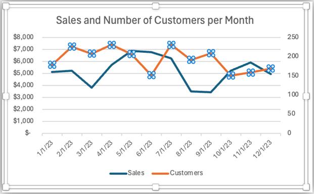
It’s better to show the Customers on a secondary axis as shown below. However, that will cause the columns of Customers to Overlap the Sales, making it difficult to see the data.
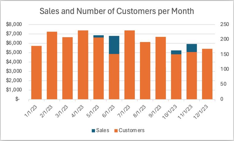
An alternative is to turn this into a Combo chart. For example, you could show the Customers as a line chart and keep Sales as a column chart. Then it’s a bit easier to read. The Sales are no longer obscured by the Customers. The use of the line for Customers might give some viewers a hint that it’s on a different scale than the dollars on the left axis.

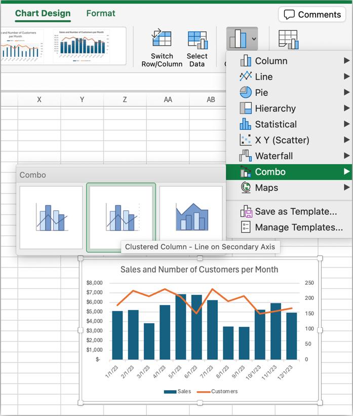
To make a chart this way is easy, but you need to know where to begin:
- Start by selecting the chart
- Then go to the ‘Chart Design’ tab of the ribbon and choose ‘Change Chart Type’
- Go to the Combo item on the menu and choose the desired combination. It shows three [3] options to combine a Column with other types. The second one is a Line on the secondary axis. Click it and your chart will be as we described above:
This is
nice, but you may want the Sales to be a Line chart and Customers a Column
chart. On Windows, this is accomplished
using the ‘Change Chart Type’ dialog.
This dialog doesn’t exist on Mac, but there’s still a way to accomplish
the task
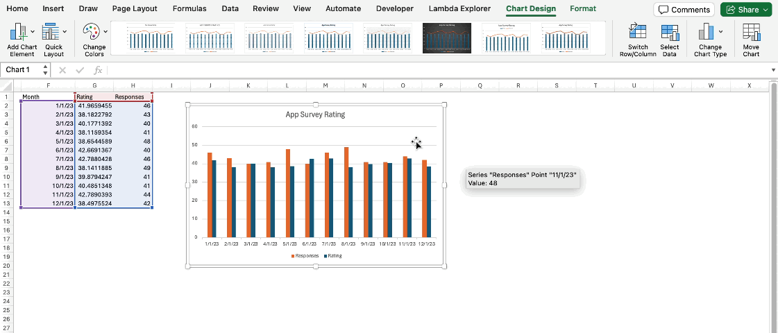
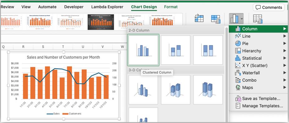
- First, select the series in your chart that you’d like to change.In our example, we’ll select the Sales series.We see that it’s selected because there are “selection handles” on the corners of the columns in the series.These are the blue dots in the screen shot below:

- Next, press the ‘Change Chart Type’ button on the ‘Chart Design’ tab of the Ribbon
- Choose Line since we want to set Sales to be a Line chart.At this point, both series are shown as Line charts
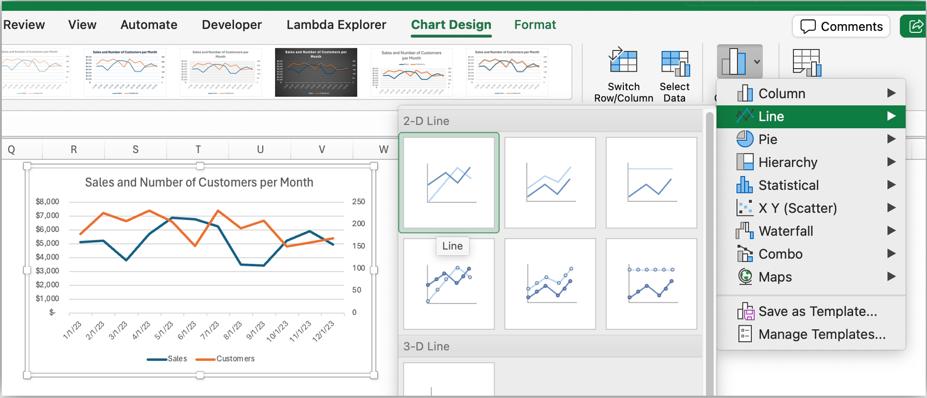
- Next, select the Customers series
- Again, choose the ‘Change Chart Type’ menu, but this time, we’ll choose Column -> Clustered Column as the chart type, since we wanted to swap from how we had it set earlier.
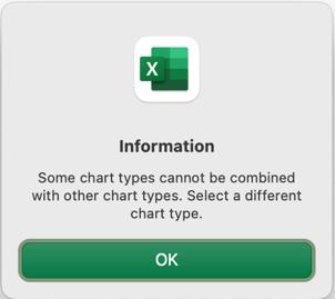
You can try to combine other chart types, but some of them won’t work and don’t make sense. For example, you can combine a column chart and a pie chart, but it’s not much use. We don’t advise making a chart like the one shown below. We’re showing it as an example of what not to do.

Some chart types can’t be combined with each other, and if you try, the entire chart will change to the type that you selected. In some cases, you’ll get an error message, indicating that you can’t combine the type that you selected.
Key Takeaway
To create a Combo chart in Excel for Mac, you should select the series that you want to change, and then pick a new chart type from the ‘Change Chart Type’ menu.
We hope you find this topic helpful. Check back for more details about Excel for Mac and how it’s different to Excel for Windows.