
Challenges: Monday Morning Mulling: May 2020 Challenge
1 June 2020
On the final Friday of each month, we set an Excel problem for you to puzzle over for the weekend. On the Monday, we publish a solution. If you think there is an alternative answer, feel free to email us. We’ll feel free to ignore you.
Welcome to this month’s Monday Morning Mulling. Our challenge this month had several mini-challenges, the last min-challenge being potentially the largest obstacle of all.
The Challenge
You might have spotted something was awry given I gave you a head start this month, proving pre-formatted chart data (all of the following inputs are numbers typed in, not text):

“All” you had to do is create the associated Excel chart with replicated label formatting:

But it was harder than that: this chart has to work after you have closed the file and reopened…
We will use the Excel starter file to walk through our suggested solution.
Suggested Solution
As mentioned above, there were several mini-challenges:
- Understand how you can create multiple number formats in Excel, never mind in a chart data label
- Create the basic chart
- Create the formatting in the data labels, realising custom number formatting will not work and conditional formatting may not be applied
- Make the solution robust enough to cope with saving the file and re-opening.
I will address all four areas below.
Mini-Challenge 1: Creating Multiple Number Formats in Excel
This is more a challenge of understanding how it works, rather than trying to solve the problem from scratch, as the inputs have already been formatted accordingly.
Returning to our problem our data appears as follows:
Here, the correct custom formatting has been generated for numbers simply typed in, without using VBA code or Excel formulae.
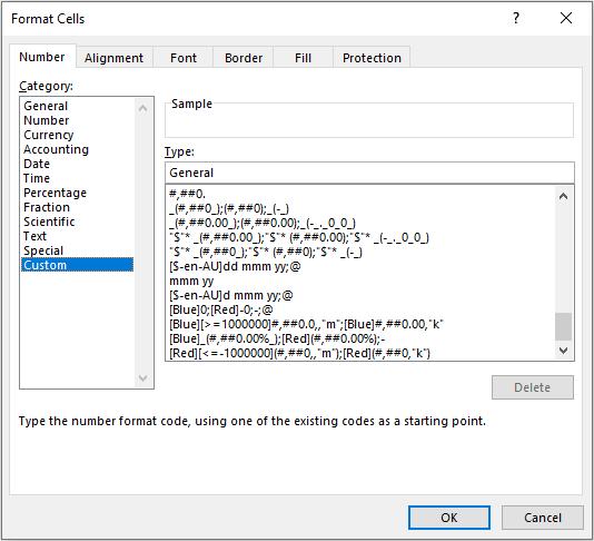
Given that one of the primary purposes of a spreadsheet is to present numerical data, it is important how numerical data is presented. Cells may be individually formatted, using CTRL + 1 or ALT + O + E in all versions of Excel:
Formatting only changes the appearance, not the underlying value, of a cell. For example, if cells A1 and B1 had the number ‘1.4’ typed in but were formatted to zero decimal places, then if cell C1 = A1 + B1, you would truly have 1 + 1 = 3 (well, 1.4 + 1.4 = 2.8 anyway).
Excel has many built-in number formats that are fairly easy to understand, e.g. Currency, Date, Percentage. Selecting the ‘Custom’ category activates the ‘Type’ input box and allows between 200 and 250 custom number formats in a particular workbook, depending upon the language version of Excel that has been installed.
The ‘Type’ input box allows up to four aspects of formatting to be specified in a cell. These aspects are referred to as sections and are separated by a semi-colon (;). To ascertain what is contained in each section depends on the total number of sections used, viz.
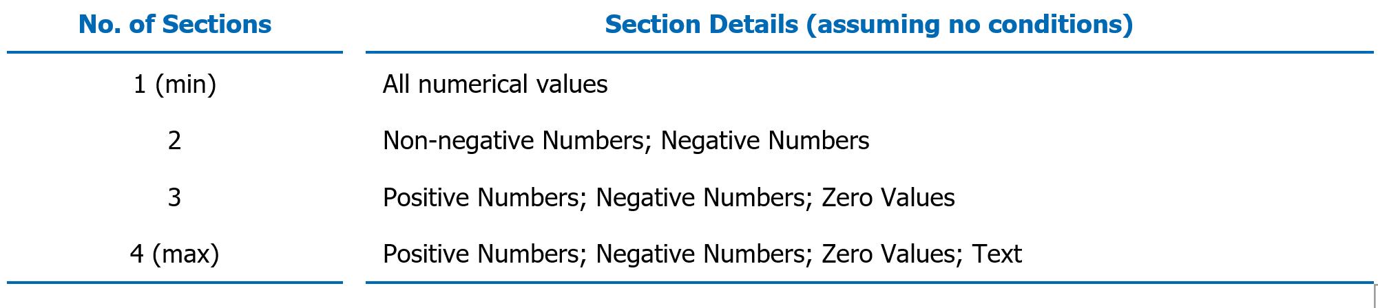
Notice only four options are available: what to do if positive, negative, zero or text.
I have written a previous article that discussed how to construct the following:

There is an alternative syntax to the above four arguments:

In the same past article, this was demonstrated as follows:
The conditions are included in square brackets such that if the condition is true, the following formatting will be applied.
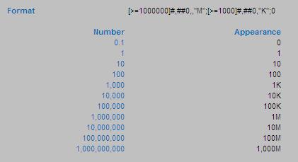
In this example, there are only three sections, so text will be formatted ‘generally’. The first section, [>=1000000]#,##0,,"M", will format all numbers greater than or equal to a million to the nearest million and add an “M” to the end of the number.
The second section will only be considered if the first condition is not true, so the order of the two ‘conditional formats’ needs to be thought through. Here, the second section, [>=1000]#,##0,"K", will format all numbers greater than or equal to a thousand (but necessarily less than a million) to the nearest thousand and add a “K” to the end of the number.
The third and final section, 0, will format all other numbers (every value less than 1,000) to the nearest integer without thousands separator(s).
This example is almost what we require; but it only allows three scenarios. We have many more.
The trick here is to resort to conditional formatting. Located in the Styles group of the Home tab, the conditional formatting feature allows you to consider multiple conditions:
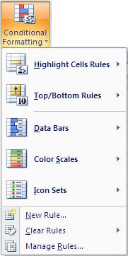
For instance, inspecting ‘Highlight Cells Rules’ is akin to many of the “Cell Value Is” functionalities of its predecessor, e.g. Greater Than, Less Than, Between, Equal To. I can use this to exploit a loophole in the restrictive number of conditions custom number formatting appears to allow. For example:
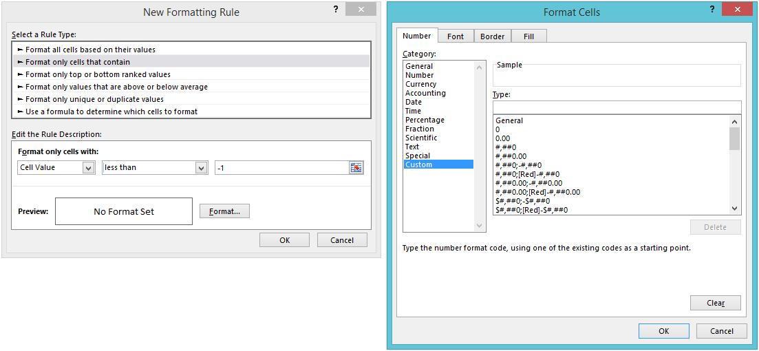
In this above illustration, I have selected conditional formatting to occur if the value in the cell is less than -1. Pressing the ‘Format…’ button then allows the user to select how the number formatting might appear.
Returning to our data:
Using both functionalities, the requirement is fairly straightforward. My suggested solution would be:
- Construct the underlying number formatting first. Personally, I would use custom number formatting so that all positive and negative numbers appeared as percentages, zero as a hyphen (“-“) and text as displayed above;
- Next, I would apply conditional formatting number formatting where the cell value is greater than one so that numbers greater than a million could be displayed to the nearest 0.1m, numbers less than a million but greater than or equal to 1,000 could be displayed to the nearest 0.00k and numbers lower than 1,000 (but necessarily greater than one) could be displayed as integers
- Finally, I would apply a second set of conditional formatting where the cell value is less than -1 as required.
I do not go through the required syntax here. My suggested solution can be found in the Excel starter file and the rationale / explanation can be understood by reading through the Number Formatting article.
Since many, many conditional formats may be applied to one cell in Excel, you can soon apply significantly more than four formats to any cell(s) in Excel.
Mini-Challenge 2: Create the Chart
This isn’t so hard, once you realise that if you want your data labels to be three different colours (blue for positives, red for negatives and yellow for zeros) and you want your columns to be different too (blue for positives, red for negatives, blank for zeros), you will need to separate your data into positives, negatives and zeros:
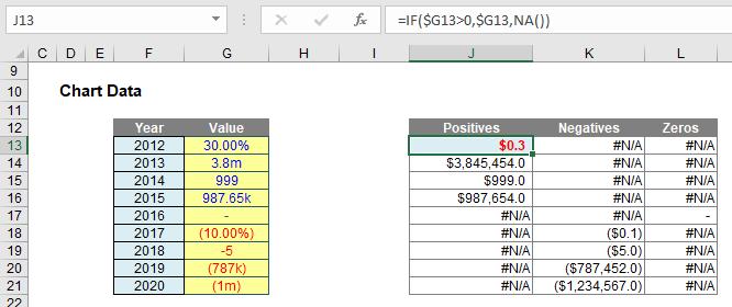
Here, I have added a “helper” table:
- Positives: J13 contains the formula =IF($G13>0,$G13,NA()). This puts the corresponding number in this cell if it is positive, else #N/A is returned. #N/A is different to zero, in that charts (depending upon which chart type is selected) will usually ignore these values (zeros are “noticed”)
- Negatives: K13 contains the formula =IF($G13<0,$G13,NA()), which returns only the negative values
- Zeros: L13 contains the formula =IF($G13=0,$G13,NA()), which returns only the zero values.
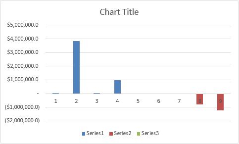
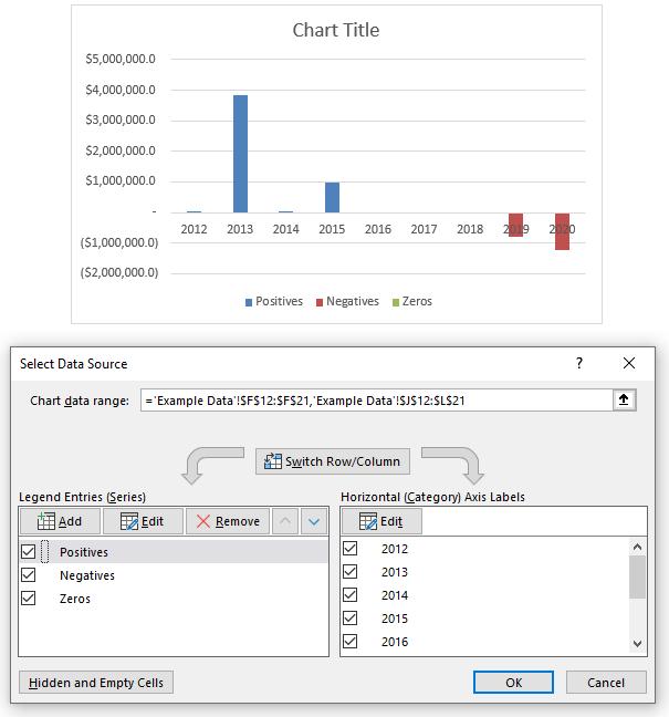
If you select cells J13:L21 and insert a Stacked Column Chart (ALT + N + C1, then choose Stacked Column Chart), you will create a chart as follows:
Right-clicking on the chart and selecting ‘Select Data…’ from the shortcut menu summons the ‘Select Data Source’ dialog, viz.
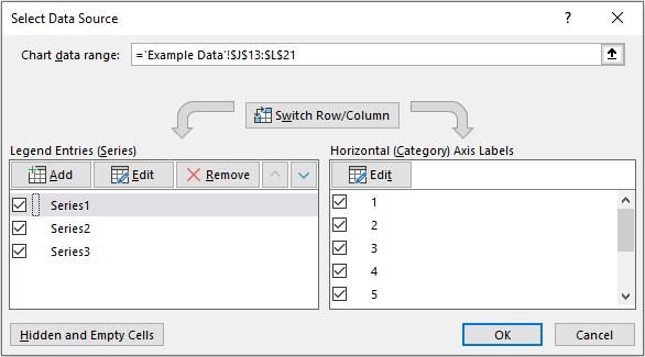
By editing the Legend Entries (Series) and the Horizontal (Category) Axis Labels, I can replace ‘Series1, ‘Series2’ and ‘Series3’ with ‘Positives’, ‘Negatives’ and ‘Zeros’ respectively, as well as swap out the integer counters for the Year:
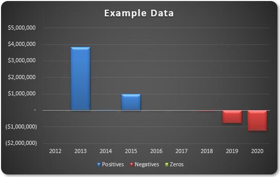
A little formatting here and there (e.g. reducing the columns’ gap widths, changing columns, adding a title) works wonders:
It appears we are nearly there. All we need to do is add the data labels. What could be simpler? Well, understanding Schwarzschild’s solution to Einstein’s field equations on general relativity, for one.
Adding data labels is simple enough, by selecting the chart and adding chart elements (clicking on the big plus [+] button) viz.
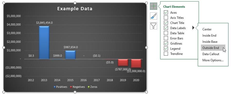
The data labels may be aligned outside end (above and below the non-negative and negative columns respectively), but what about formatting? Given we have three series, having blue for positive labels, red for negative labels and yellow for zeros is straightforward. However, how do you mirror the number formatting for positives and negatives when each has more scenarios than custom number formatting can deal with? You cannot use conditional formatting with data labels, so our earlier trick is redundant here.
Mini-Challenge 3: Creating Data Label Formatting
The data labels cannot be created using custom number formatting. I will have to get more creative. If you select the data labels and then format the selection, the ‘Format Data Labels’ pane will appear:
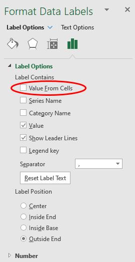
We need to change the label contents from Value to ‘Value From Cells’. This means we can select a different cell – such as text – associated with these values. Then, it’s easy.
Therefore, I create a second “helper” table:

These three added fields create text strings that mimic the number formatting using Excel’s TEXT function. In its simplest form, TEXT has the following form:
=TEXT(value to be formatted, “Format required”)
The formatting in inverted commas (speech marks) follows the same syntax as custom number formatting, except you cannot use speech marks for text (a backslash should be used instead). Therefore, the three formulae added are:
- The formula for positives (e.g. cell J13) is given by
=IF(ISNA(J13),".",TEXT(J13,IF(J13>=10^6,"#,##0.0,,\m",IF(J13>=10^3,"#,##0.00,\k",IF(J13<1,"0.00%","0")))))
This formula checks to see whether the number is positive (IF(ISNA(J13), …) – if there is an #N/A error in cell J13 then the number is not positive and no further formatting is required. When this happens a period (.) is displayed. The character is subjective; I use it as it is difficult to see and text labels misbehave if they are allowed to be completely empty or just contain a space. The rest of the formula uses TEXT to format the positive number appropriately in millions, thousands, percentages or just as an integer - The formula for negatives (e.g. cell K13) is given by
=IF(ISNA(K13),".",TEXT(-K13,IF(-K13>=10^6,"(#,##0,,\m)",IF(-K13>=10^3,"(#,##0,\k)",IF(-K13<1,"(0.00%)","-0")))))
This formula checks to see whether the number is negative (IF(ISNA(K13), …). The rest of the formula uses TEXT to format the negative number appropriately in millions, thousands, percentages or just as an integer =IF(ISNA(K13),".",TEXT(-K13,IF(-K13>=10^6,"(#,##0,,\m)",IF(-K13>=10^3,"(#,##0,\k)",IF(-K13<1,"(0.00%)","-0"))))) This formula checks to see whether the number is negative (IF(ISNA(K13), …). The rest of the formula uses TEXT to format the negative number appropriately in millions, thousands, percentages or just as an integer - The formula for everything else – which should be zeros (e.g. cell L13) is given by
=IF(ISNA(L13),".",IF($G13=0,"-",NA()))
This is much simpler, but just allows for any possible text that has crept through.=IF(ISNA(L13),".",IF($G13=0,"-",NA())) This is much simpler, but just allows for any possible text that has crept through.
If the ‘Value From Cells’ selects these ranges rather than the ‘Values’, the chart will be generated just as we require (having placed the chart over my “helper” tables):

We’re finished!
Mini-Challenge 4: Make the Solution Robust
No we’re not. Try closing and saving the file, then re-open. If you make all of the input values (50.00%), you will probably see something similar to the following chart:

You may not be missing the same labels, but you will probably be missing some. Similarly, if I type ‘123’ into all the inputs I may get:

Typically, the labels missing the first time will appear here, and vice versa. Not good!
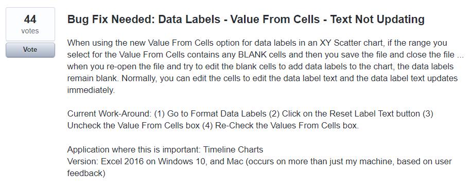
This is soooo frustrating! This is a bug in Excel. It is still prevalent in Excel 2019 and the latest versions of Microsoft 365. A quick consultation with your favourite search engine tends to lead you to ideas such as saving the chart as a chart template, and create a macro on opening that will re-apply the chart. Thank you very much; that’s not for me.
It’s not often on these challenges that we cheat quite like I will be doing this time. For this problem, there is a common free, third party add-in that appears to come to the rescue, namely past Excel MVP Rob Bovey’s XY Chart Labeler (sic).
If your IT administrator will allow you, downloading this add-in allows you to add ‘XY chart labels’ – and these seem to stick. This is what we used to generate this month’s suggested Excel solution. It’s easy to use – all you have to do is add the chart labels and reference the text values using the add-in rather than Excel’s tools.
With no disrespect, maybe eventually Excel will get its own data labelling house in order though:
Until next month.
The Final Friday Fix will return on Friday 26 June with a new Excel Challenge. In the meantime, please look out for the Daily Excel Tip on our home page and watch out for a new blog every business workday.