
Challenges: Monday Morning Mulling: July 2019 Challenge
29 July 2019
On the final Friday of each month, we set a Power BI or Excel problem for you to puzzle over for the weekend. On the Monday, we publish a solution. If you think there is an alternative answer, feel free to email us. We’ll feel free to ignore you.
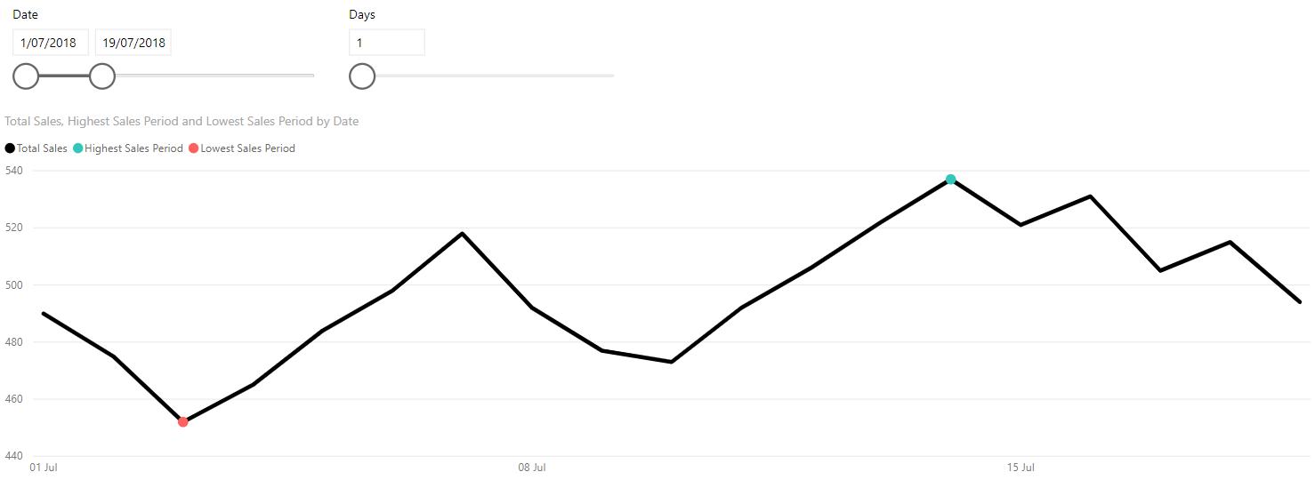
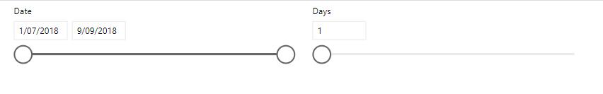
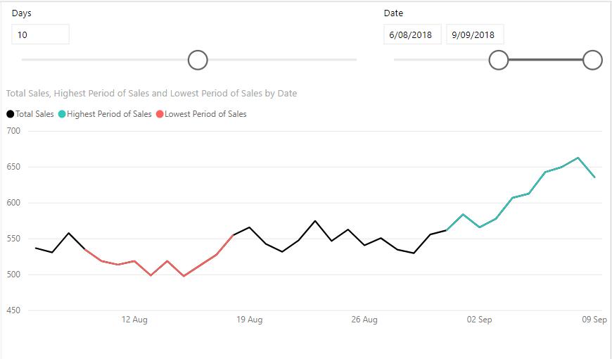
To recap, the problem we had last week was to create a visualisation that will highlight the best and worst periods in our data. This visualisation would update the best and worst periods based on a date filter and a toggle to increase or decrease the number of points to be considered in one period:
Solution
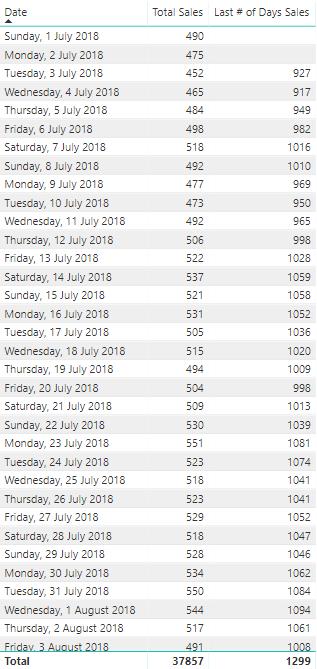
First let’s look at the data:
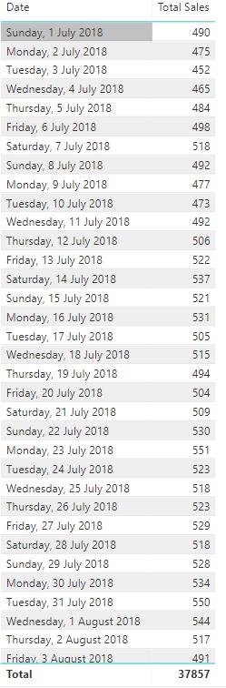
It is a simple table that contains the daily sales data.
Conceptually, what we must do is create a measure that will calculate the total sales for every period in our data. Then, create another measure to compare these numbers with each other so that we can determine the best and worst periods in our dataset.
For example, if we want to consider the best and worst three days in our data, we would want to sum every three day period in our dataset in a column, then highlight the highest sum and the lowest sum as our best and worst periods respectively.
To break it down we are going to need three measures:
- A measure that will calculate the Sum of Last Number of Days Sales (Last # of Days Sales)
- A measure that will take the [Last # of Days Sales] and find the highest sale period, or maximum (Highest Sales Period)
- A measure that will take the [Last # of Days Sales] and find the lowest sale period, or minimum (Lowest Sales Period).
Last # of Days Sales
The first measure to create is the measure that will calculate the last number of days total sales based on an input, hence the first step is to create the input. This input will be the number of days to be considered in one period. To create this, navigate to the Modelling tab on the ribbon and select the “New Parameter” option:

This will bring up the 'What-if parameter' dialog box, where we populate the input fields.
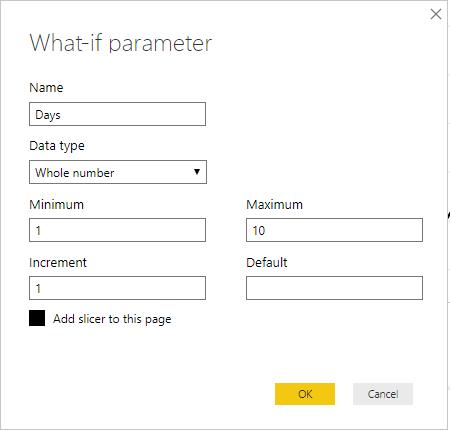
The maximum number can be any number you want. For this example, we have elected to have 10 days as the maximum number of days to be considered in a period.
This would also be a good time to create a date slicer in the report:
We can now create the measure to calculate the total sales for the last few ‘Days’:
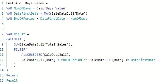
The second line of code defines the variable (VAR), NumOfDays which correlates to the Days input parameter we created earlier.
The following line of code defines the DataFirstDate variable as the latest date in our dataset:
VAR DataFirstDate = MAX(SaleDataJul1[Date])
The third line defines the EndOfPeriod variable which is the last date we want to include in our period:
VAR EndOfPeriod = DataFirstDate - NumOfDays
Lines 7 to 14 calculate the sum of each period in our dataset:
VAR Result =
CALCULATE(
SUM(SaleDataJul1[Total Sales]),
FILTER(
ALLSELECTED(SaleDataJul1),
SaleDataJul1[Date] > EndOfPeriod && SaleDataJul1[Date] <= DataFirstDate
)
)
Dragging this measure into our data table:
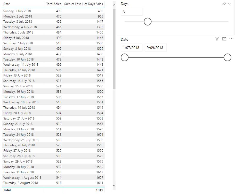
We can see that it is indeed summing the last three days of sales, however we do not want to include the first two rows. As the sum for the first two rows will only be for one or two days of sales, when we highlight the lowest point of our data, these numbers will always be the lowest sum and thus be highlighted. Therefore, we need to make the following changes to our measure:
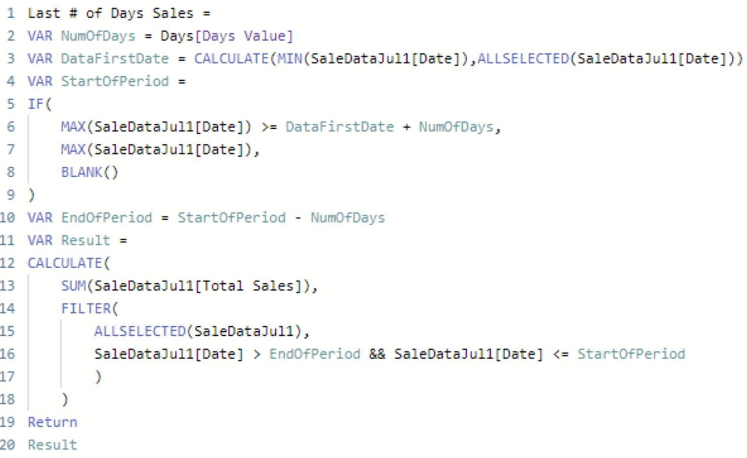
We have changed the calculation of the DataFirstDate variable, so that it calculates the first date of the selection of dates by the filter.
We have included a new variable StartOfPeriod, this variable will test if the latest date in the dataset is greater than or equal to the first date in the selection plus the number of the days in the selection. If it is less than that it will return with BLANK(). This is so that we do not include periods that have less than three periods to be summed.
The final change is on line 16 where we use StartOfPeriod rather than DataFirstDate as the condition:
The next step is to highlight the best and worst sales in the data set. We do this by creating two more data series that will only display data for the best sales period and the worst sales period. We can then colour these series a different colour to the primary series, achieving the highlighting effect.
Highest Sales Period Measure
For this measure we will require three variables:
- the Number of days (NumOfDays)
- a variable that will return with the value of the period with highest sales (HighestSales)
- a variable for the dates for the period with the highest sales (DateHighestSales).
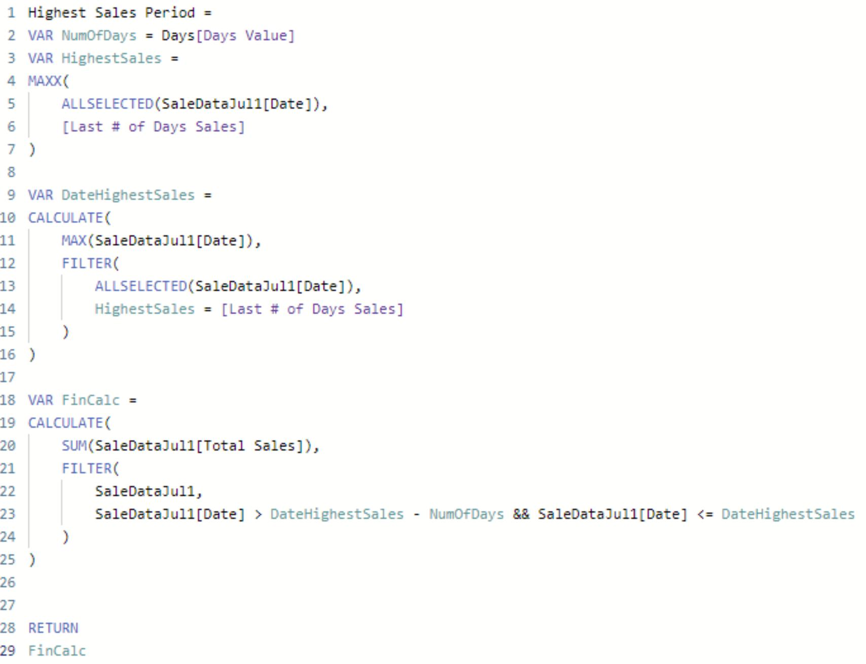
The NumOfDays variable is coded to return with the value of the number of days from our input parameter.
We have coded the HighestSales variable to return with the max value from the [Last # of Days Sales] measure we created earlier, from the selection we have selected. It is important to use ALLSELECTED(SaleDataJul1[Date]) to limit this calculation to our selection based on the date slicer.
The DateHighestSales variable is coded to return with the dates for the period with the highest sales. This is done by calculating the maximum value in the SaleDataJul1[Date] column, then applying a filter based on the data selection filter. With the condition of when the HighestSales variable equals the [Last # of Days Sales] measure.
Finally, we have the FinCalc, short for final calculation, variable. This variable calculates the sum of the total sales column, filtered on the date range for the highest sale period.
With our input parameter for the number of days set to three we get the following results:
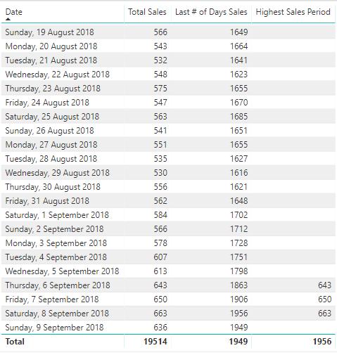
We can see that our highest period of sales measure is returning with the sale values for the highest sale period, (1,956 sales on the 8th September 2019).
Lowest Sales Period Measure
Now we must create the Lowest Period of Sales measure (hint: it is very similar to the Highest Period of Sales measure). All we need to do is change the maximum calculations to minimum calculations instead.
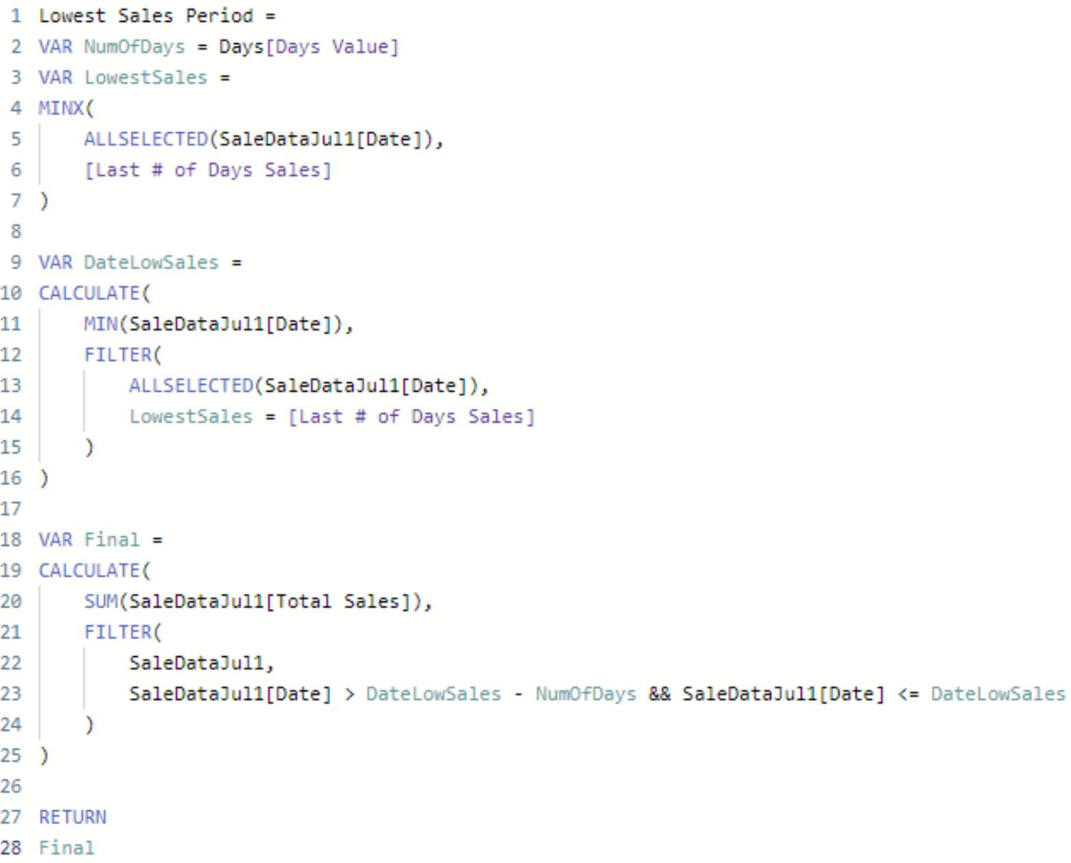
The two measures are very similar, with the only difference being that the Highest Sales Period measure will calculate the maximum in the selection compared to the Lowest Sales Period measure that will calculate the minimum of the selection.
We can then plot the two measures into our chart and adjust the colours for each of them, in order to create the desired highlighting effect:
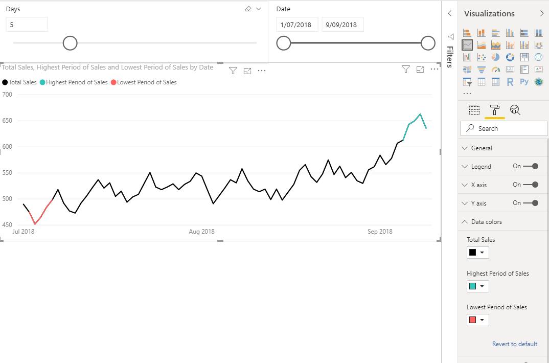
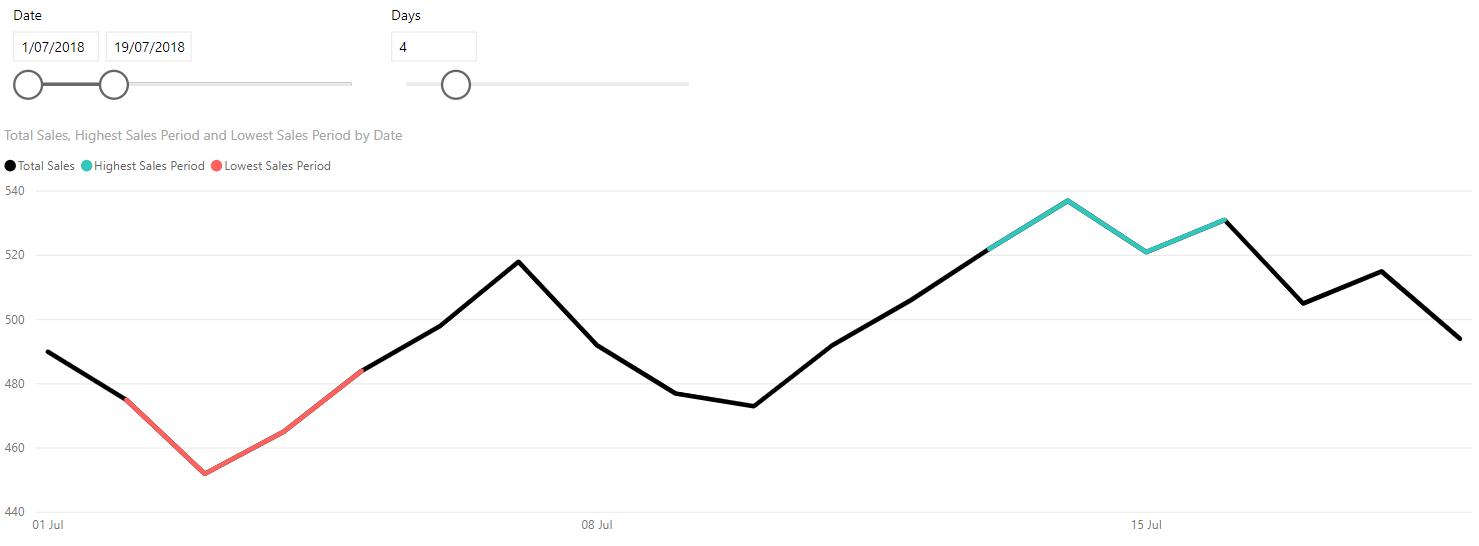
Changing our selection of dates and period range will update our chart accordingly:
That’s how we did it. Did you find a more elegant solution?
The Final Friday Fix will return on 30th August with a new Challenge. In the meantime, please look out for the Daily Excel Tip on our home page and watch out for a new blog every business workday.