
Power BI Blog: Just Speculate Over Numbers – Part 6
7 June 2018
Last week we finished putting together our Powerball dataset and it’s time to do some analysis.
What is the first thing any punter would like to know? Why, which numbers have been picked most frequently! Let’s do that at the very least.
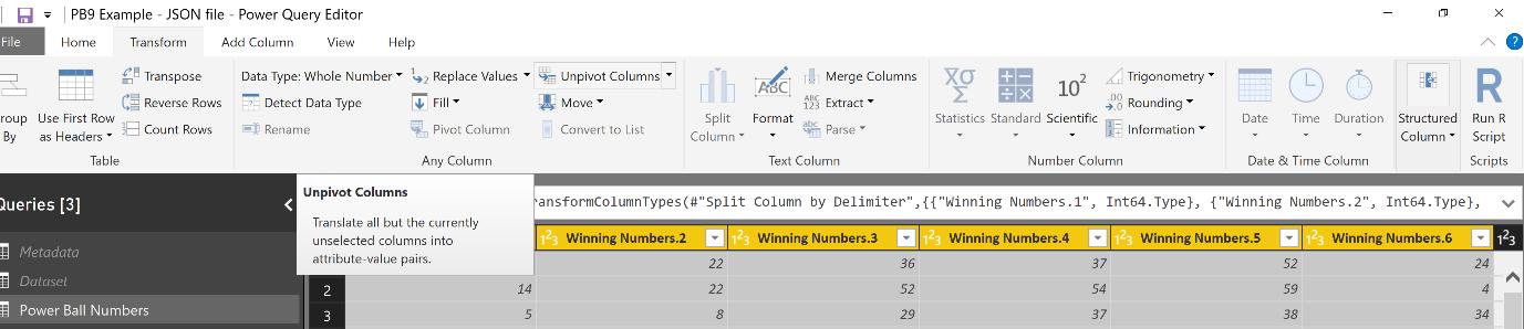
However, as our numbers are spread over 6 columns, it would be hard to do frequency analysis. We need to put it all in one column in order to easily count it up. Luckily we can easily do that in the Power Query Editor.
Go back into our final Powerball Numbers query. As covered here, we’re going to unpivot the numbers. Select all the Winning Numbers columns and hit the "Unpivot Columns" button in the Ribbon under the Transform tab in the "Any Column" subcategory:
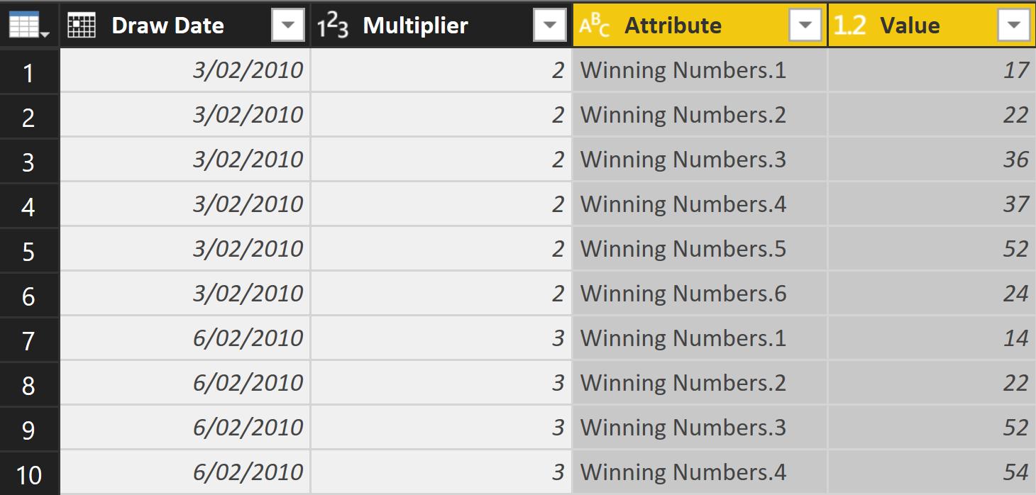
Our table will look like this:
Easily done and we can do our analysis, so let’s hit "Close & Apply" and get to work!
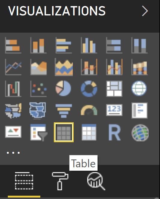
Let’s put up a Table visualisation. It’s the 3rd visual on the 5th row in the "Vizualizations" pane
If we hit the Value field of our data in the “Fields” pane, this comes up in our visual:
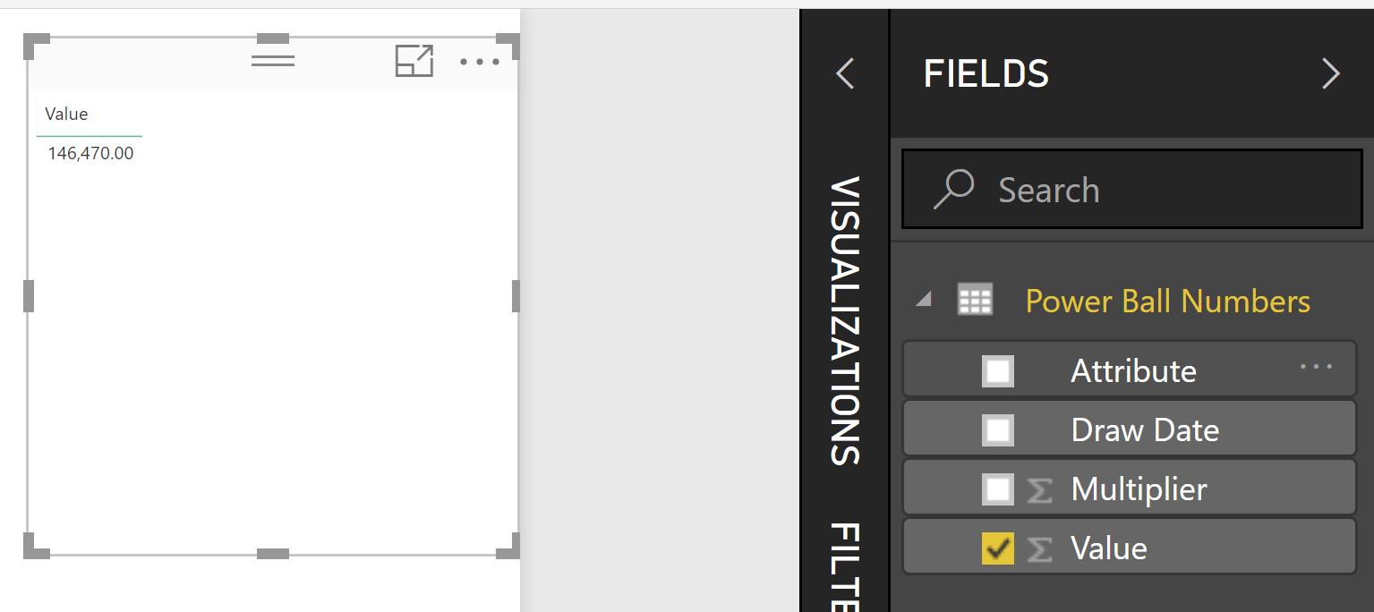
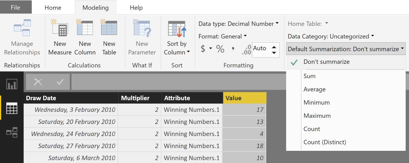
It has summed up all the numbers in the Value field! You can see that it will default to being summed up by the large sigma sign next to the field name in the “Fields” pane. How do we avoid this?
Click on the Data tab on the side to view our table.
Select the Value column (by clicking on the header) and then in the Ribbon under the Modeling tab in the Properties subcategory, click on the "Default Summarization" drop down arrow and choose "Don’t Summarize".
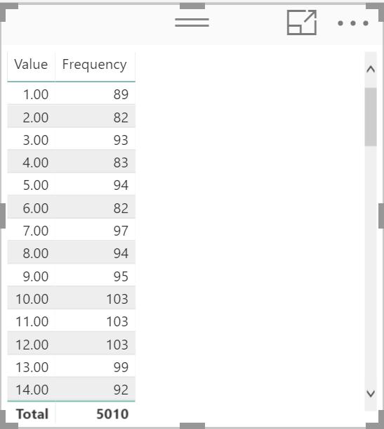
Head back to the report page. Get rid of that old visual and redo it. We’ll see something different:
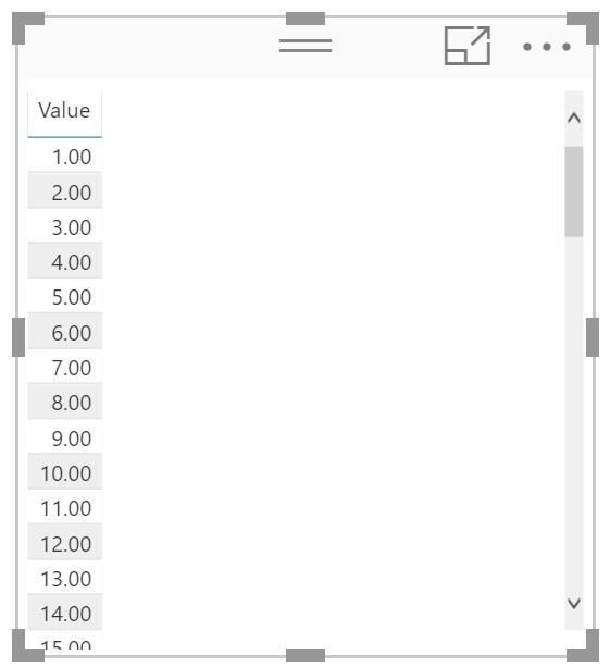
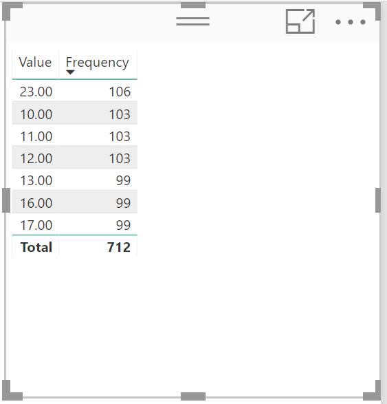
Notice that our numbers are now showing up? But we want to see how frequently they did.
Go back to the Data tab. Let’s use DAX to create a measure to count how frequently the numbers occurs. We’re going to use the CALCULATE function which you can read more about here.
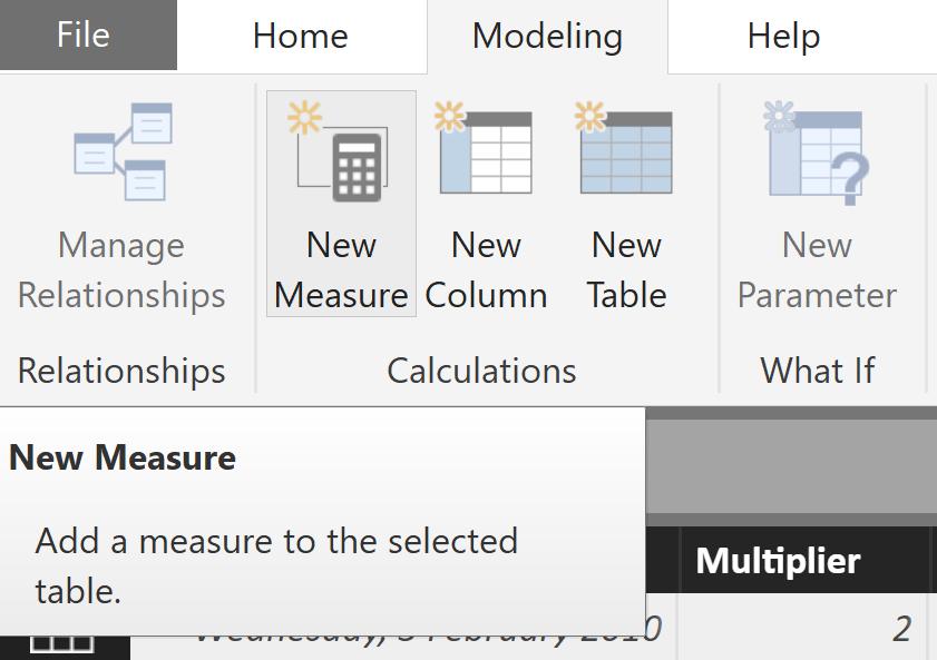
On the Ribbon in the “Modeling” tab under the “Calculations” subcategory, click on “New Measure”:
Type the following in the formula bar:
Frequency = CALCULATE(COUNT('Power Ball Numbers'[Value]))
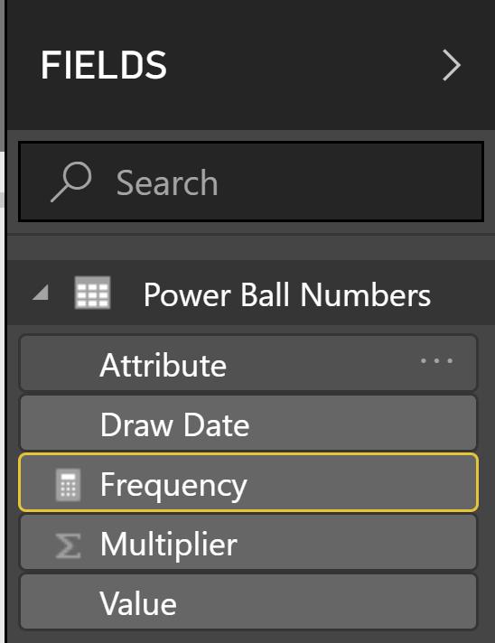
A new column will not appear, but in the fields pane you’ll see the newly created measure show up and it will have a calculator symbol next to it to indicated a calculated column.
Let’s pop it into our table. Head back into the Report tab and then click the check box next to Frequency.
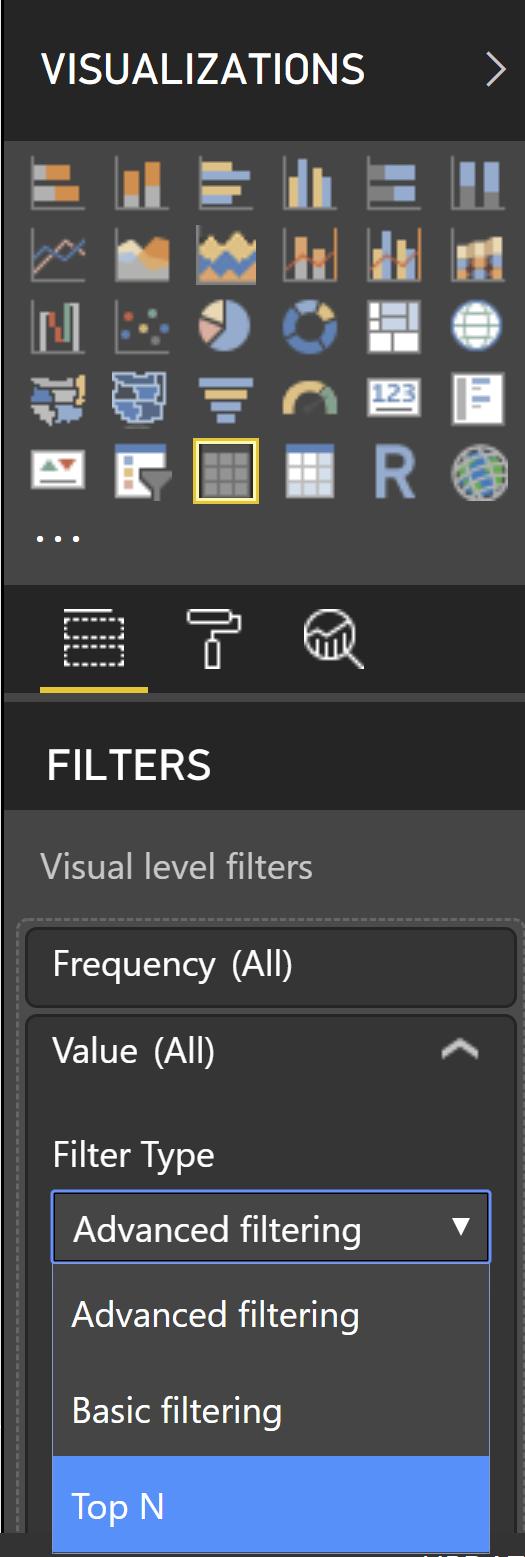
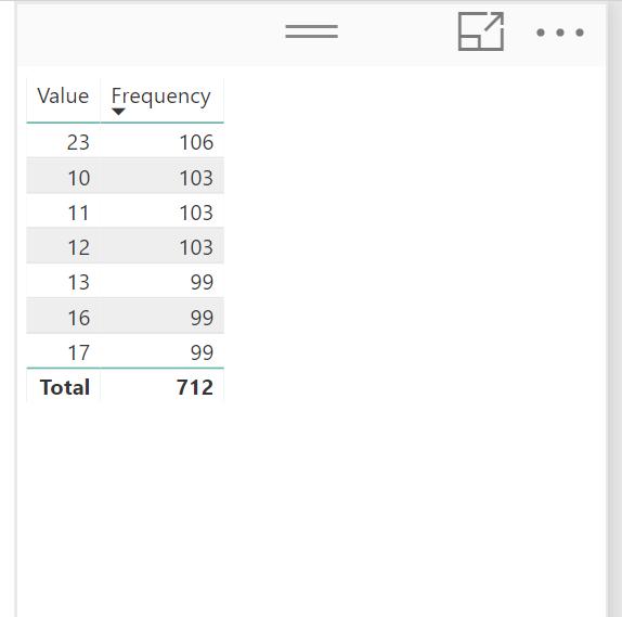
To filter only the top 6, in the “Filters” section of the Visualizations pane, under the “Visual level filters” expand Values. There will be a drop down under a section called “Advanced Filtering” and choose Top N.
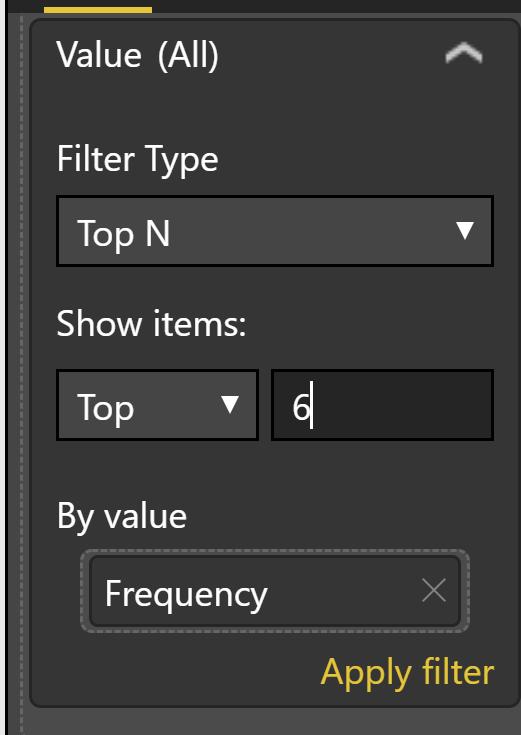
Additional fields will then show up. We want to see the top 6 numbers, so under “Show items:” ensure that the menu shows “Top” and type "6" in the box next to it.
The filter also needs to know by what it will sort by. Drag the Frequency field from the “Fields” pane in the “By Value” section like so:
With everything filled out correct, “Apply filter” will turn orange. Click on it and see how it updates our visual.
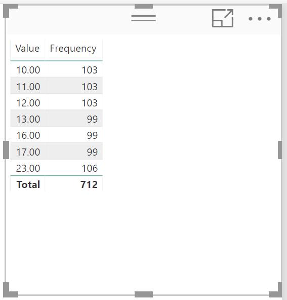
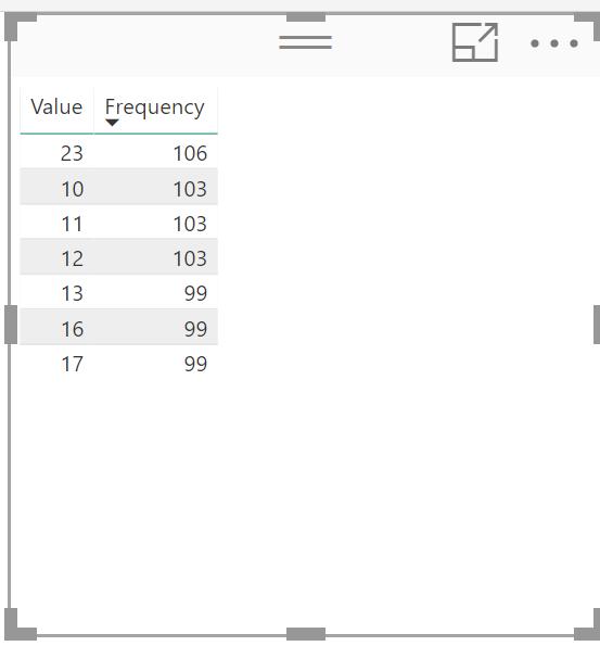
But notice how it is sorted on Value? Click on Frequency on the visual and it will sort on that field instead to show it in descending order.
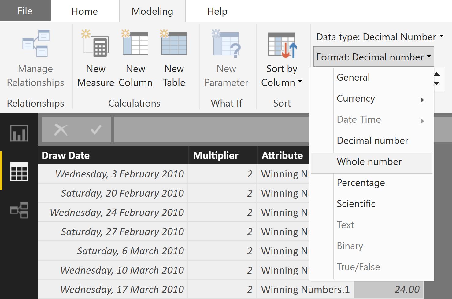
But I don’t like the number formatting on the Value! I can change that by going back into the Data tab and changing it in the Ribbon on the Modelling tab in the Formatting subcategory and choosing “Format” and choosing “Whole number”.
And our visual will be updated accordingly:
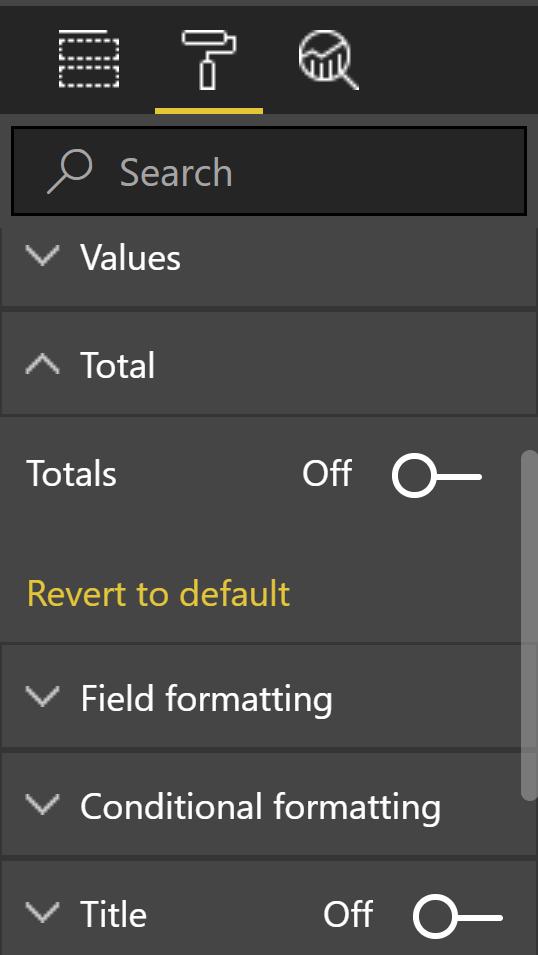
The Total row in the visual is not useful in this case because we are just concerned with the frequency of the numbers. The total of the top 6 is not helpful. Let’s remove it. This is done by clicking on the paintbrush icon in the “Visualizations” pane. Expand the “Totals” section and then toggle “Totals” to the “Off” position.
And now our visual looks nice and tidy displaying only the relevant information.
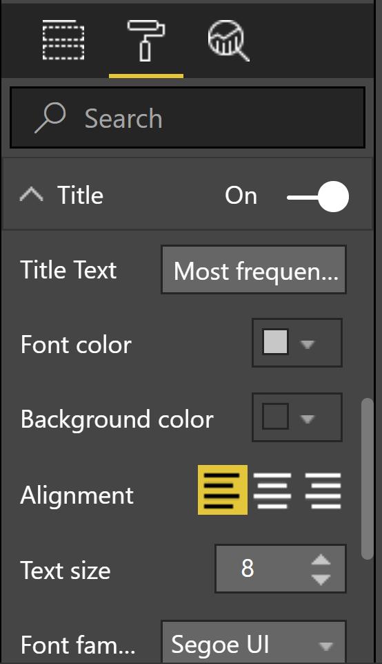
You can further customise the visual by adding a title in the section further down. Toggle it to "On" and type a useful title:
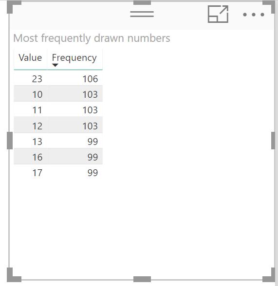
There you go! Feel free to experiment with more of the formatting options available in this section.
Next week we'll speculate further over these numbers.
Tune back next time for more Power BI Tips!