
Charting the Movements
This article provides a step-by-step construction of the oft-used but seldom built correctly waterfall chart. By Liam Bastick, director with SumProduct Pty Ltd.
Query
As part of my job, I have to summarise how numbers move from one period to the next using a “waterfall chart”. However, I cannot seem to get my chart to work quite right. Could you give me some guidance please?
Advice
A waterfall chart is a variation of an Excel column chart that provides a visual representation of what has made a key output vary between one period and the next, viz.
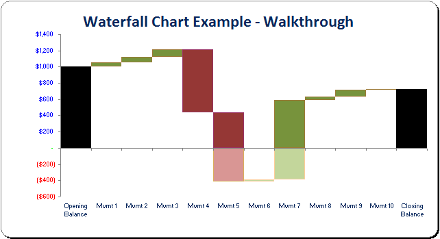
In the above example, the two black columns represent the opening and closing balances for a key output in a particular period. The intermediary blocks represent how various drivers have affected this balance within the period. Note how increases in value are coloured green and decreases are coloured red (slightly fainter if the cumulative total is below zero) in this example.
This graphic can be quite powerful in explaining key variances to end users, as needed.
I will use the following attached Excel file to talk through how to build this chart up from first principles.
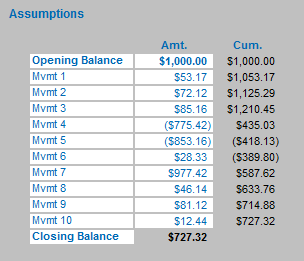
On the Waterfall Chart worksheet, the opening balance and intrinsic movements are recorded (perhaps linked to calculations elsewhere), with the closing balance a calculated cell.
In this illustration, like with most of my example Excel files, white cells may be changed without affecting the calculative functionality of the model.
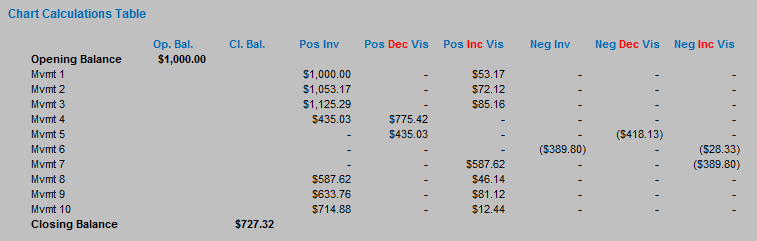
This table is not yet ready to be used to create our waterfall chart: to that end, we need to build an interim Chart Calculations Table (which is presented in rows 30 to 44 of our attached example). It is recommended that the calculation table is built as follows as the order of the columns should not need to be changed when constructing the chart:
| Column and Heading | Example Formula | Explanation |
|---|---|---|
| G: Opening Balance | =G11 (only first row) | Provides opening balance. |
| H: Closing Balance | =G22 (only last row) | Provides closing balance. |
| I: Positive Invisible | =IF(G12>0,MAX(H11,),MAX(H12,)) | If the particular movement is positive, this takes the previous movement’s cumulative balance; if not, it takes the current movement’s cumulative balance. In either case, the balance used must be positive. This is used as an invisible column to ‘prop up’ the movement that will be displayed. |
| J: Positive Decreasing Visible | =IF(G12<0,-MAX(G12,-MAX(H11,)),) | If the movement is negative, display as a positive number the value closer to zero of the movement and the last movement’s cumulative balance. Together with column I, this will ensure a block appearing to go downwards will not go below the x-axis (i.e. a value of zero). |
| K: Positive Increasing Visible | =IF(G12>0,MIN(G12,MAX(H12,)),) | Similar to column J, if the movement is positive, display as a positive number the smaller of the movement and the current movement’s cumulative balance. Together with column I, this will ensure a block appearing to go upwards will calculate correctly if the previous cumulative balance was negative. |
| L: Negative Invisible | =IF(G12>0,MIN(H12,),MIN(H11,)) | Exactly the opposite of column I, if the particular movement is positive, this takes the current movement’s cumulative balance; if not, it takes the previous movement’s cumulative balance. In either case, the balance used must not be positive. This is used as an invisible column to ‘prop down’ the movement that will be displayed. |
| M: Negative Dec. Visible | =IF(G12<0,SUM(J34:K34)-ABS(G12),) | If the movement is negative, this calculates the amount of the movement that should be displayed below the x-axis (the positive amounts were calculated in columns J and K). |
| N: Negative Inc. Visible | =IF(G12>0,SUM(J34:K34)-ABS(G12),) | Similar to column M. The distinction in whether the movement is positive or negative is so that positives may be coloured one way and negatives another. |
In our illustration, our Chart Calculations Table will resemble the following:
At this juncture, the chart may now be constructed. By selecting the Chart Calculations Table (cells D32:N44 in our example), the chart may be built as follows:
Excel 2003 and earlier
- Select the Chart Wizard (ALT + I + H)
- In Step 1, select the Column chart type, and the Stacked Column chart sub-type (second one on first row)
- Click ‘Next’
- In Step 2, ensure the range has been correctly selected. In our example, ensure the Series is in ‘Columns’ not ‘Rows’
- Click ‘Next’
- In Step 3, add a Chart Title and Axes Labels as required. The legend should not be displayed (it will make the chart seem confusing)
- Click ‘Next’
- In Step 4, determine the Chart Location as required
- Right-click on any column in the chart and then choose ‘Format Data Series…’ from the shortcut menu. Go to the ‘Options’ tab and select a ‘Gap width’ of zero
- Delete grid lines if necessary.
Excel 2007
- On the ‘Insert’ tab of the Ribbon, select ‘Column’ in the Charts group and the ‘Stacked Column’ chart (second one on first row) from the 2-D column charts (ALT + N + C + Right Arrow + ENTER)
- Right-click on the chart and select ‘Select Data…’ from the shortcut menu
- By using the ‘Switch Row / Column’ button if necessary, ensure that the Legend Entries are the titles from the top row of the data table (row 32 in our example) and that the Horizontal (Category) Axis Labels are the descriptions from the first column (column D in our example)
- With the chart selected, go to the Chart Tools ‘Layout’ tab in the Ribbon and select ‘Chart Title’ and ‘Axis Titles’ labels from the ‘Labels’ group
- Right-click on the Legend and select ‘Delete’ from the shortcut menu
- Right-click on any column in the chart and then choose ‘Format Data Series…’ from the shortcut menu. Select the first entry, ‘Series Options’ , in the first column and select a ‘Gap width’ of ‘No Gap’ by dragging the pointer to the left
- Delete grid lines if necessary.
The chart is almost there. Borders and fill patterns need to be changed for each data series. Whilst the colours for visible increases and decreases are a matter of taste, the invisible columns need to have no border and no fill pattern. To change these properties, simply select the required data series by clicking on the chart, and then:
Excel 2003 and earlier
- Right-click on the column in the chart and then choose ‘Format Data Series…’ from the shortcut menu
- Go to the ‘Patterns’ tab and select the ‘Border’ and ‘Area’ properties as required.
Excel 2007
- Right-click on the column and then choose ‘Format Data Series…’ from the shortcut menu
- Select the third and fourth entries in the first column, ‘Border Color’ and ‘Border Styles’ and revise as necessary.
Finally, most modellers will not want the interim data table visible. Rather than hide it, I always recommend grouping rows or columns (in this example, select rows 30:44, then ALT + SHIFT + Right Arrow). However, with Excel’s default settings, this will make the chart image ‘disappear’ if the data is not visible. To counter this irritating anomaly, select the chart (otherwise the options below may be greyed out) and then:
Excel 2003 and earlier
- Go to Tools -> Options on the drop down menu (ALT + T + O)
- Go to the ‘Chart’ tab
- Uncheck the check box titled ‘Plot visible cells only’
- Click ‘OK’.
Excel 2007
- Right-click on the chart and select ‘Select Data…’ from the shortcut menu
- Click on the ‘Hidden and Empty Cells’ button in the bottom left hand corner
- Check the check box titled ‘Show data in hidden rows and columns’
- Click ‘OK’ buttons (twice).
If you have a query for this section, please feel free to drop Liam a line at liam.bastick@sumproduct.com or visit the website www.sumproduct.com