Tornado Charts Have You in a Whirl..?
In this article we consider a graphical approach to sensitivity analysis by building up a common illustration of sensitivities – the tornado chart. By Liam Bastick, Director with SumProduct Pty Ltd.
Query
I have been asked to put together a type of sensitivity graph known as a tornado chart. Could you explain what this is?
Advice
I define “sensitivity analysis” as meaning the flexing of one or at most two variables to see how these changes in input affect key outputs. With respect to constructing a tornado chart, I need to become even more specific. Here, I consider the flexing of only one variable at a time.
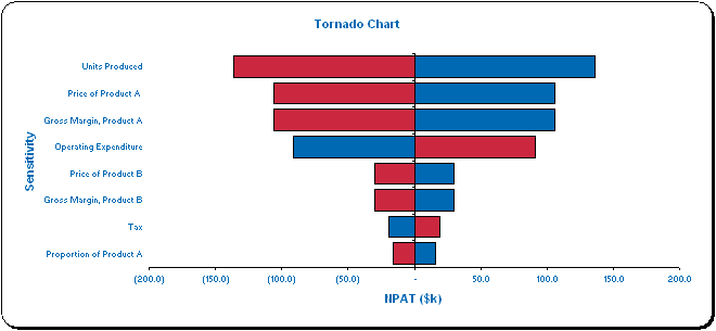
Tornado charts are a type of bar chart that reflect how much impact varying an input has on a particular output, providing both a ranking and a measure of magnitude of the impact, sometimes given in absolute terms (as in our detailed worked example below) and sometimes in percentage terms.
As you can see in the above mock example, a base line is drawn for a selected output (the vertical line in this graphic) which corresponds to all inputs set at their “base” settings, i.e. with no sensitivities incorporated.
The variables are ranked so that the input that causes the most variation in the chosen output is shown first, the assumption that causes the second greatest movement is ranked second, and so on. The ends of the bars show how much the output is affected by the sensitivity, and the end product frequently resembles a ‘tornado’, hence the name for this bar chart.
In theory, this chart can show end users which assumptions appear to be the key drivers of a particular output and this can greatly assist management decision-making.
There are issues with this rather simple tool. If all inputs are varied similarly (e.g. ±10%) this is often known as a “deterministic” tornado chart, as this determines which inputs have most effect in such circumstances.
However, this is often unrealistic as this does not take into account the likelihood of such variations (e.g. foreign exchange rates may vary by ±30%, whereas fixed costs may only range by ±3%, say). When the probability of such a variation is also taken into account (not considered here), this is often known as a “probabilistic” tornado chart instead. Please note these explanations have been made simple deliberately for this article!
Further, it assumes that the relationship between inputs and outputs is ‘monotonic’, i.e. continuing to increase (or decrease) an input value should not suddenly make the output change direction. For example, increasing costs should continue to decrease profits (they should not suddenly rise). If this is not the case, then the variations may not show the maximum / minimum values of the outputs for the range, and therefore the chart would be utterly meaningless. But enough of this criticism. Let’s assume it all works and go through an example using the attached Excel file.
Walkthrough Example
This file contains two key worksheets, the second being a summary Income Statement:
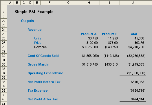
This example is driven by the following inputs:
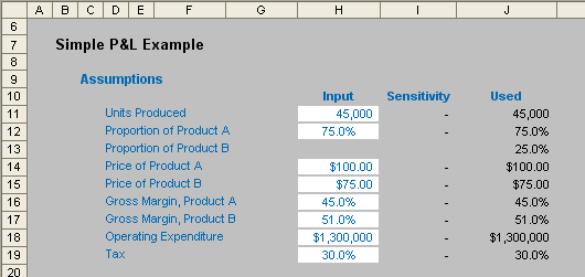
It is not that important to fully understand how these calculations work. The point here is to demonstrate how to construct a tornado chart. In the image above, note that column I (Sensitivity) is blank, but allows us to sensitise the inputs and hence see how the outputs vary as a consequence.
The other key worksheet in the model creates the tornado chart. It contains the sensitivity inputs and 1-dimensional (1-D) Data Tables based on Net Profit After Tax (cell J40, shown above). (A full explanation of how to create 1-D Data Tables is given in this link.)
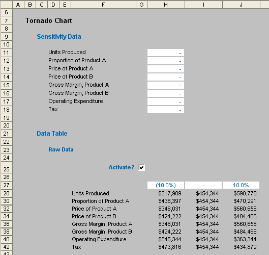
For this example to work correctly, the sensitivity inputs (cells H11:H18) should all be set to zero so that the base case is displayed.
Also, note that in our example here, all inputs are flexed by ±10%. It is common to use symmetrical variations, but it does not necessarily mean all inputs should be flexed by similar proportions, as the discussion on deterministic versus probabilistic tornados (above) observed. The reader will note that rows 29, 31, 33, 35, 37, 39 and 41 have all been hidden from view and a cursory glance at these rows will make it clear how easy it is to change each flex if required. In our example though, we will keep it simple.
Further, it should be recognised that the middle column of the data table is necessary, although it looks superfluous initially. It acts as a check that the output is indeed the “base output” with zero flex, but it is also required to gauge the magnitude of the variation in outputs.
This “raw data” needs to be ‘cleaned’. This is done as follows.
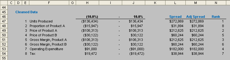
The table is replicated so that the variation to the base case is detailed in columns H:J. The spread is calculated in column L (using =ABS(J47-H47) for example here), as this is needed to rank the assumptions.
Columns E and M are used to make adjustments to this spread if necessary, so that no two spreads will be exactly the same. I do not go into detail as how this is done here, as this is a personal choice and the technique I have adopted will not work for all scenarios. I encourage readers to review my approach and make up their own minds as to how to avoid having ties. The aim is to ensure that no two spreads are identical as this causes problems for ranking.
Column N then ranks the adjusted spreads, using the formula =RANK(M47,$M$47:$M$54), with 1 being the largest adjusted spread and 8 the smallest (RANK simply ‘ranks’ the items in a list in this case – the default setting – in descending order).
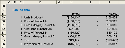
This “Cleaned Data” table now requires reordering prior to chart construction and this undertaken using the INDEX(MATCH) technique discussed in full >here. The chart table should then look like this:
We are now in a position to create the chart. As usual, I supply two sets of instruction here: one for Excel 2003 and earlier, and the other for Excel 2007 and later.
In any case, the table (cells F59:J66) should be selected. Then:
Excel 2003 and earlier
- Select the Chart Wizard (ALT + I + H);
- In Step 1, select the ‘Bar’ chart type and the ‘Clustered Bar’ sub-chart type;
- In Step 2, ensure the data range is =Tornado_Chart_BA!$F$59:$J$66 and that the series is in ‘Columns’;
- In Step 3, I suggest ‘Tornado Chart’ as the chart title, ‘Sensitivity’ for the category (X) axis and ‘NPAT’ for the value (Y) axis;
- In the final Step 4, select the chart location as an object in the worksheet; and
- Click ‘Finish’
Excel 2007 and later
- Click on the ‘Insert ’ tab on the Ribbon, then select ‘Bar’ from the ‘Charts’ group and ‘Clustered’ from the ‘2-D Bar’ section (ALT + N + B + ENTER);
- With the chart selected, click on the ‘Chart Tools, Layout’ tab and then select ‘Chart Title’ from the ‘Labels’ group, then ‘Above Chart’ (ALT + JA + T + down arrow twice + ENTER) for a title of ‘Tornado Chart’;
- Similarly, type in ‘Sensitivity’ for the Primary Vertical Axis title (ALT + JA + I + V + down arrow once + ENTER); and
- Type in ‘NPAT’ for the Primary Horizontal Axis title (ALT + JA + I + H + down arrow once + ENTER)
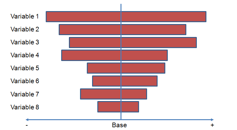
This will generate a rather raw looking chart that will probably not look dissimilar to the following illustration:
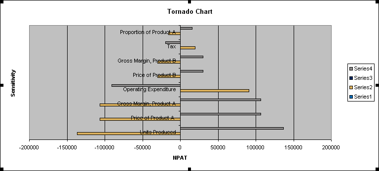
The legend should be removed (right click on it and select ‘Clear’ or ‘Delete’ from the shortcut menu) first of all, although it will still be evident that the bars are not aligned, are too small and inverted. You may be tempted to change the ranking so that the chart is displayed correctly, but often the data and the chart go hand in hand in outputs and it makes more sense to have the key driver at the head of the table.
To correct these issues, we need to make further changes:
Excel 2003 and earlier
- Right click on the vertical axis and select ‘Format Axis…’ from the shortcut menu;
- On the ‘Patterns’ tab select ‘Low’ in the ‘Tick mark labels’ section;
- On the ‘Scale’ tab check ‘Categories in reverse order’;
- Click ‘OK’;
- Right click on the horizontal axis and select ‘Format Axis…’ from the shortcut menu;
- On the ‘Patterns’ tab select ‘Next to axis’ in the ‘Tick mark labels’ section;
- Click ‘OK’;
- Right click on the data bars and select ‘Format Data Series…’ from the shortcut menu;
- On the ‘Options’ tab select an ‘Overlap’ of 100 and a ‘Gap width’ of near zero, say 20; and
- Click ‘OK’
Excel 2007 and later
- Right click on the vertical axis and select ‘Format Axis…’ from the shortcut menu;
- Change ‘Axis Labels’ to ‘Low’ in the drop down box;
- Check ‘Categories in reverse order’;
- Click ‘Close’;
- Right click on the horizontal axis and select ‘Format Axis…’ from the shortcut menu;
- Change ‘Axis Labels’ to ‘Next to axis’ in the drop down box;
- Click ‘Close’;
- Right click on the data bars and select ‘Format Data Series…’ from the shortcut menu;
- Use the sliders to select an ‘Overlap’ of +100 and a ‘Gap width’ towards ‘No Gap’, say 20; and
- Click ‘Close’
The plot area colour, bar colours and gridlines can be formatted as required; similarly, the horizontal axis numbers may be custom formatted as described here. Eventually, you should end up with a dynamic tornado chart that looks similar to the following graphic: