
Power BI Blog: Top 5 Things in Power Bi That You Probably Aren’t Using (and Really Want to Use!)
28 June 2018
We’re taking a break from the Power BI JSON series to have a quick overview of some of the tools in Power BI that you might have overlooked in your rush to create dashboards and reports. Here are some of the features we think that are worth a special mention:
1. Row Level Security
Want to produce dashboards but don’t want employees seeing how much everyone else earns? You can restrict access to data at the row level by employing Row Level Security.
This nifty feature allows you to set up rules using DAX filters that restrict users from seeing information that doesn’t apply to them. For example, for our Australian users, we can set up a restriction that they can only view Australian data as follows:
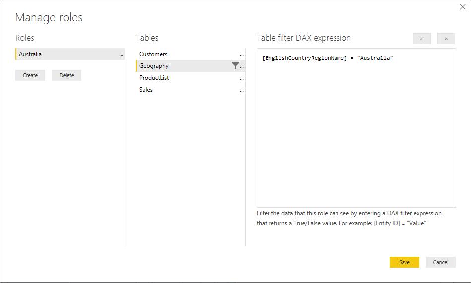
By doing that, anything that is related back to the Geography table with a country name of “Australia” will be excluded from the reports and dashboards that they are able to view.
2. Quick Insights
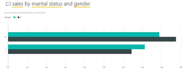
Quick Insights is both underrated and overlooked, as it doesn’t have quite the same “WOW” impact of other tools in Power BI. Once you upload your data to the PBI Service, you can let Microsoft servers run their processing power over your dataset, searching for outliers, correlations, trends and so forth. This will result in a series of up to 30 charts that can help explain something interesting about your dataset, such as:
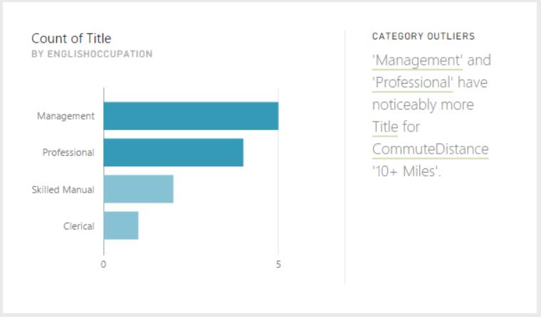
Sometimes they’re less than impressive. However, the key value in the Quick Insights isn’t to give you a magic bullet that solves all of your problems, but to prompt you to ask further questions. Just yesterday, we had a client who used a Quick Insights chart to prompt a question about activities on each day of the year, which showed a seasonality that prompted them to look at activities on each weekday, which prompted them to crack down on operational processes that led to a bias in their performance.
3. Q&A
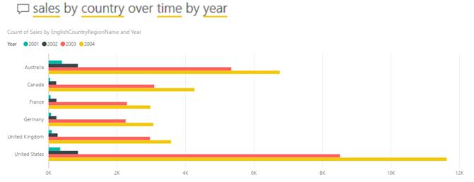
Q&A is one of those magic bullet things we referred to above. The power of Q&A is to be able to ask plain English questions, and have it scour your data for the answer. For example:
Or, if your dataset permits:
This is an incredibly powerful tool that lets people ask their own questions and seek answers, without needing to wait for report owners and management accountants to set up reports first. Of course, it’s possible that you might not want people to have free range access to your data! Well, if you set up Row Level Security, you and your users won’t be able to use either Quick Insights or Q&A in the Power BI Service. That means that you’re hamstrung too – you can’t use it to quickly generate charts for reports either. So, you’re left with…
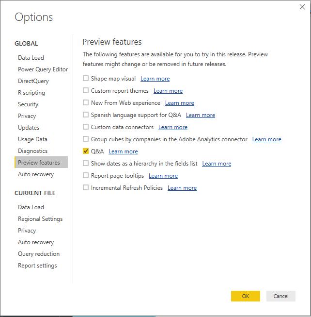
4. Q&A in PBI Desktop
Q&A in Power BI Desktop. Wait, what? I didn’t see a button for that? To enable this, you need to go to the Options dialog and check out the Preview features:
This creates the Ask a Question box in the Insert group of the Home tab, or you can just double click on a report page to ask a question:
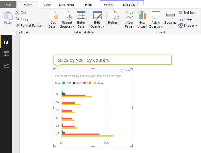
Now you can use Q&A in the comfort of your own desktop!
5. Analyse – explain the difference
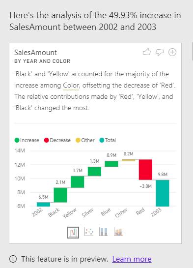
The final cool feature that we think people haven’t adopted yet is the Analyse feature in Power BI Desktop. This is also in preview, but if you have a single metric over time, you can right click on one of the time periods, click on Analyse and ask it to explain the increase (or decrease in the values). Power BI Desktop then thinks about what contributes to the differences, and offers you a series of waterfall charts (with the option to use bubble charts and a couple of others for good measure) to help explain why values have changed.
There you go – we’ll cover all of these features in more detail in upcoming blogs, but this should be a nice taster for what is yet to come! Come back next week for more Power BI tips!